I joined the U.S. Soccer Federation as its first-ever in-house graphic designer. I crafted and implemented comprehensive brand strategies for the USWNT, USMNT, and the various federation departments, ensuring alignment with each department's mission, values, and objectives.
Oversaw and enhanced a unified and impactful brand identity that engaged fans across all touchpoints, including digital media, merchandise, stadium experiences, local-market advertising, and integrated marketing campaigns.
Collaborated effectively to convey the brand vision and narrative across multiple departments in the federation—such as youth national teams, youth academies, the referee department, coaching education, charitable funds, and corporate sponsorships.
Served as the guardian of the brand, ensuring that storytelling and visual representation remained consistent across all platforms and reflected the core values and mission of the federation (to make soccer the most preeminent sport in the U.S.).
Collaborated with our communications team and drove the creative vision for both senior national teams, overseeing a lean team of contracted designers and photographers to deliver innovative, fan-focused content.
Championed technology integration to streamline content production, elevate storytelling, and tailor fan experiences across emerging media platforms—including the first-ever U.S. Soccer Mobile App.
Collaborated closely with internal stakeholders, including the ticketing, sponsorship, and community impact teams, to develop comprehensive, multi-channel campaigns that advanced key business objectives such as fan acquisition, engagement, and retention.
Photography Direction Ahead World Cup Pursuit
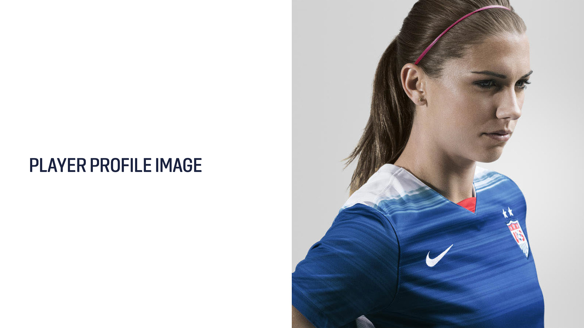
With the 2019 Women's World Cup just over a year away, we recognized the need to ensure our brand was as cohesive and polished as possible. This required aligning all creative assets under a unified brand look and feel. Beyond our bold red, white, and blue colors, our players were the face of our brand.
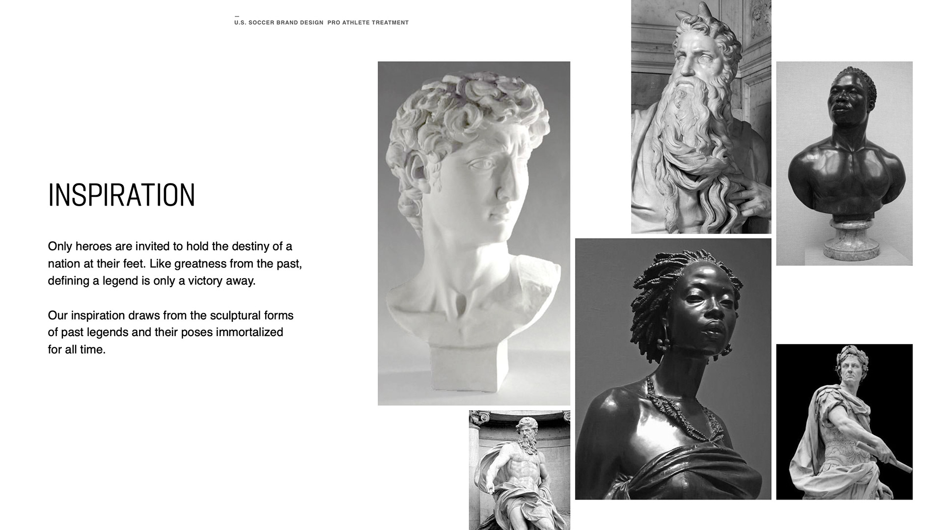
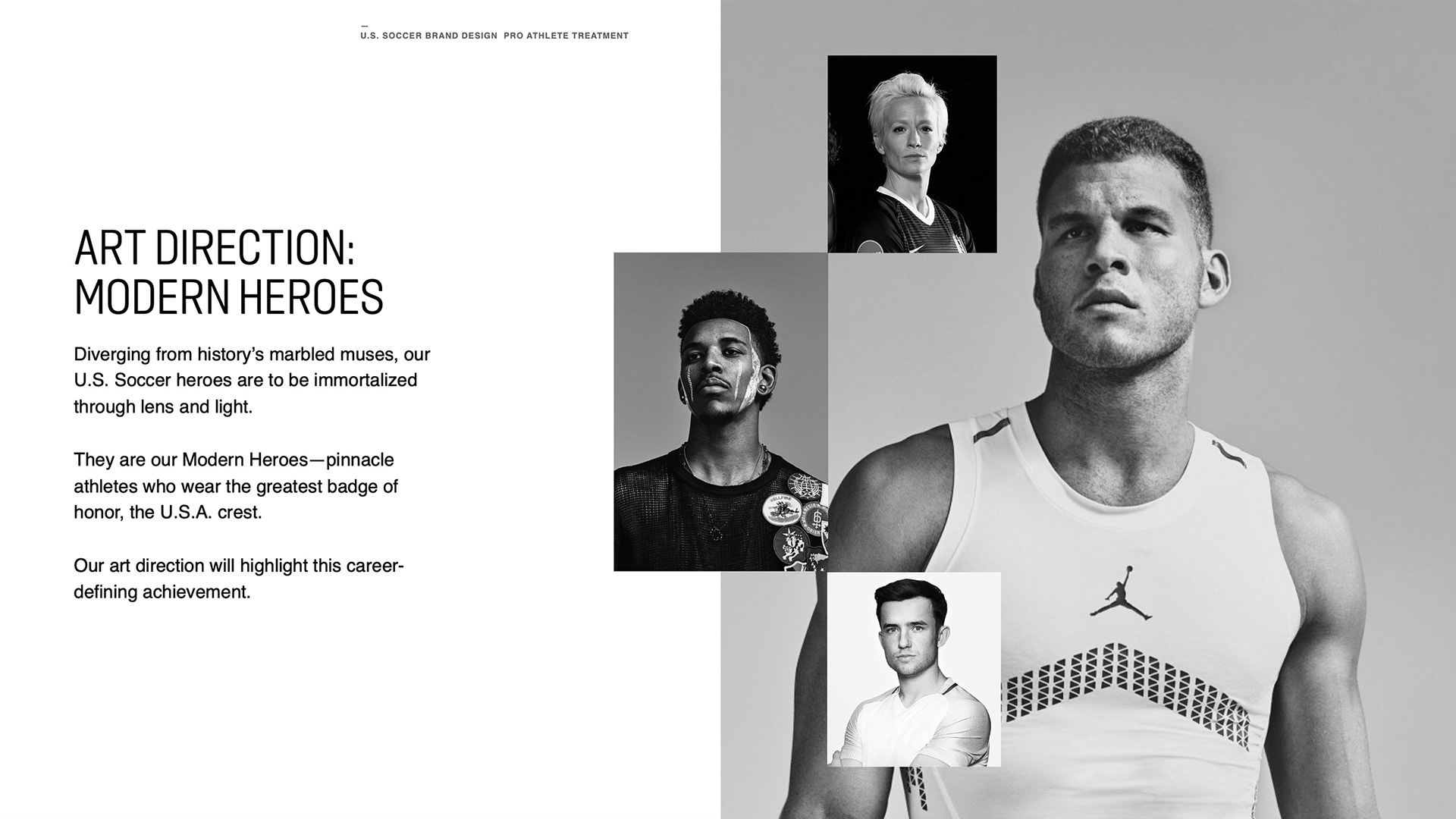
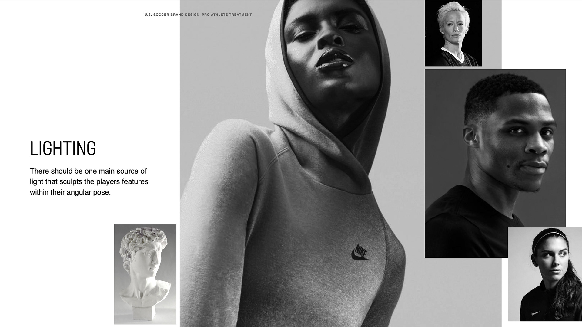
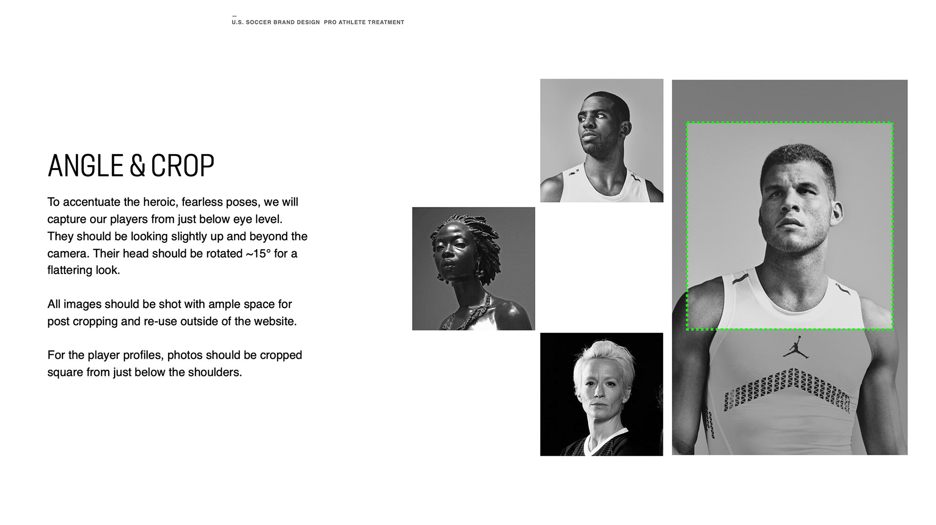
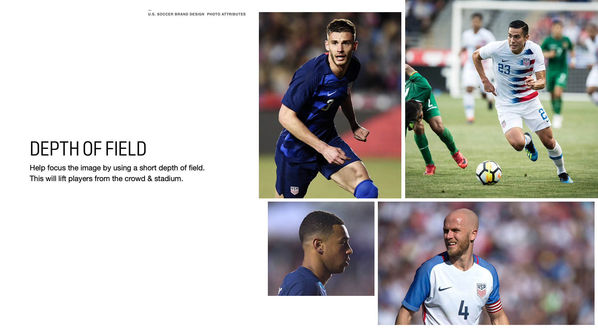
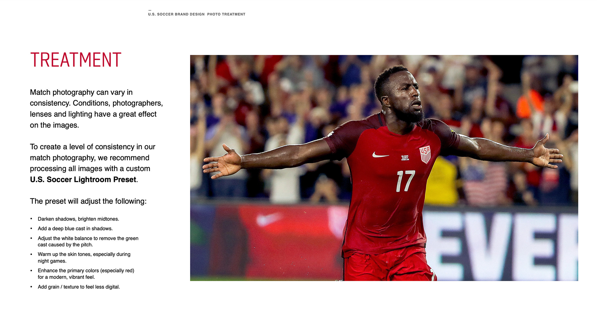
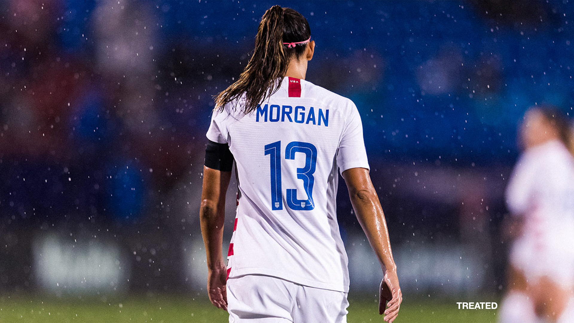
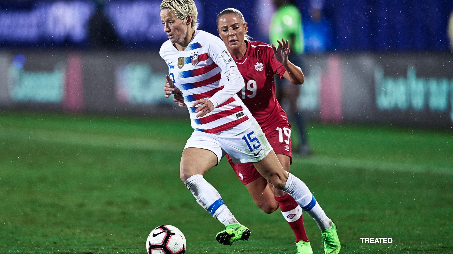
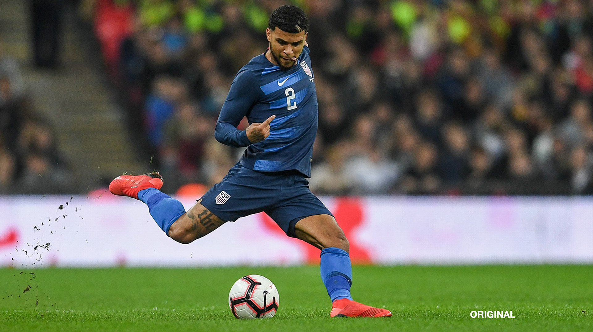
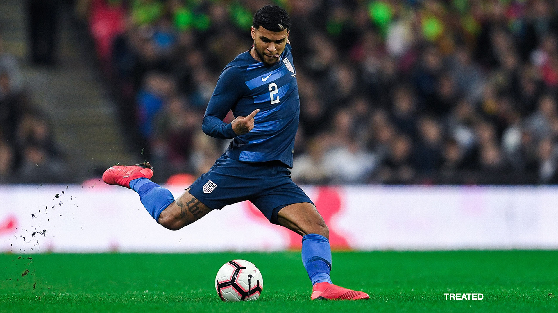
To establish consistency in our photography, we leveraged images captured the year before the World Cup. This process involved setting clear guidelines for photo angles, facial expressions, color treatments, cropping, and the specific contexts in which each type of photo should or should not be used.
I developed a comprehensive PDF guide to enforce these photo-brand guidelines across internal teams and several externally contracted photographers and editors. This document provided detailed instructions to ensure every image remained on brand, helping us present a unified and professional identity across all our platforms and channels as we approached the global stage.
Art Direction for studio photographers on media days:

Art Direction for photographers on match days:
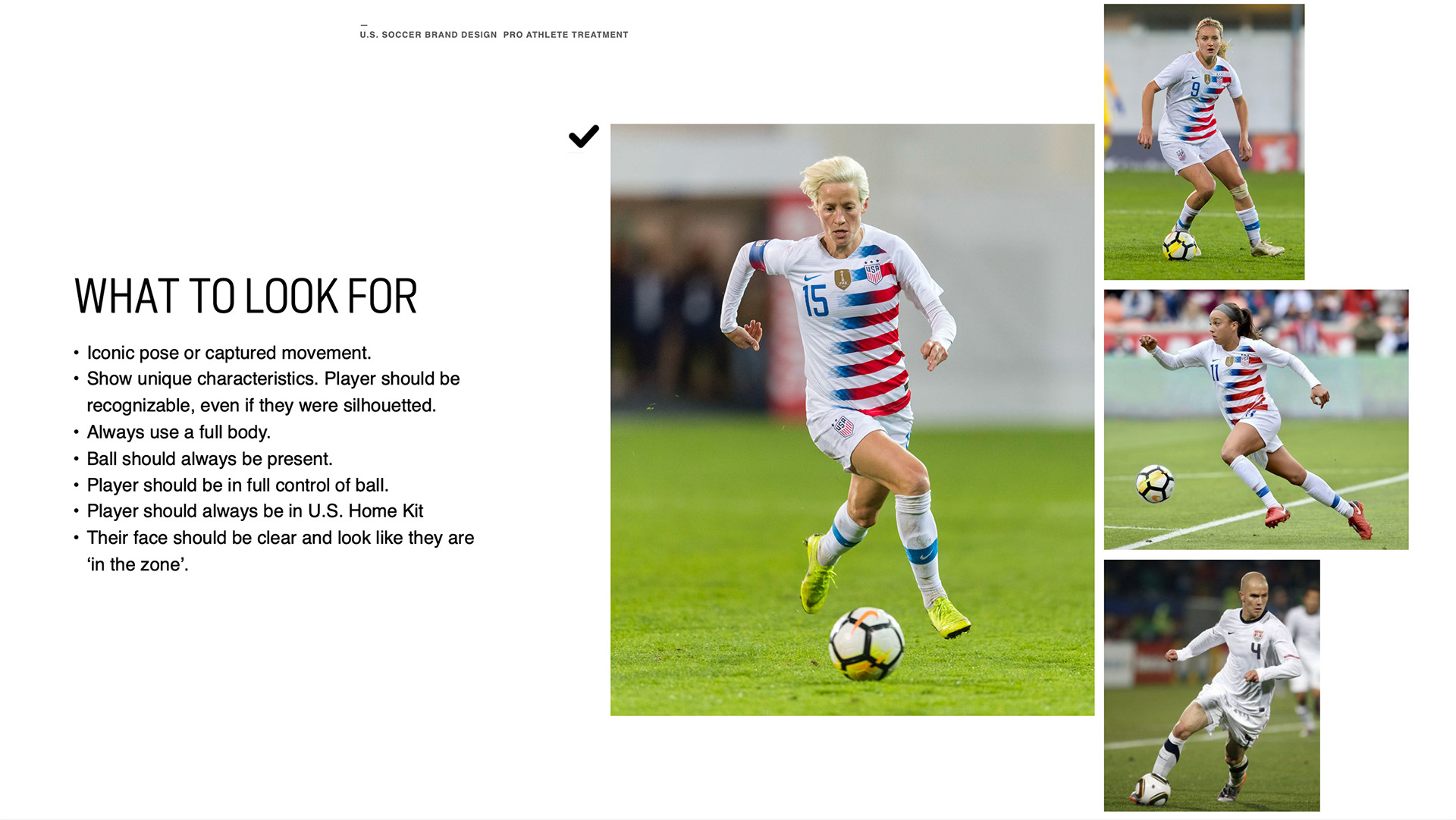
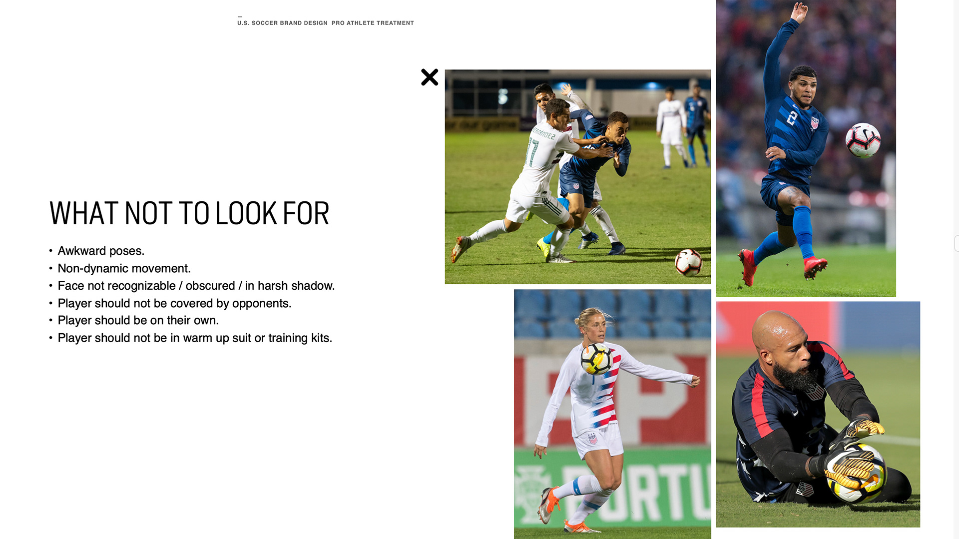
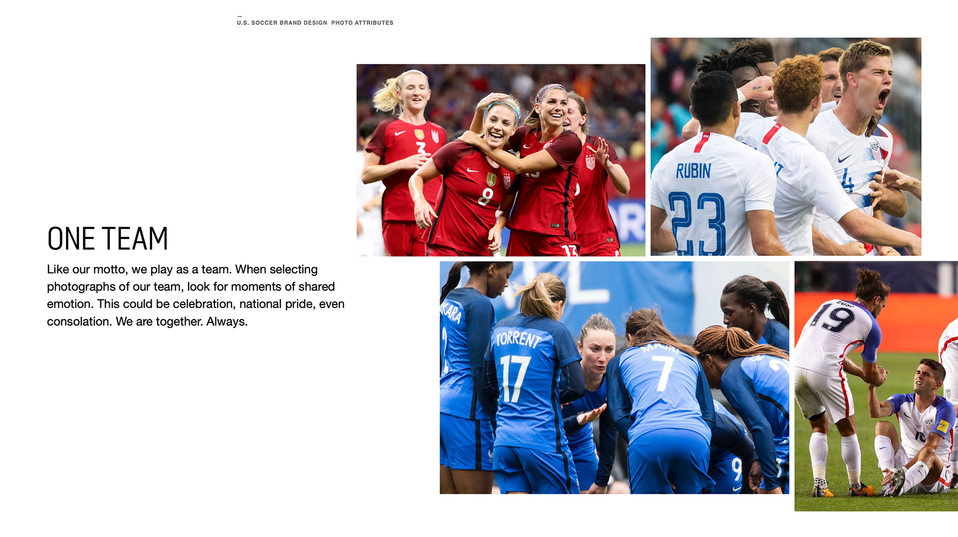
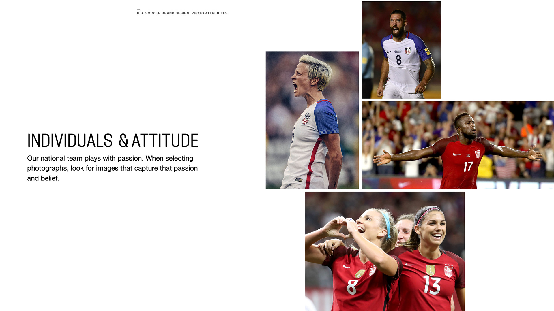
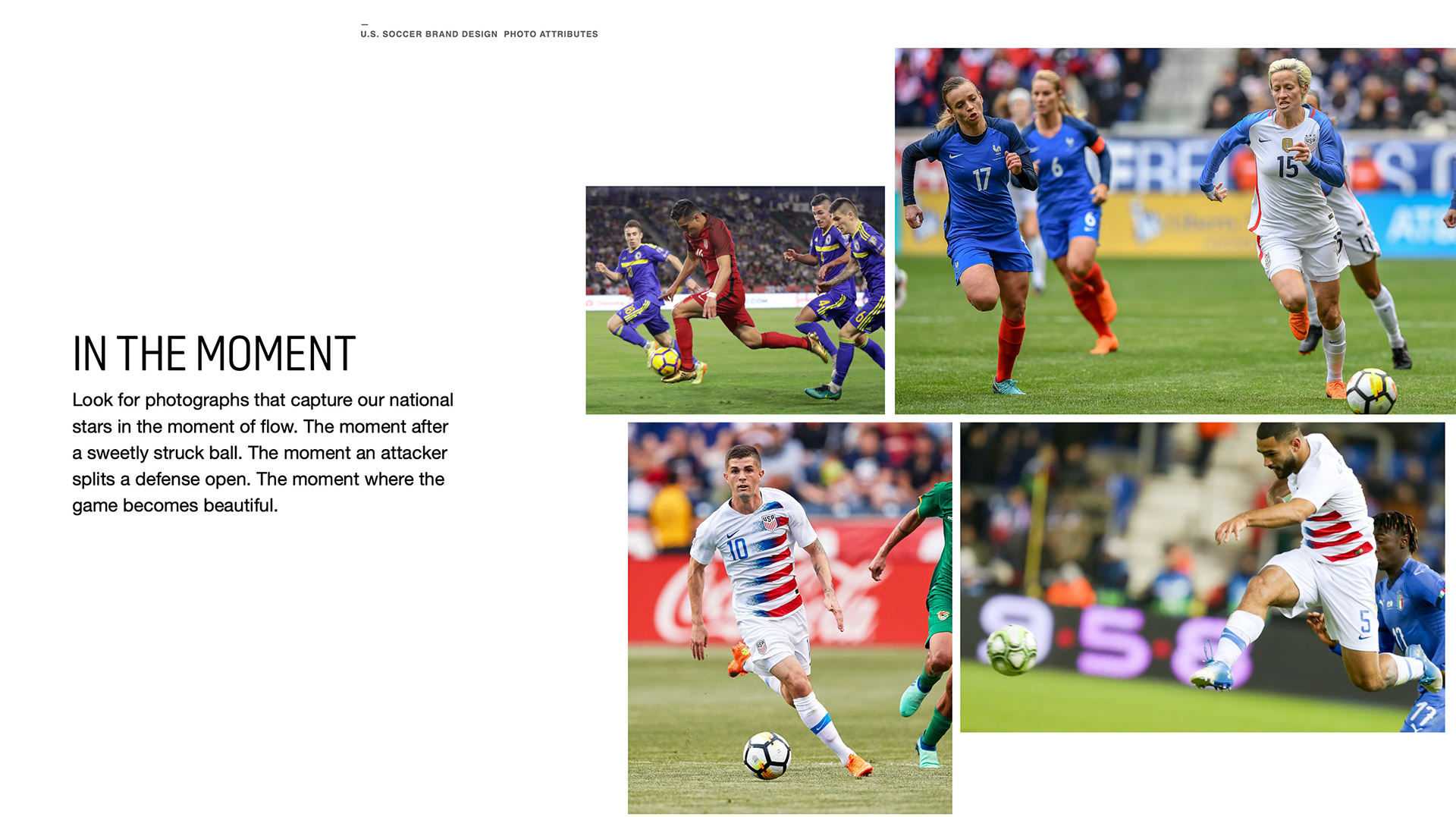
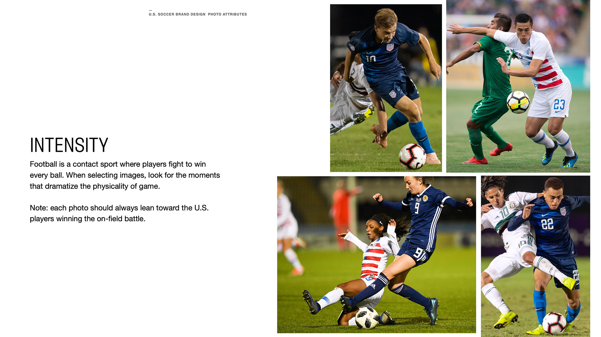
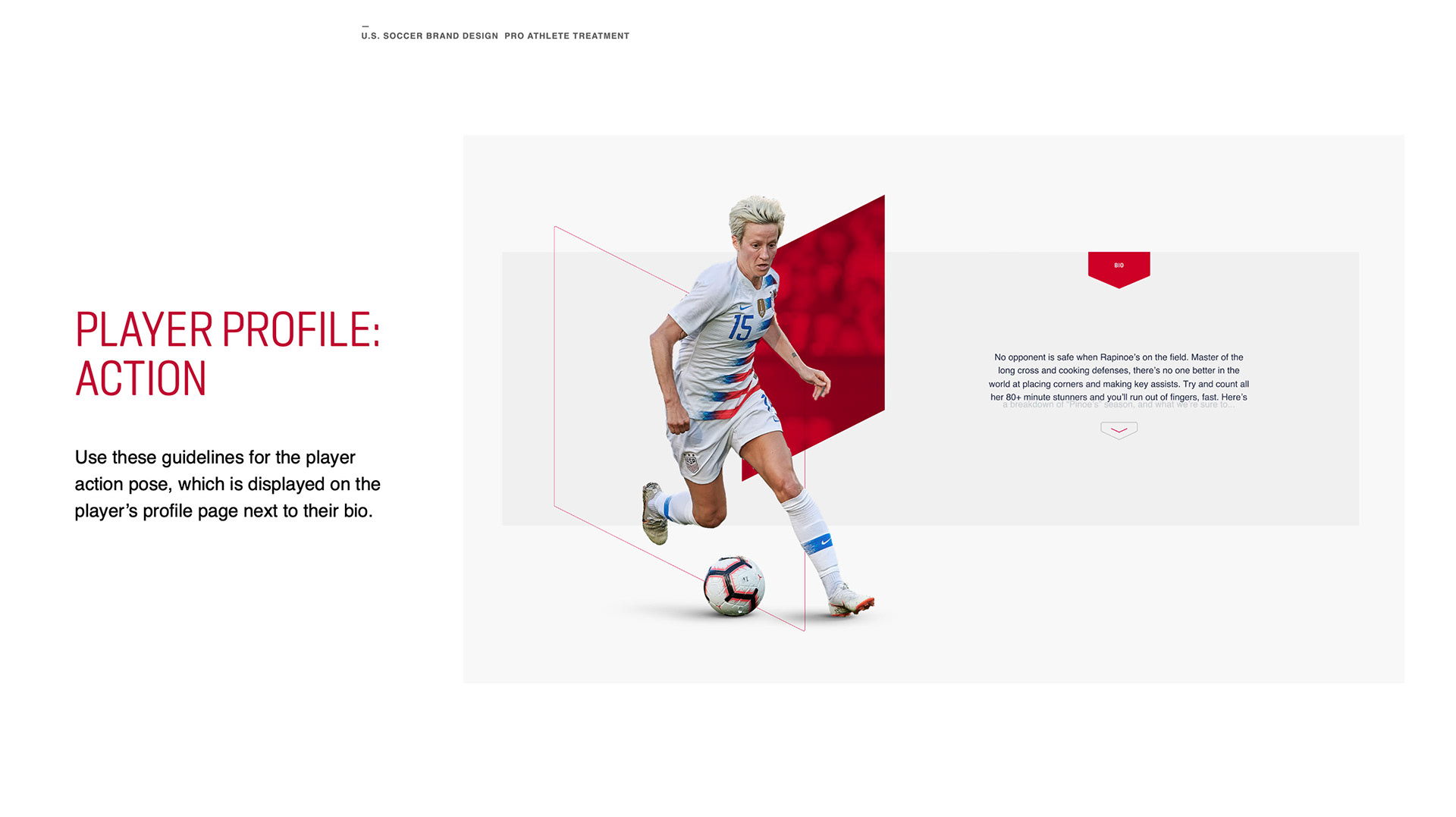
Direction on selecting photos:

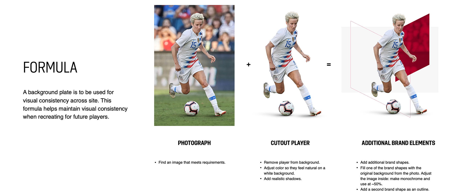
Following these directions/ guidelines allows the designers to replicate and evolve a consistent look throughout graphics and campaigns, as shown in the formula:
Direction for photo editors:


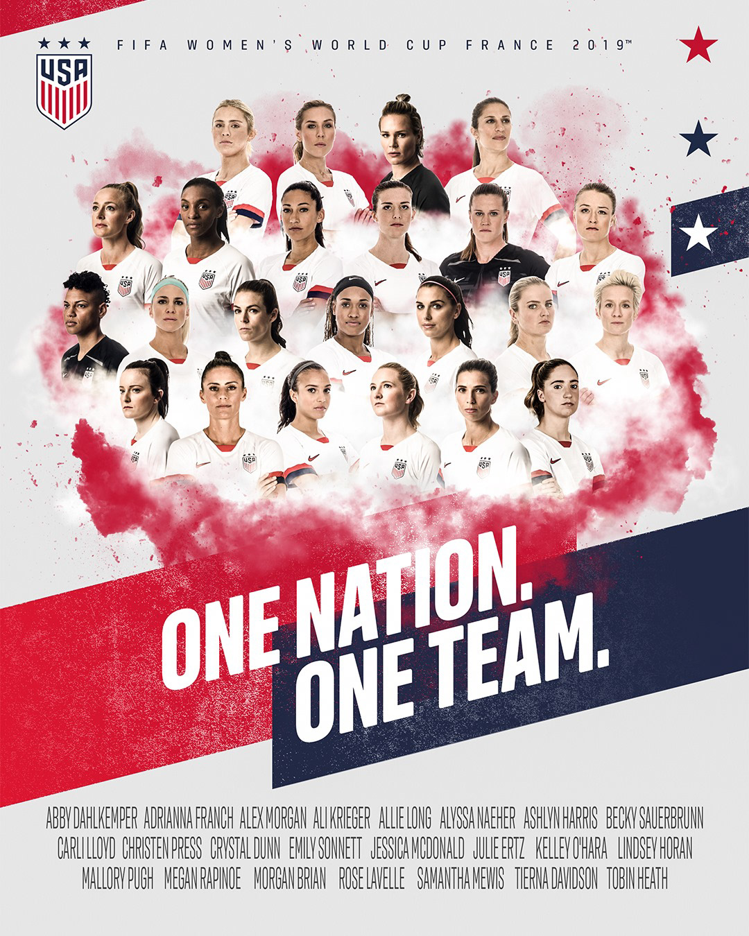
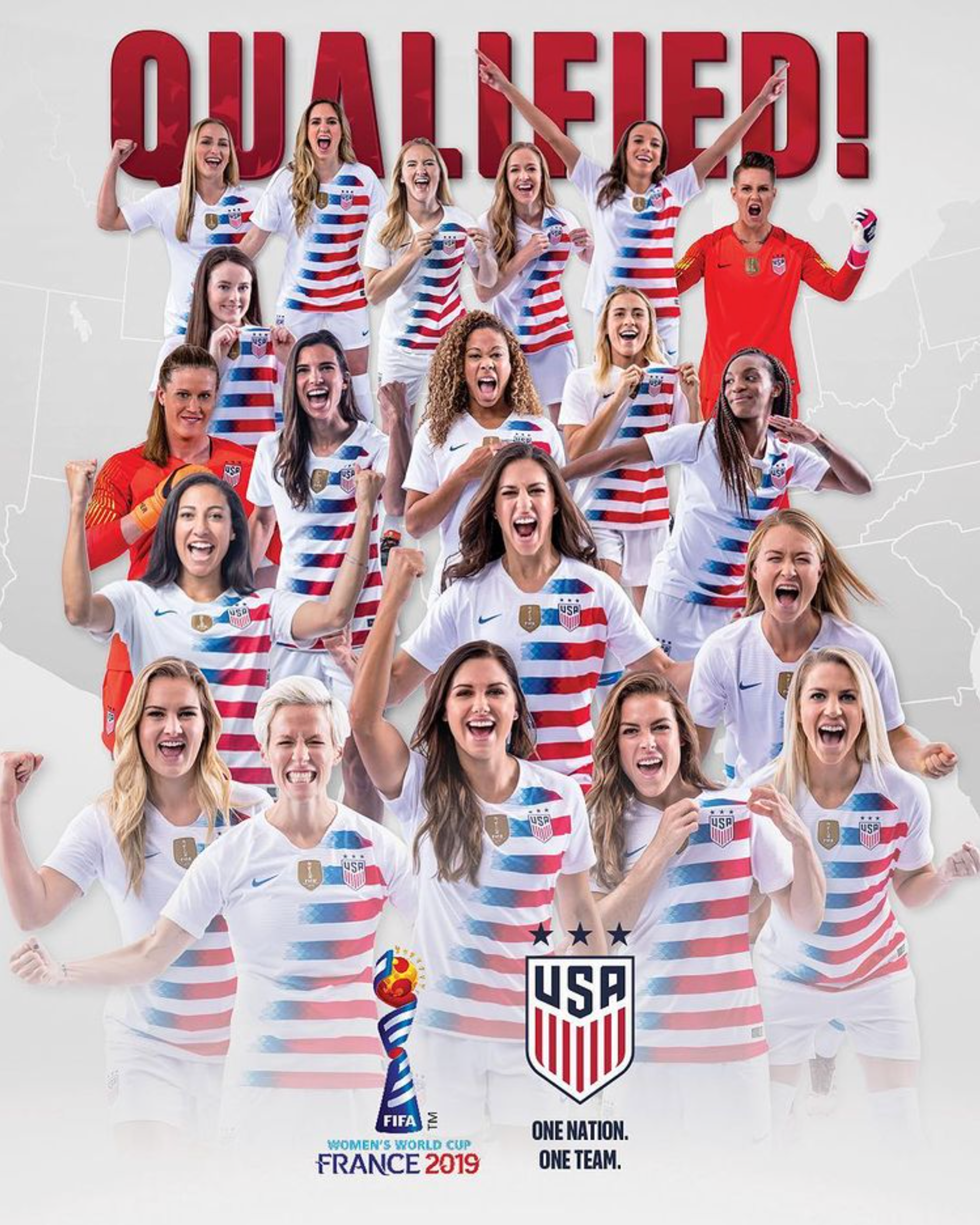
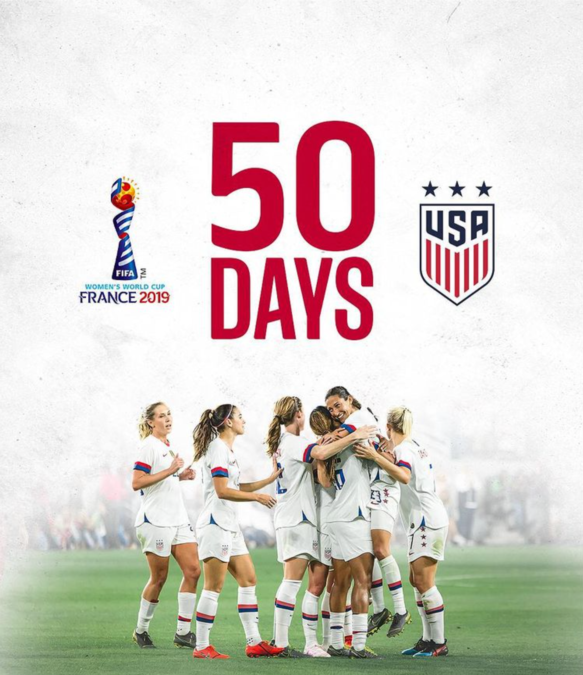
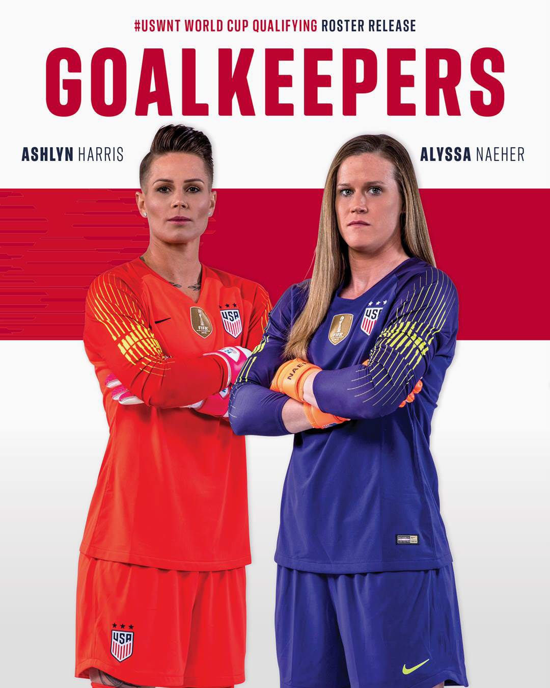
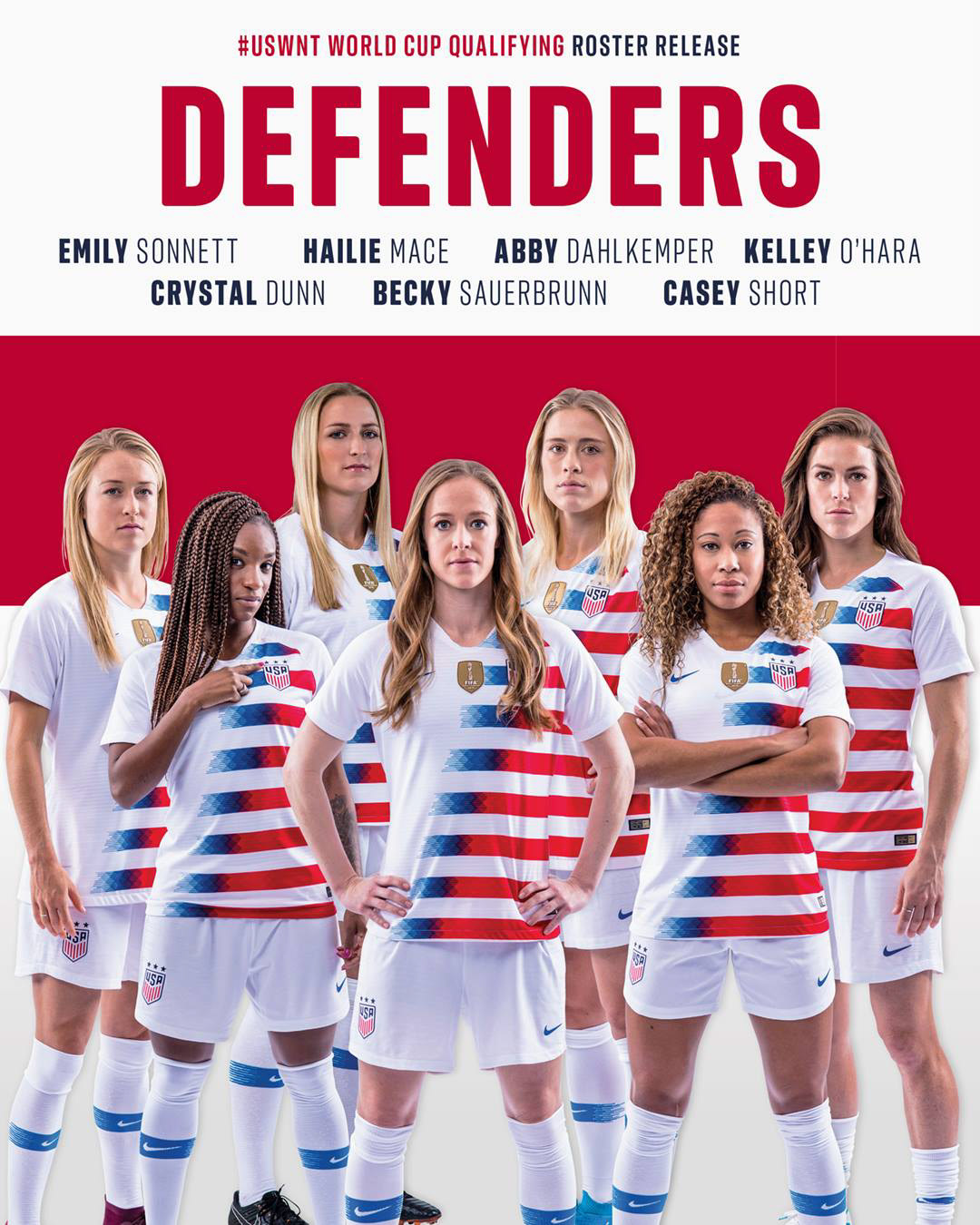
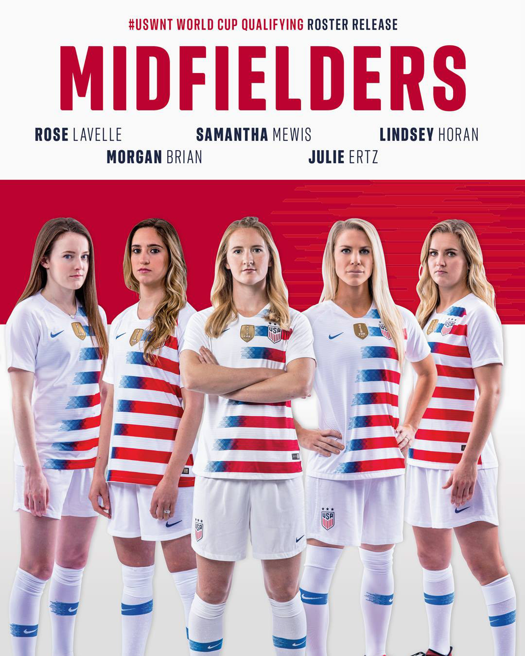
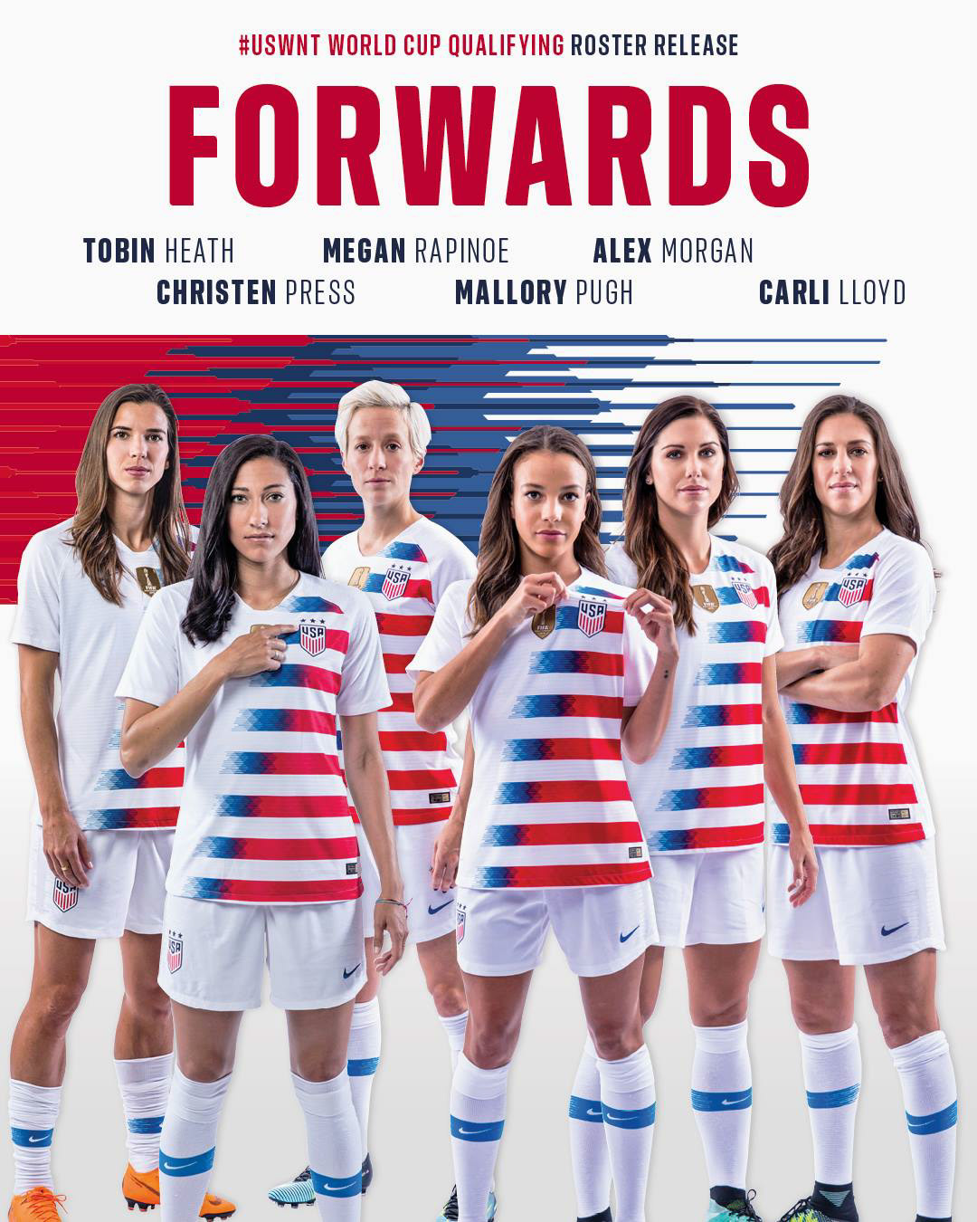
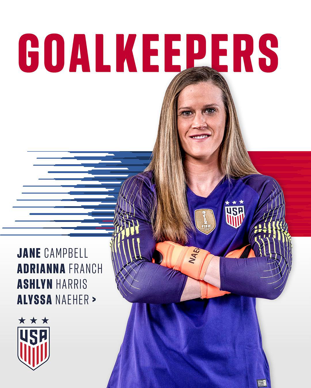
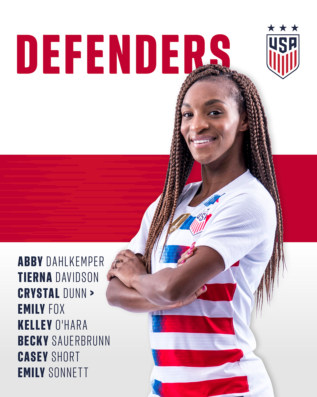
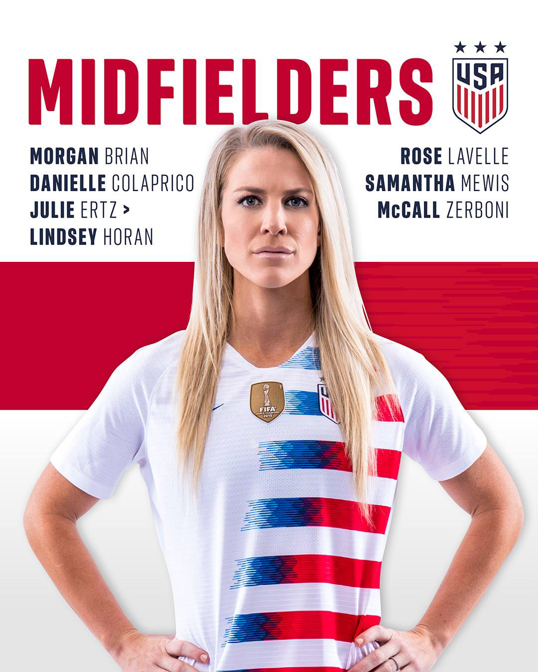
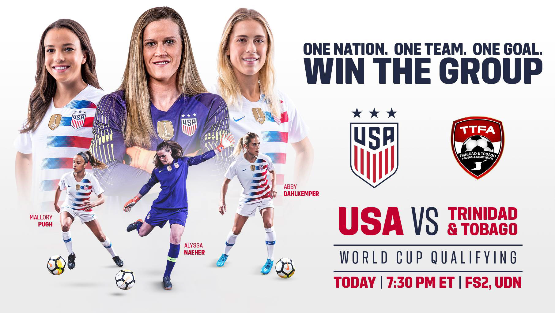
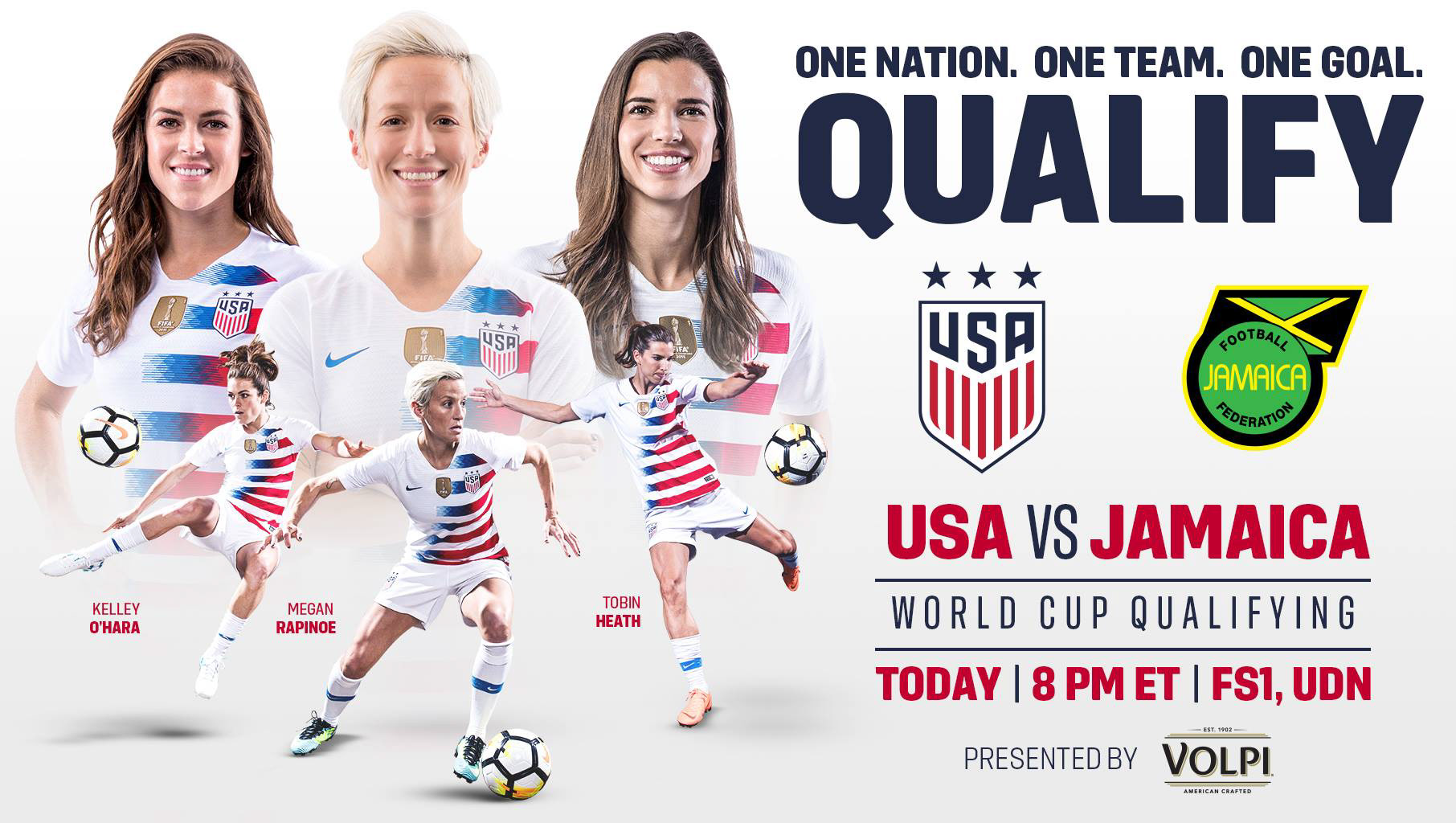
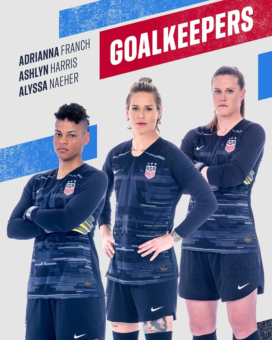
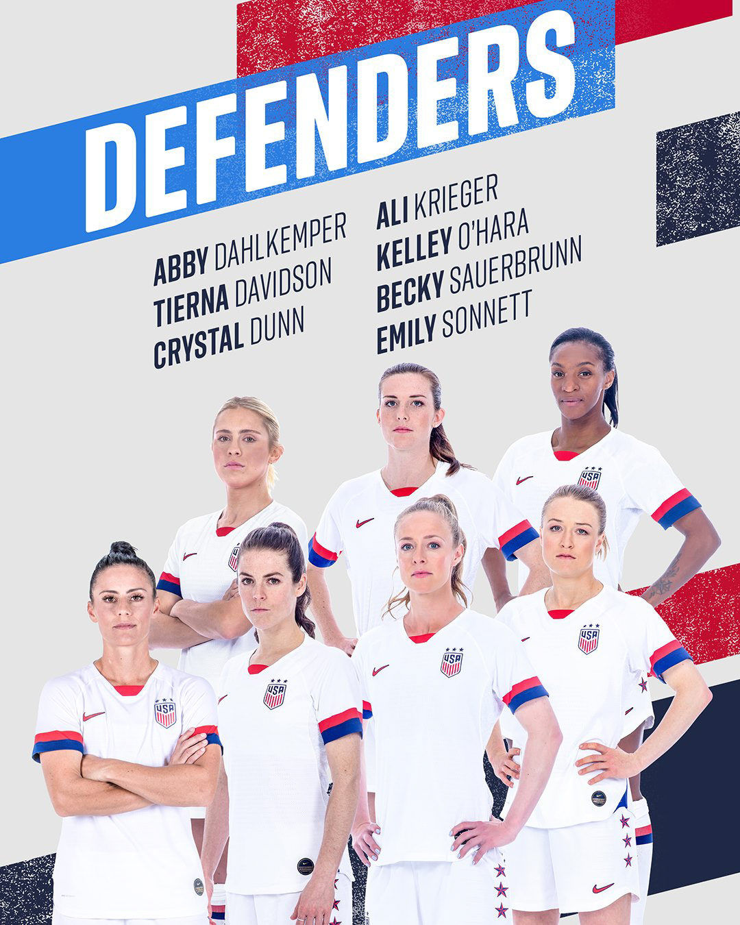
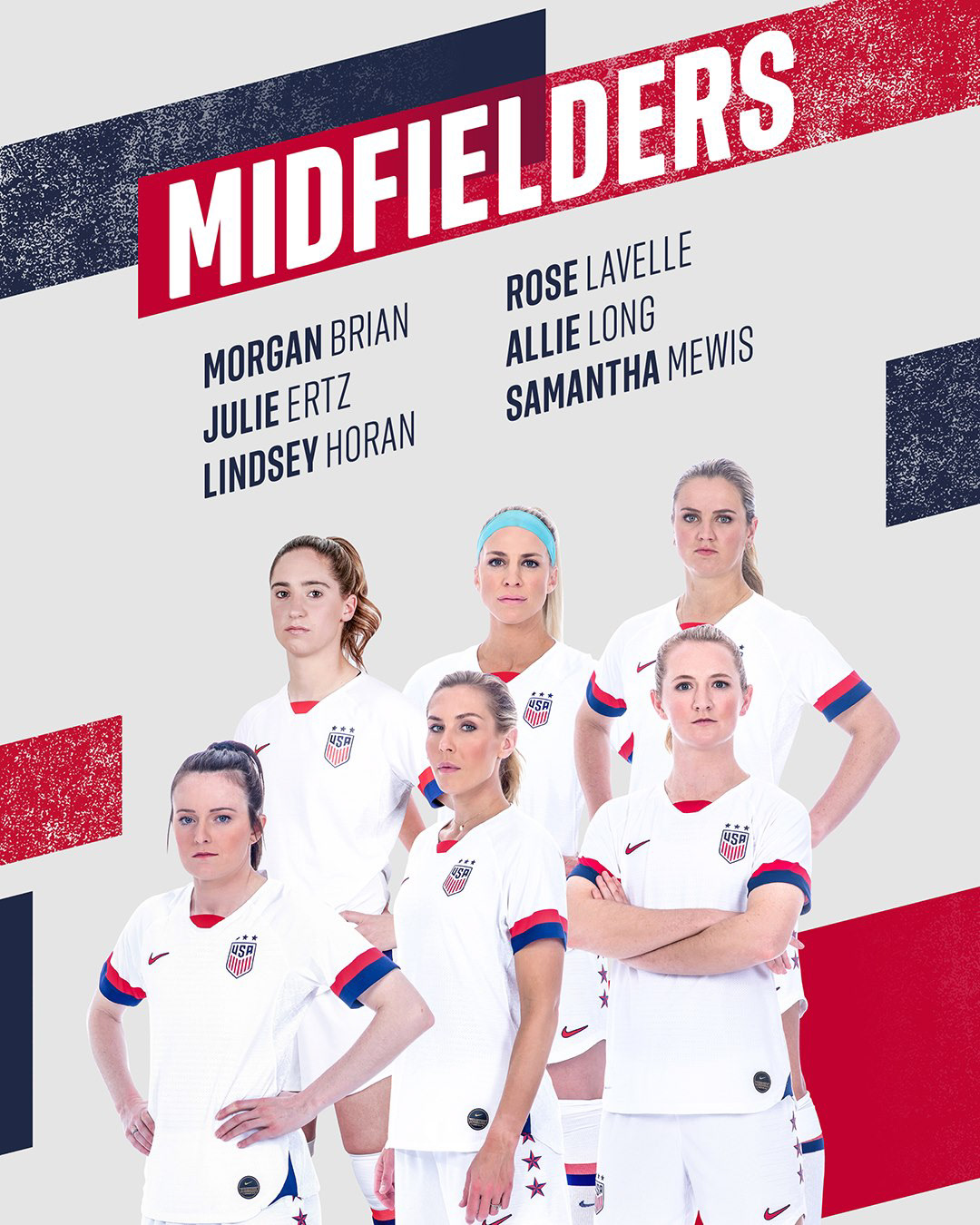
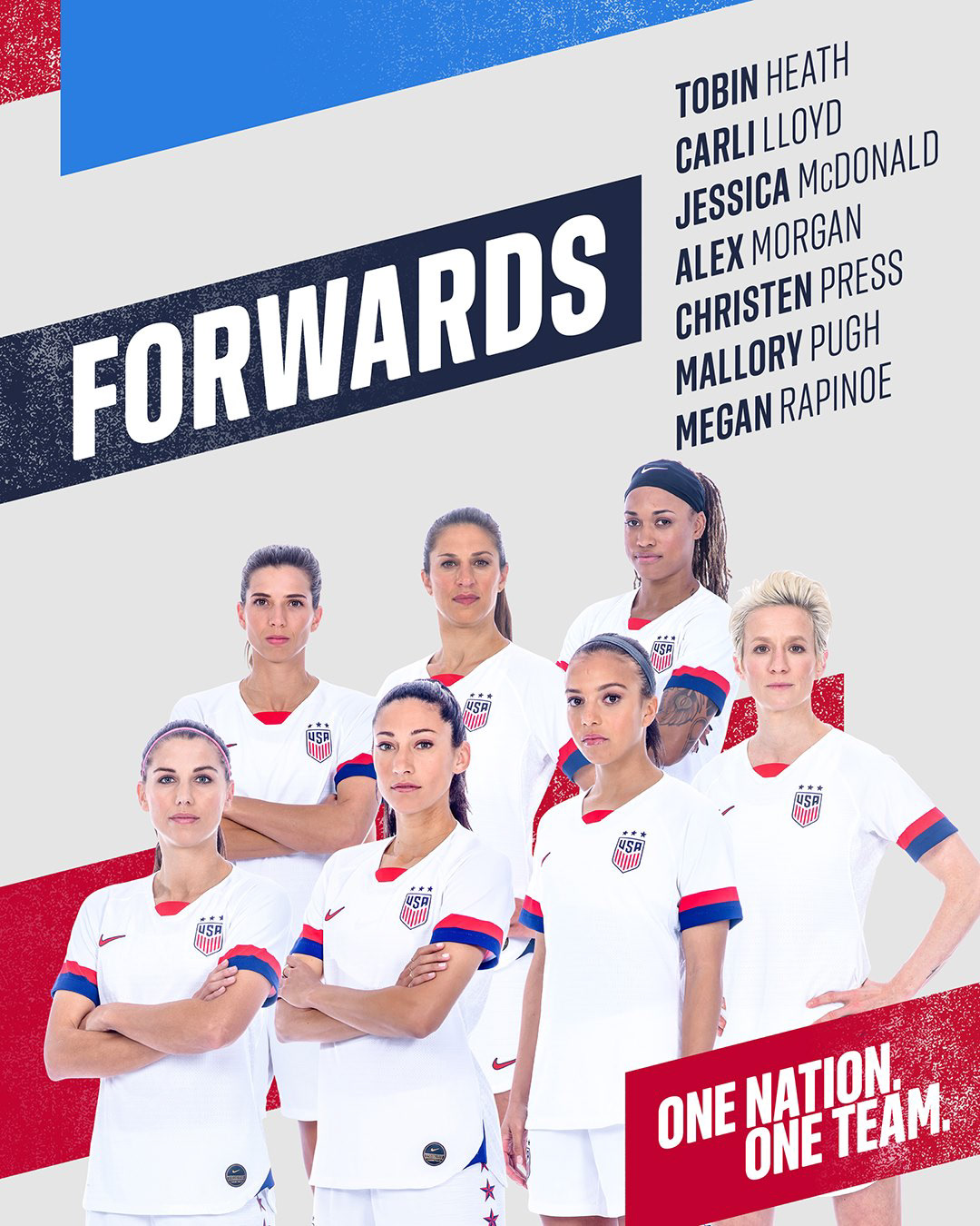
2019 Women's World Cup Campaign
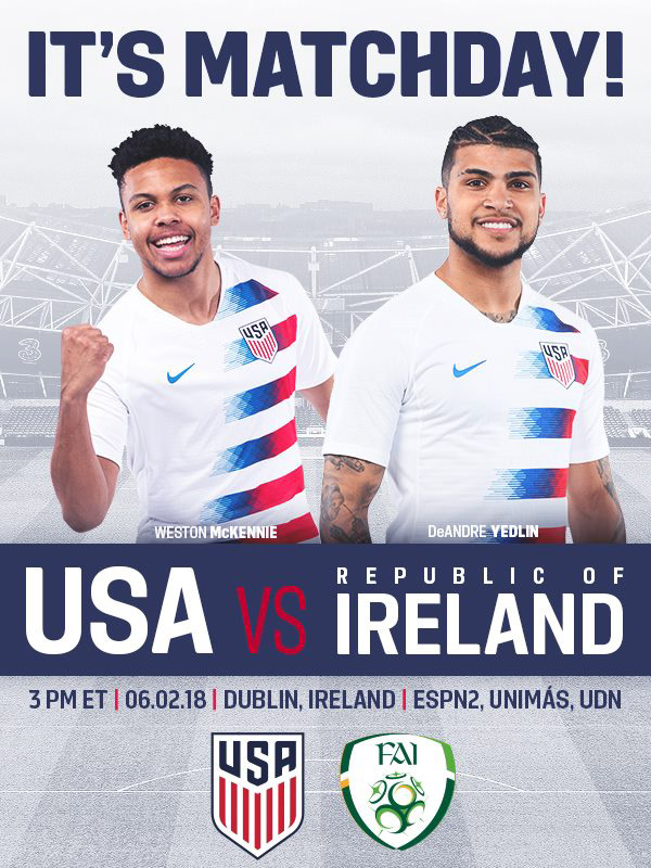
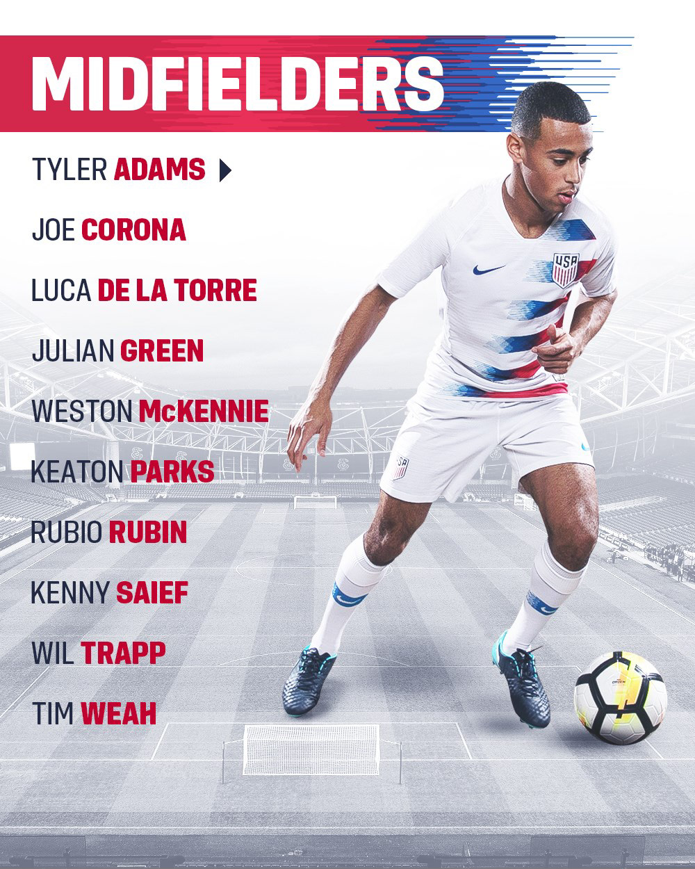
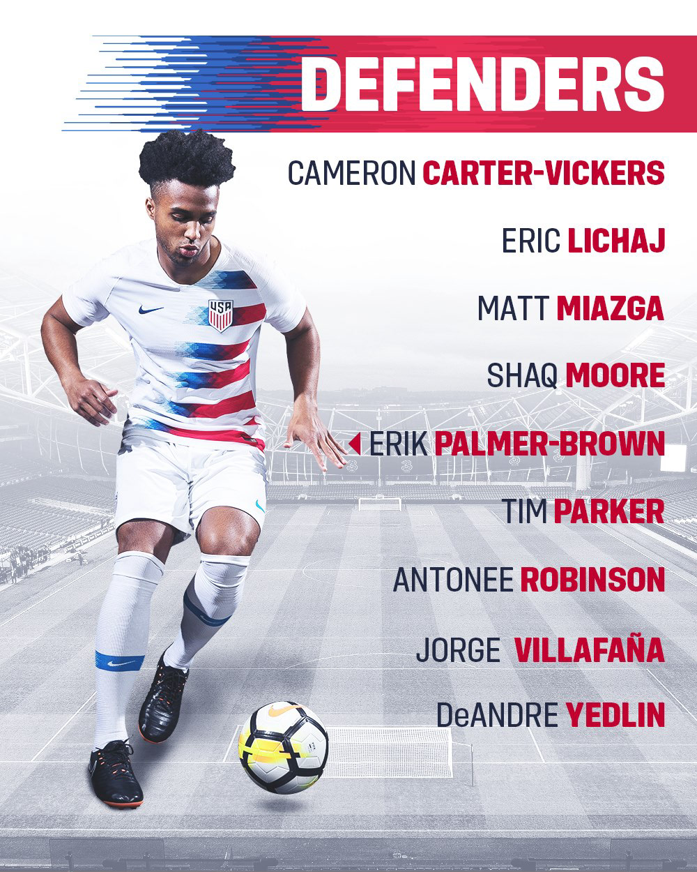
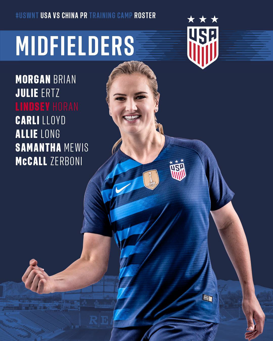
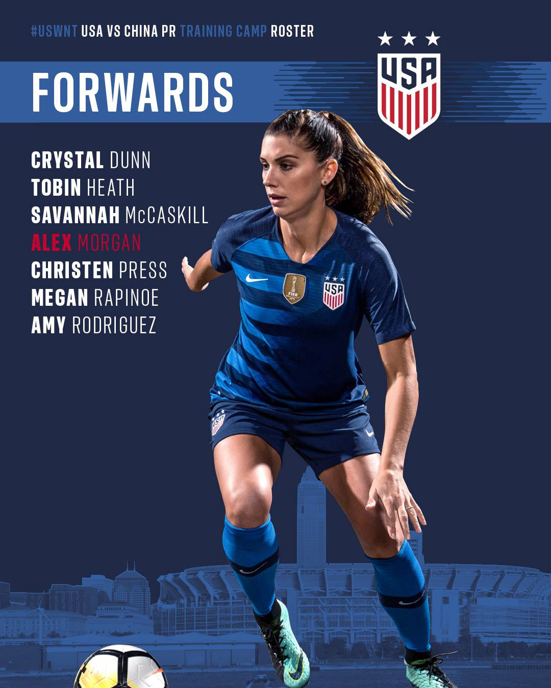
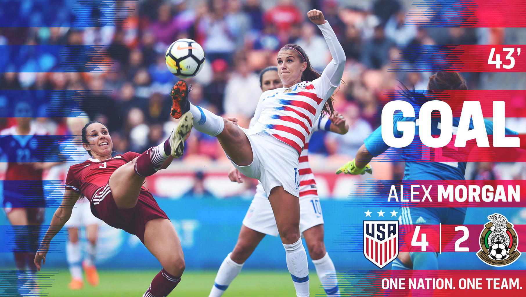
"The World's Winningest Team" is how the USWNT came to be known leading up to the opportunity to make history: winning the FIFA Women's World Cup two times in a row. With all eyes on the USWNT before the big tournament, we started our brand strategy and messaging well in advance to call upon all fans to join us on our journey from qualifying matches to the World Cup Final in Paris. Several notable stages throughout the journey brought our fans together: qualifying matches, jersey launches, roster announcements, World Cup branding, and finally, post-World Cup branding, known as the Victory Tour. Throughout all of these stages, I contributed as the lead designer, providing direction to our photographers on media days, meeting with stakeholders to discuss overall goals and strategies, and collaborating with Nike to capitalize on key moments such as the official jersey design and launch ahead of the World Cup.


Because many of the qualifying matches are ahead of the 2019 World Cup, we started incorporating a direct brand narrative into match-day graphics to contextualize each game. For example, "Our Journey Starts Here" communicates that this is the first game leading up to qualification, and many more games are to come on this implied 'journey' to winning the 2019 World Cup.
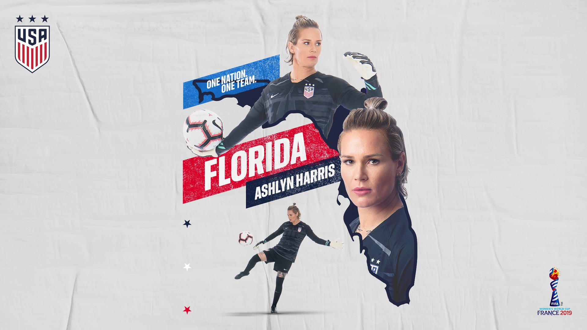
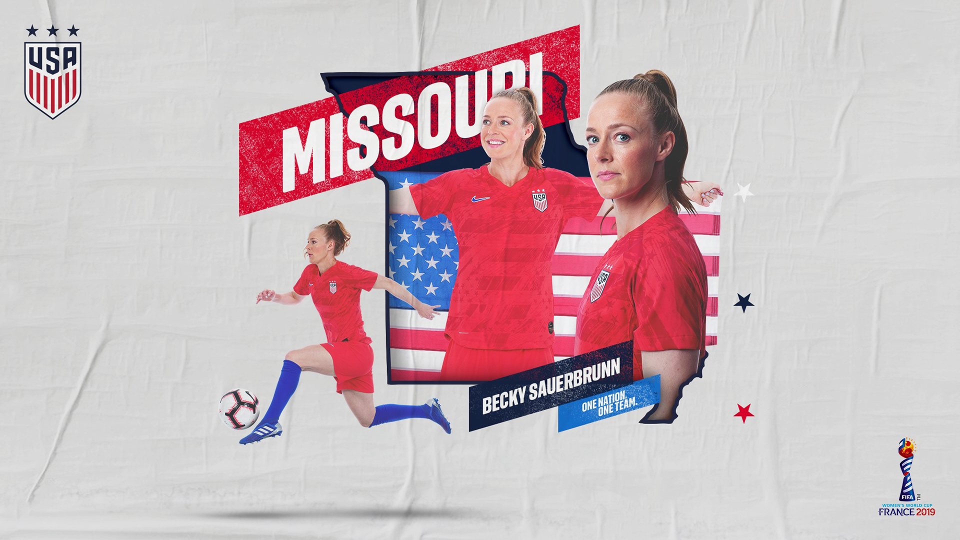
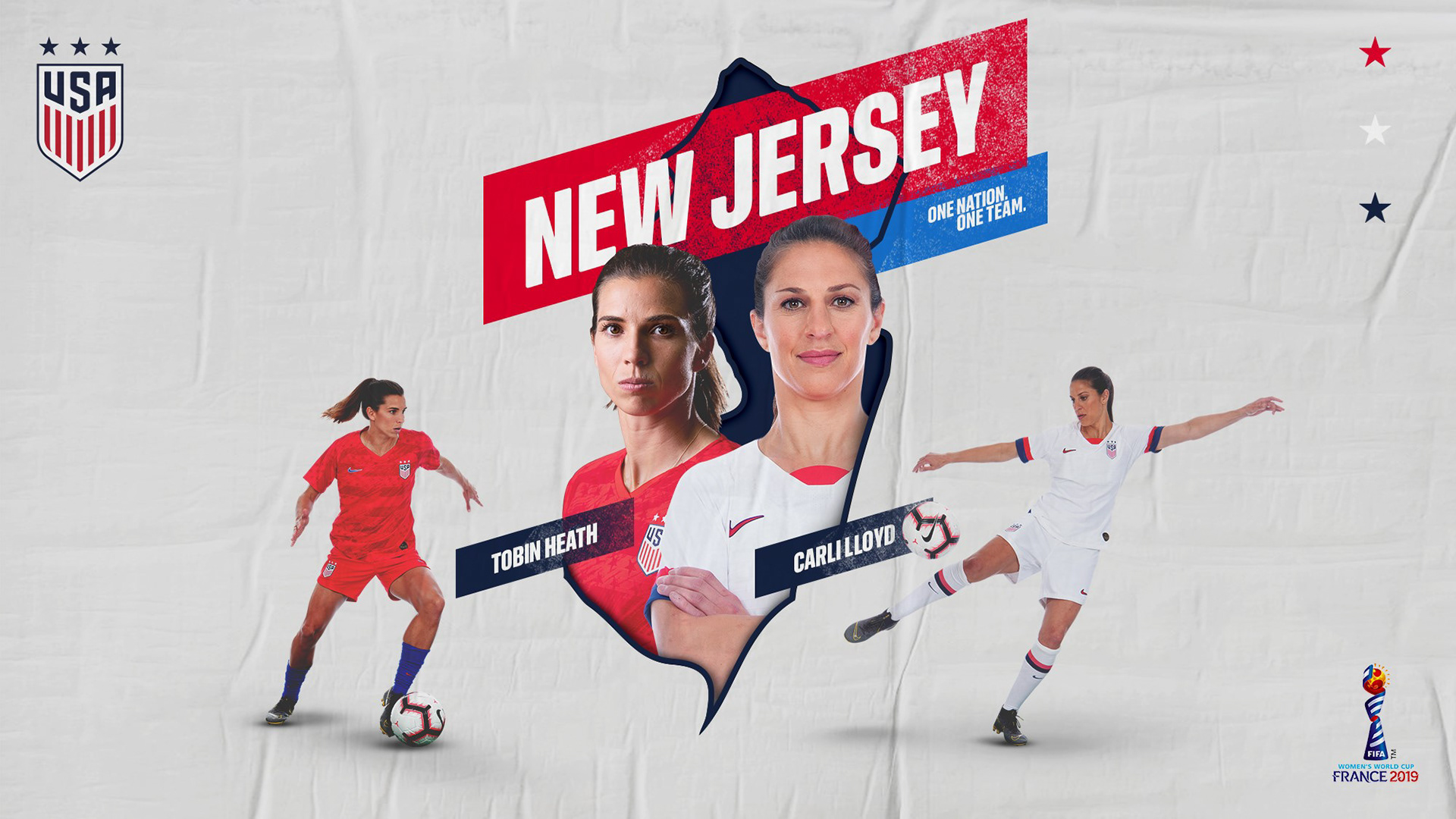
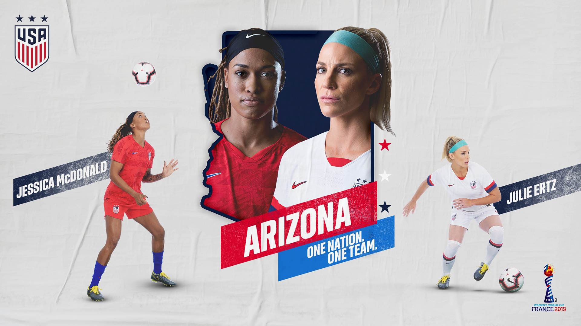
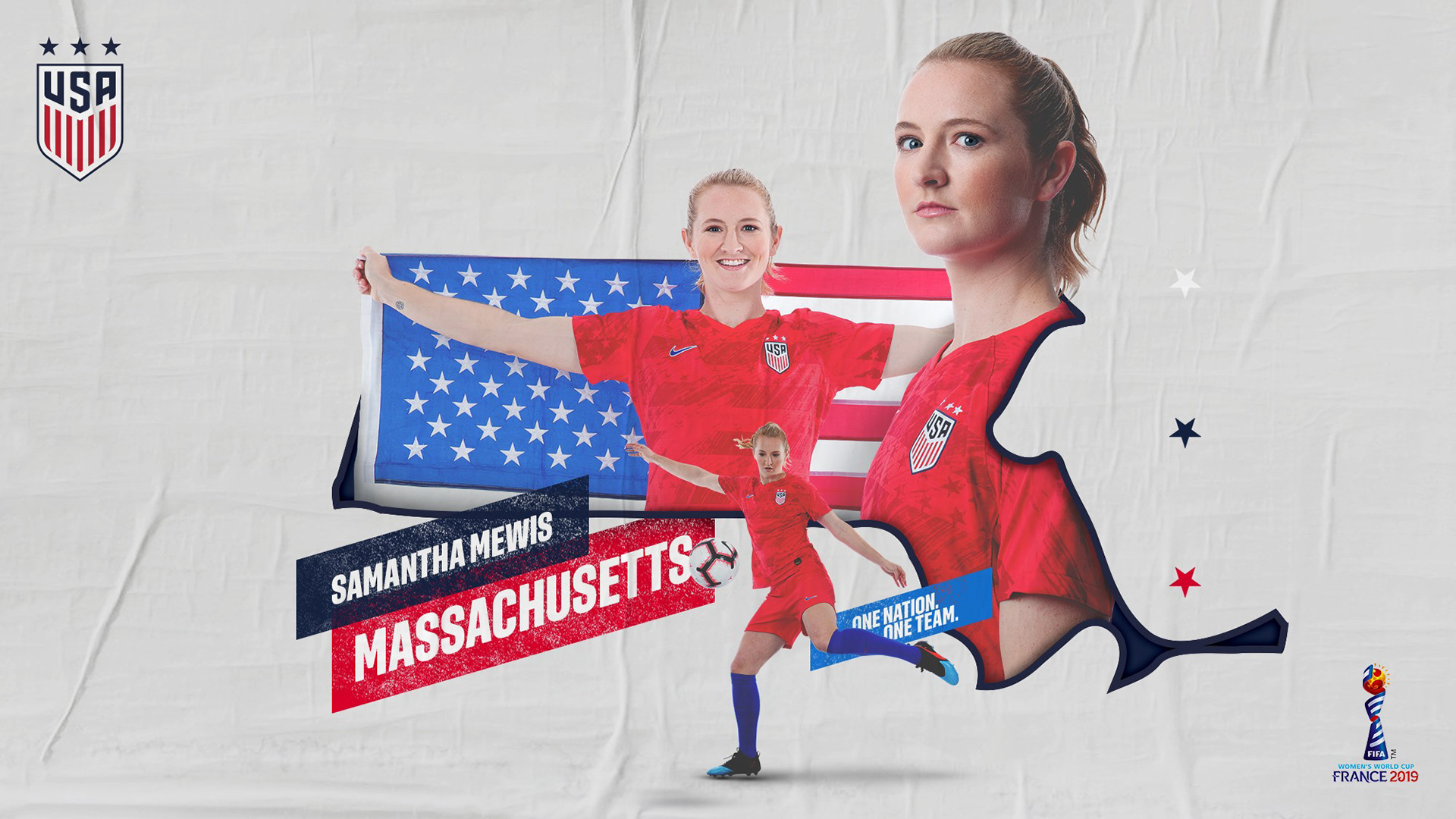
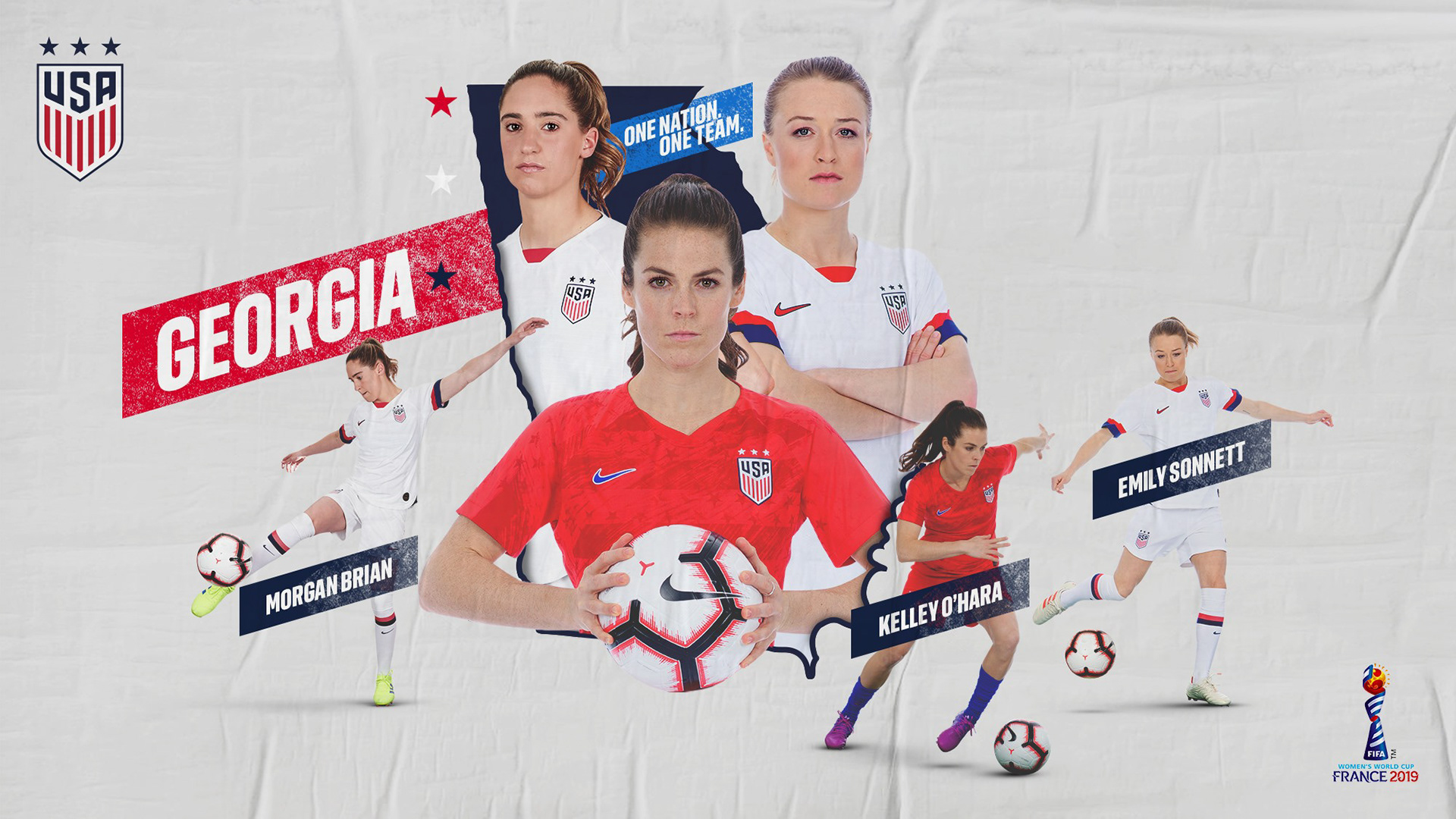
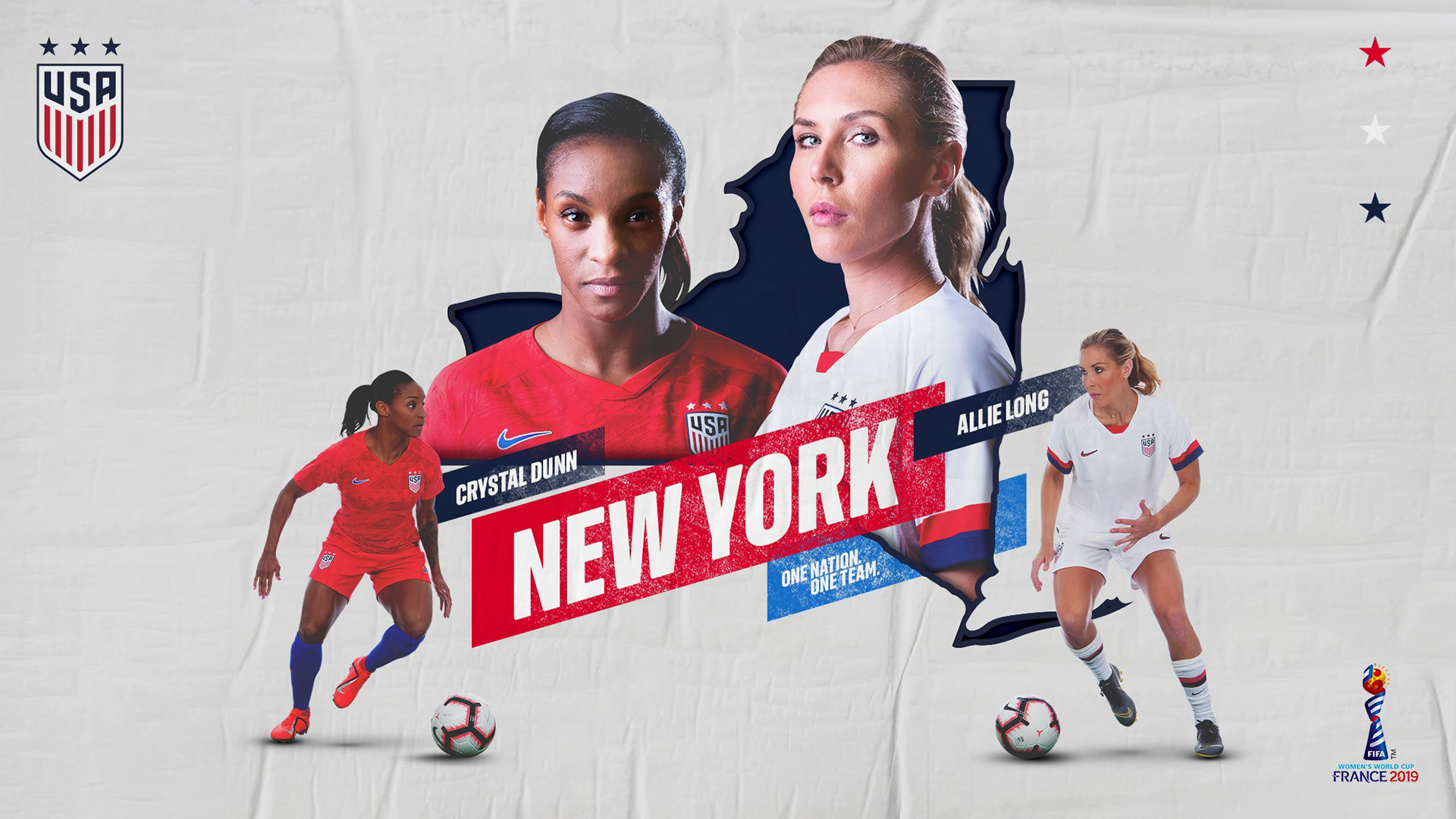
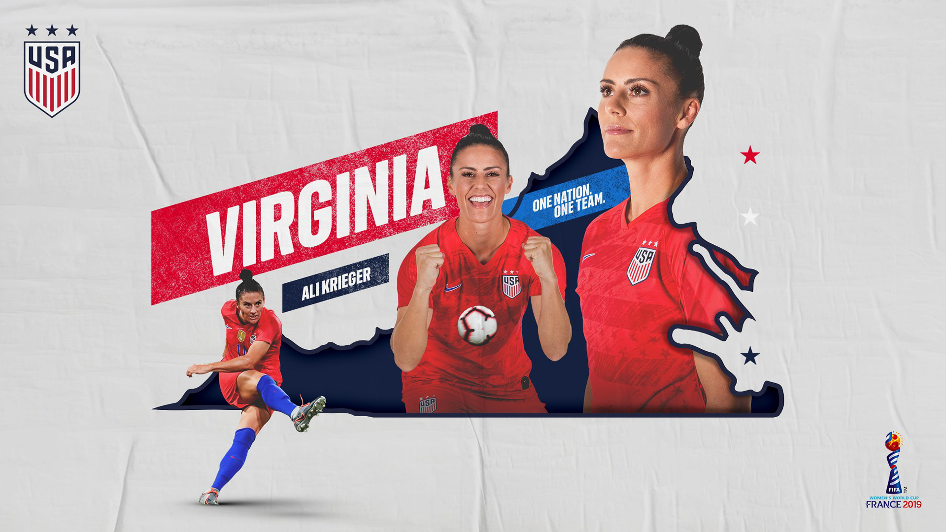
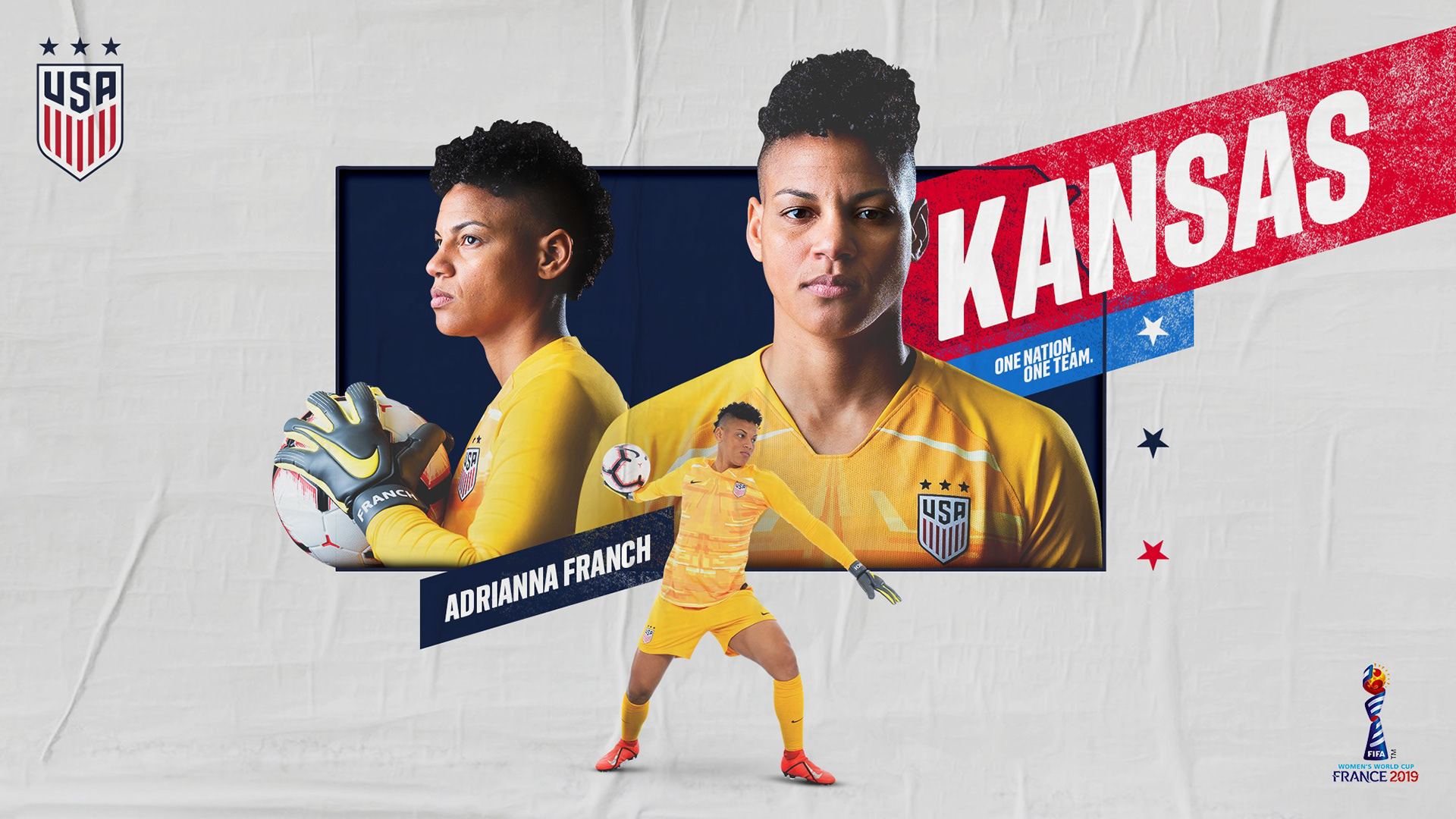
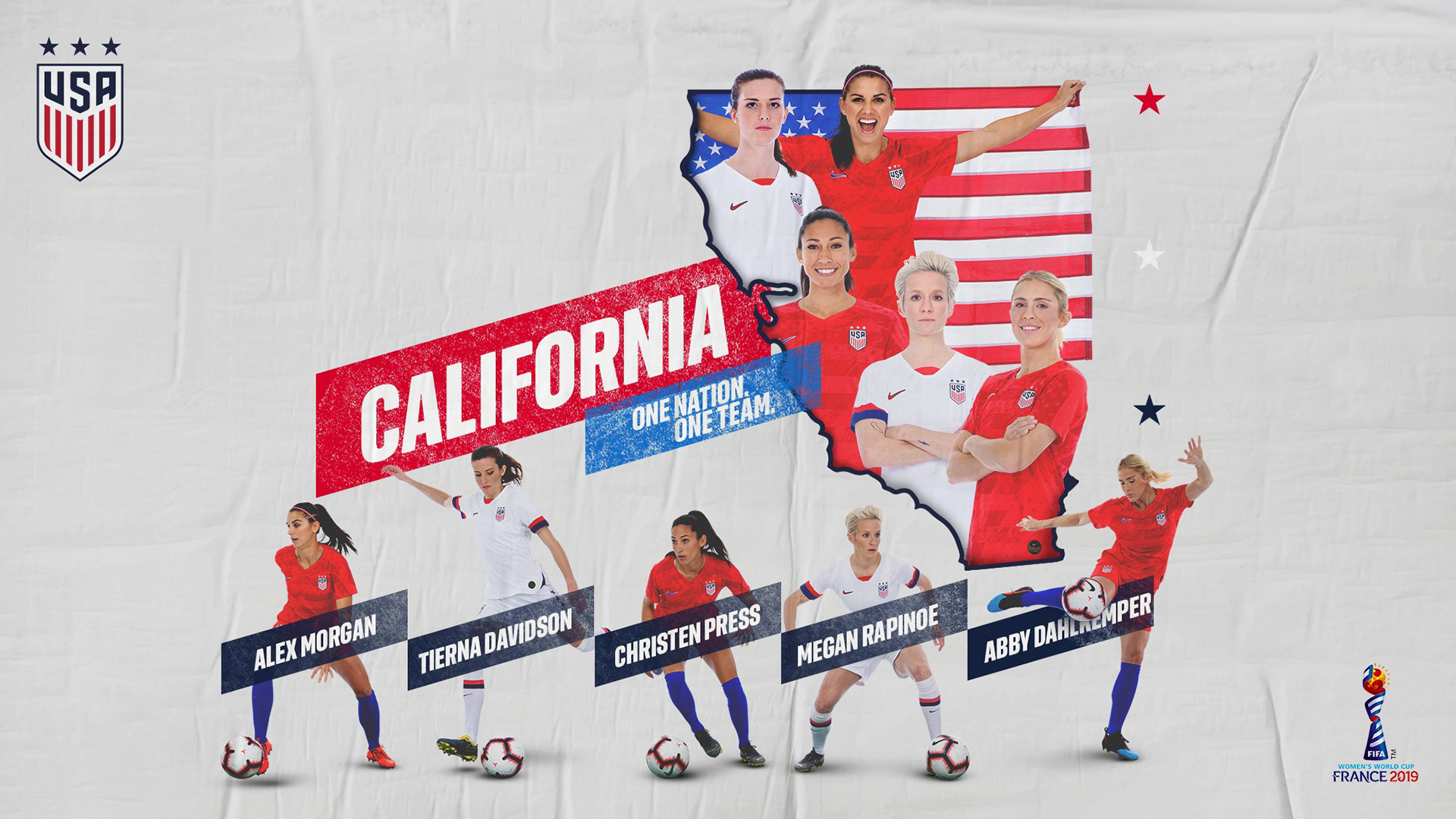
During the final days leading up to the 2019 Women's World Cup, I created a graphics campaign that celebrated and showcased each player's home state. Representing a player's country on the global stage is one thing, but representing their state unlocks a deeper level of connection with the fans in those respective states. Additionally, without heavy use of text, this campaign was an innovative way to educate our casual fans tuning in ahead of the World Cup.


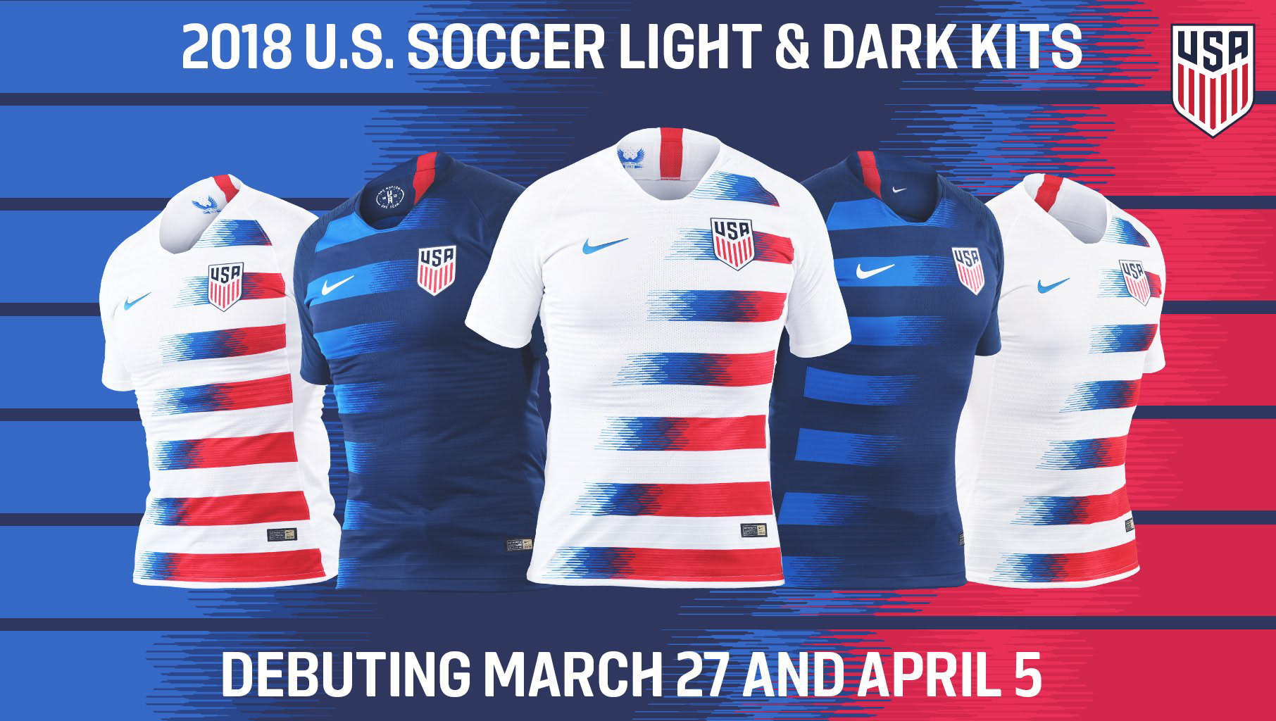
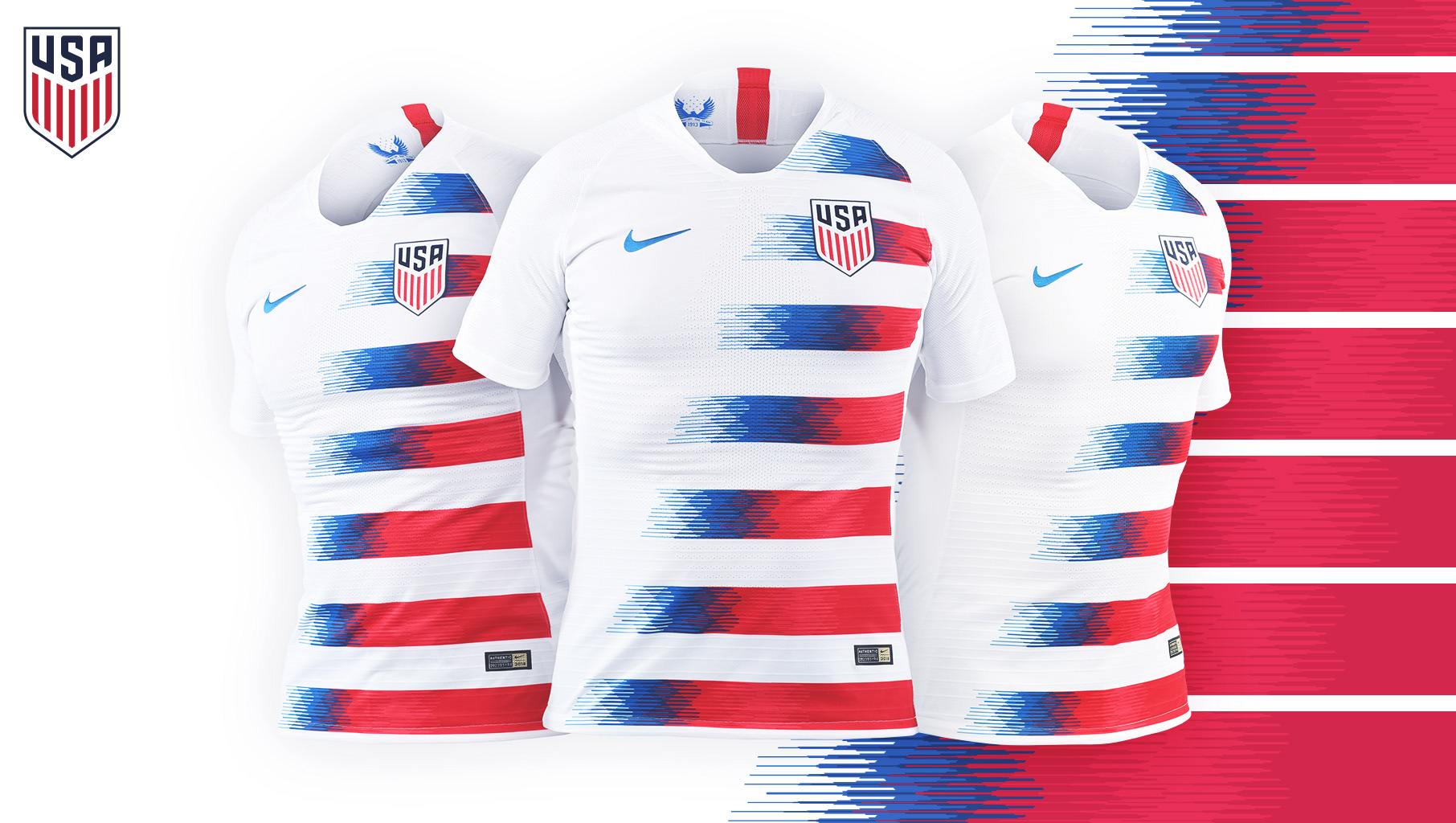
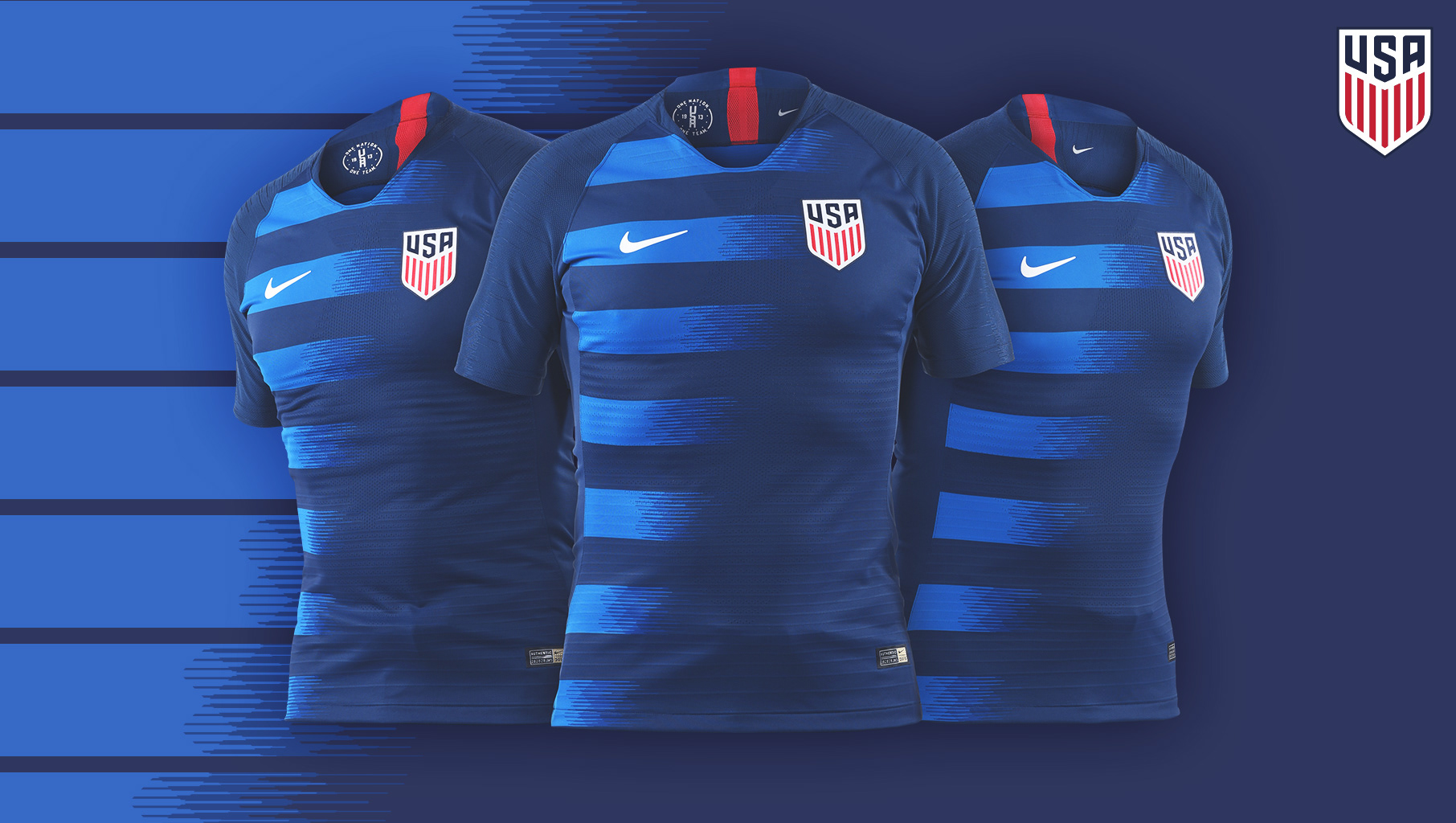
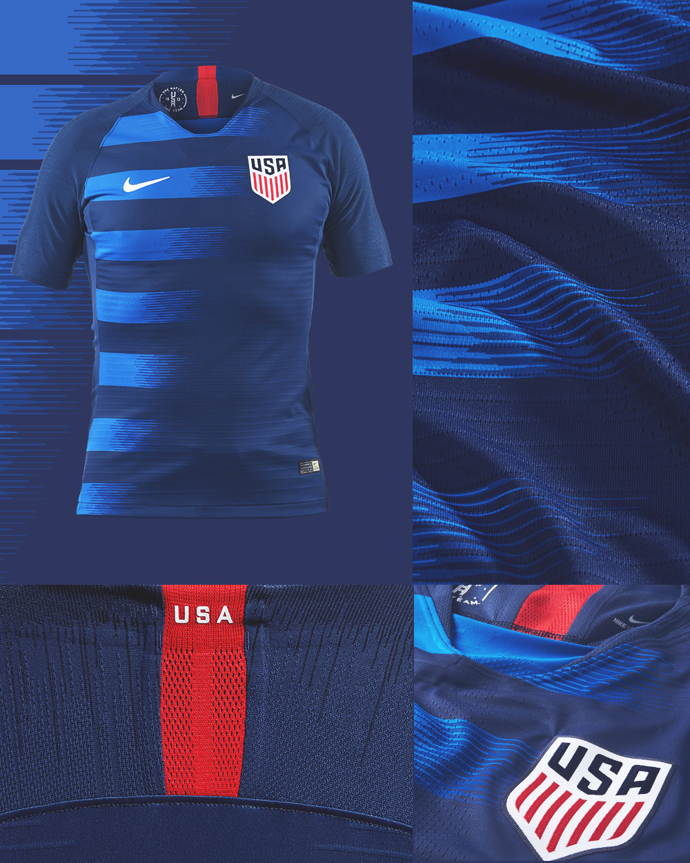
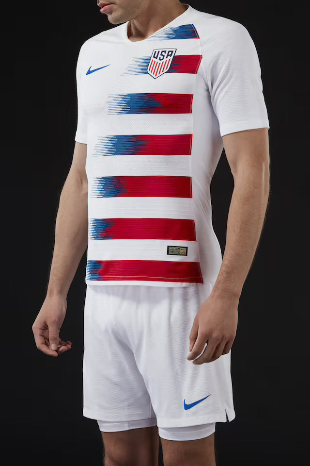
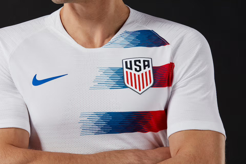
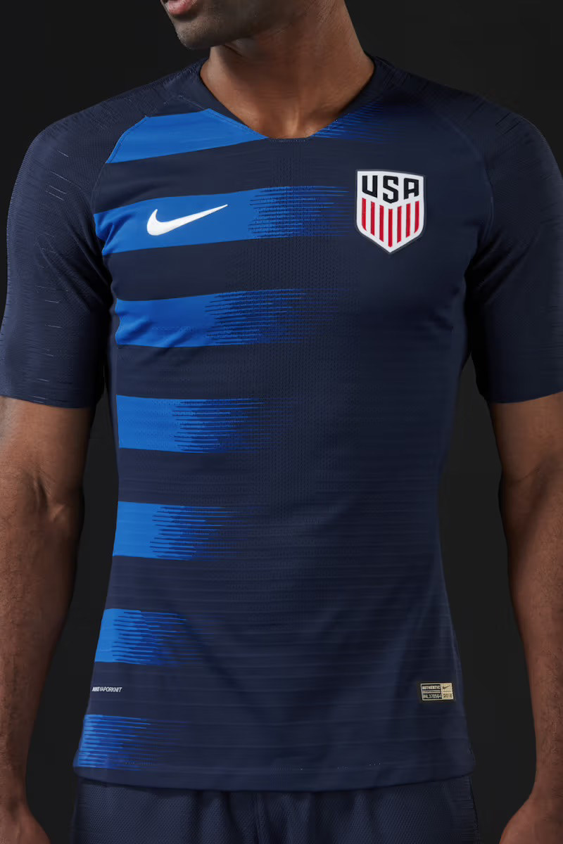
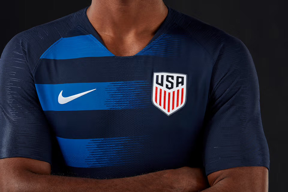
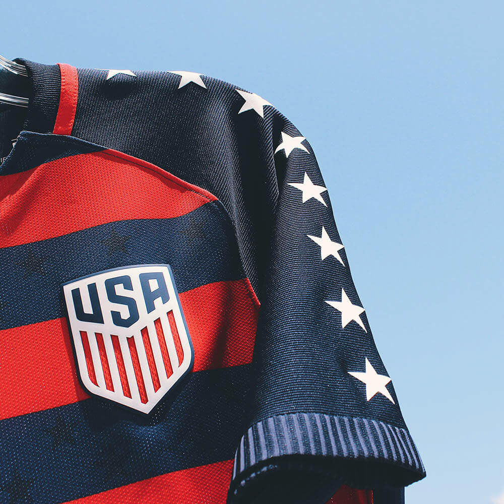
Light/ Dark Kit Launch & Branding Campaign
In collaboration with the design team at Nike, we designed the "Light/Dark" kits for the U.S. Soccer Federation to wear in 2018.
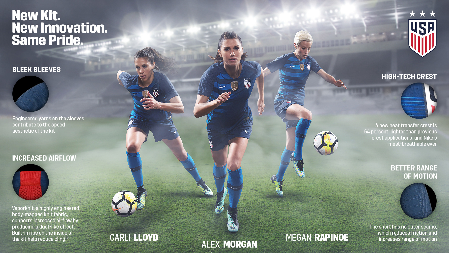
A stylized version of the American eagle, complete with 13 stars representing the original 13 colonies, forms a unique pride graphic inside the 2018 USA light jersey. The stripes shift from red to blue, and the diagonal flow of the blue creates an abstract sash, subtly nodding to a common design element in U.S. kits throughout the ages.
“I love how patriotic it is. It’s bright and makes a statement,” U.S. WNT forward Mallory Pugh said of the USA’s new light kit.
While the inspiration for the light kit is grounded in the familiarity of our flag, the dark kit reflects the excitement of embracing the unknown through a gesture toward space travel, notable in the inner pride badge, which features a custom USA icon inspired by NASA Space Mission badges and the sleek, negative shaping of the shirt’s stripes.
“The kit is so unique; there is nothing out there that looks similar. I love the blue kit; it’s so clean and crisp,” U.S. MNT forward Christian Pulisic said.
My roles: Creative Direction, Brand Strategist, Photographer/Editor, Graphic Designer
Once the design was complete, it was time to photograph the players wearing the new kits.
By providing art direction to our photographers and instructing players on specific poses, our small team developed a large library of player assets to use in graphics for the duration of the Light/Dark campaign.
Pulling from our new asset library, I strategized how the kit design would extend and scale, supporting the U.S. Soccer brand. My goal was to create and implement a bold, modern, aggressive, and timeless visual appeal that would elevate U.S. Soccer's presence in the sports industry.
The adjoining branding borrowed signature patriotic elements from the kits and was utilized for all digital graphics, social media, in-stadium graphics, merchandise, and large-scale prints such as billboards.
Generic kit promotions were advertised on U.S. Soccer's social media, website, email, and printed billboards around the country. The image above is a composite of multiple photoshoots that brings the team's top three players together (Lloyd, Morgan, Rapinoe). The graphic also promotes the innovative kit material created by Nike.


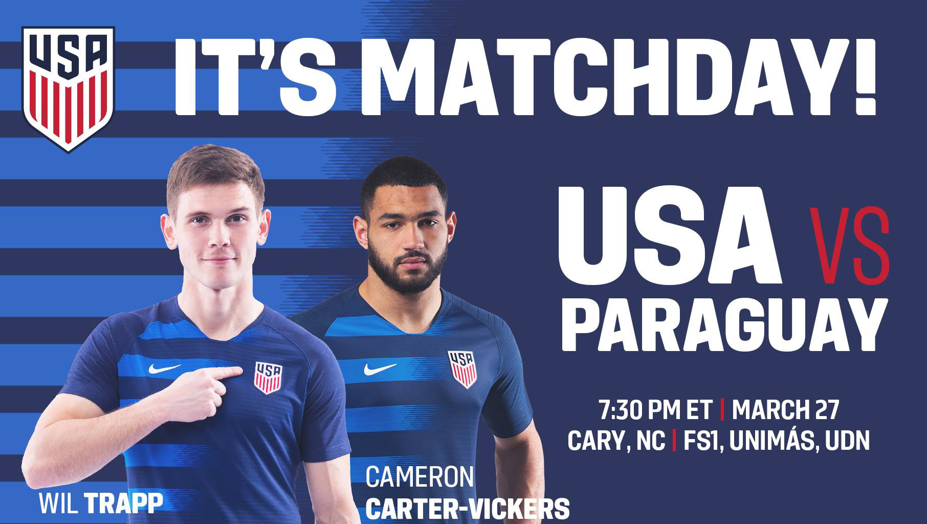
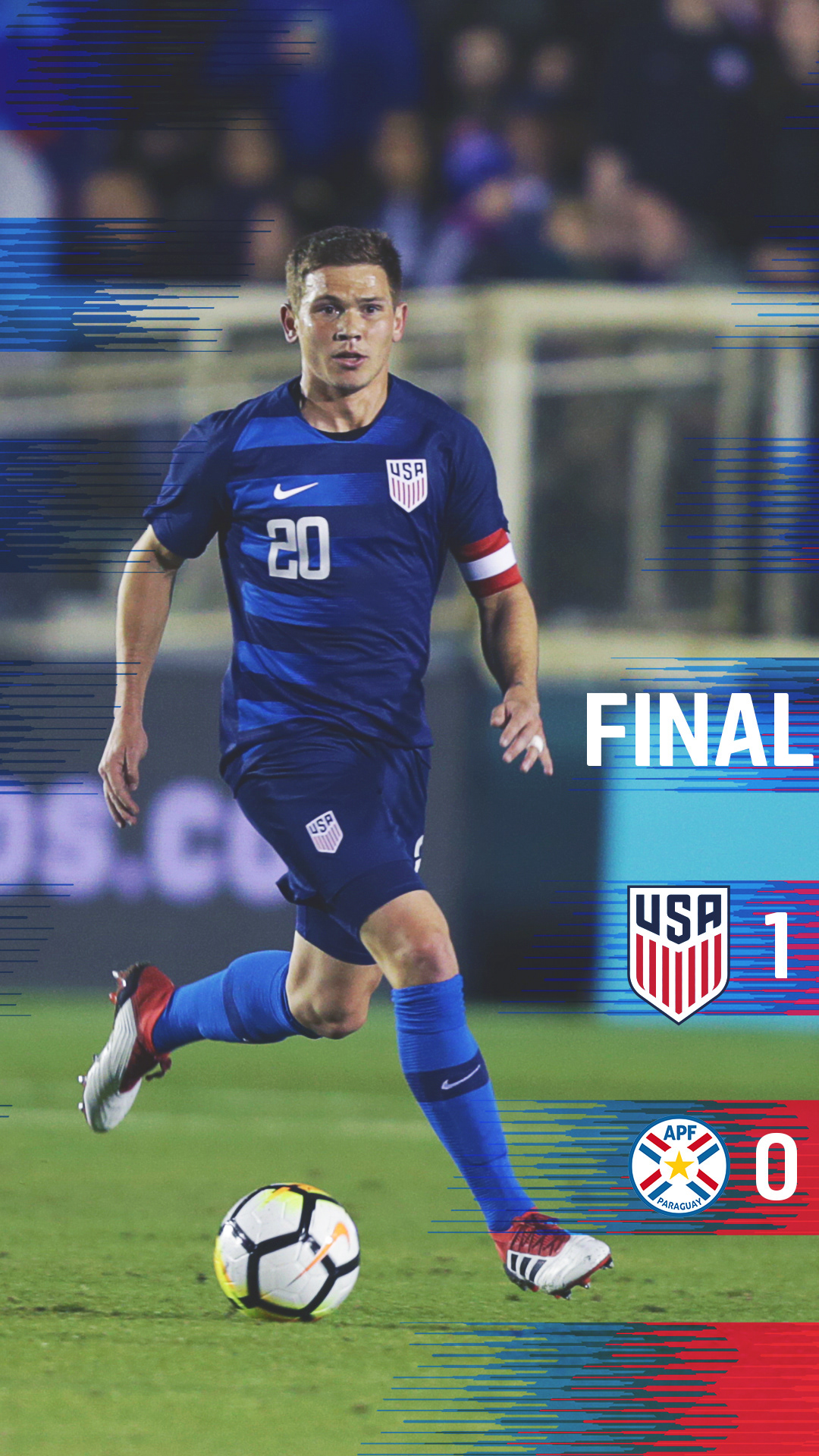
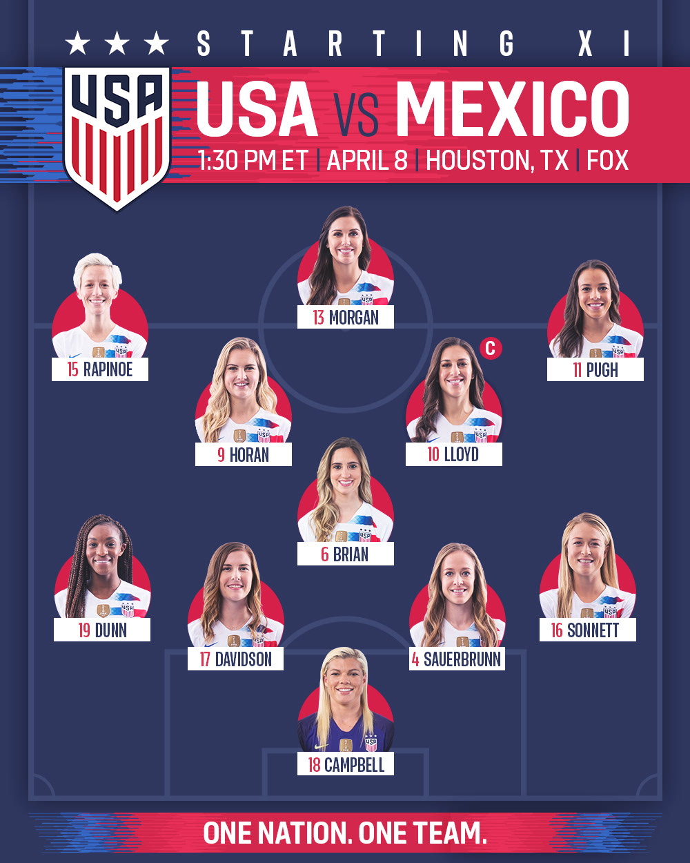
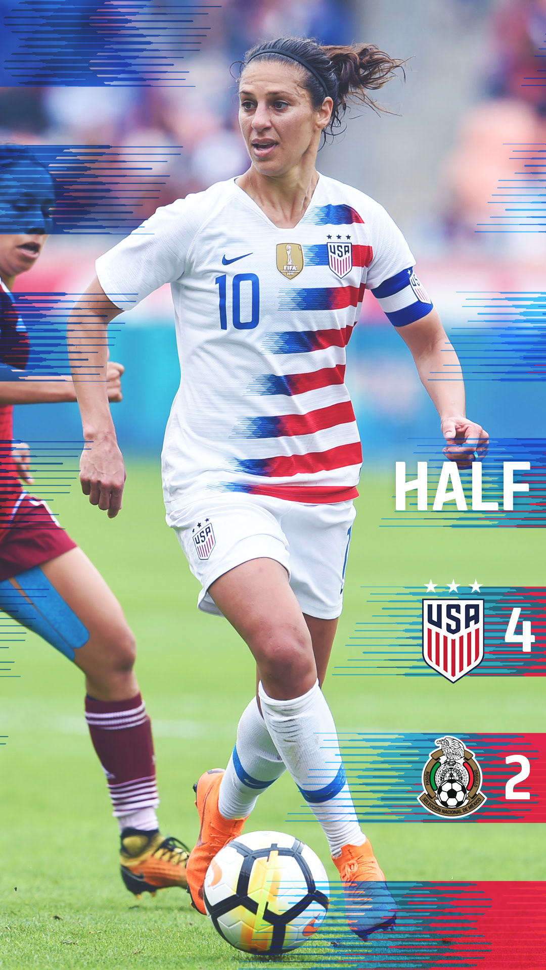
Bringing the design elements from the kit into the graphics: implementing a new branding for U.S. Soccer, seen below for live in-game graphics for U.S. Soccer's social media. These two games (MNTvPAR and WNTvMEX) were the first in which the new U.S. Soccer kits debuted for the Men's and Women's teams.

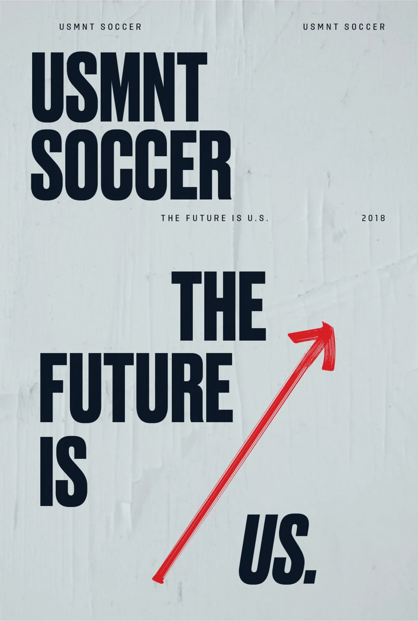
The Future is US.
The U.S. Men's National Team failed to qualify for the 2018 FIFA World Cup, contributing to the lowest viewership in decades and a significant drop in youth sports participation. How do we inspire a new generation to lead American soccer forward into glory?
To show our fans and supporters that we, as a federation, are taking the necessary steps to rise from the ashes, we hired a new coach and training staff and invested in the next generation of our young, up-and-coming players.
Alongside the staff and player changes, we created a moonshot and an invitation to all Americans to take part—by tapping into the essence of American values—grit, audacity, and innovation—led by the daring nature of youth.
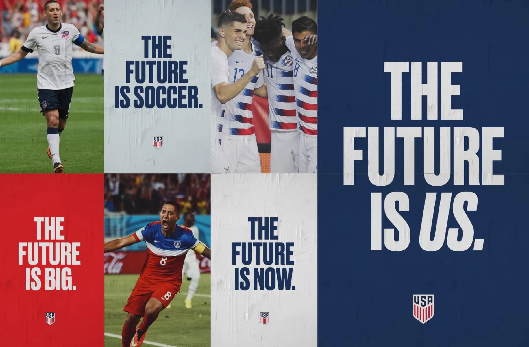
"The Future Is Us" is built on a theme of hope and optimism. It focuses on the idea that the U.S. Men's National Team is transitioning into a new era. The message conveys that the team's future is in capable hands and that developing young players and their potential to succeed on the world stage is what matters most.
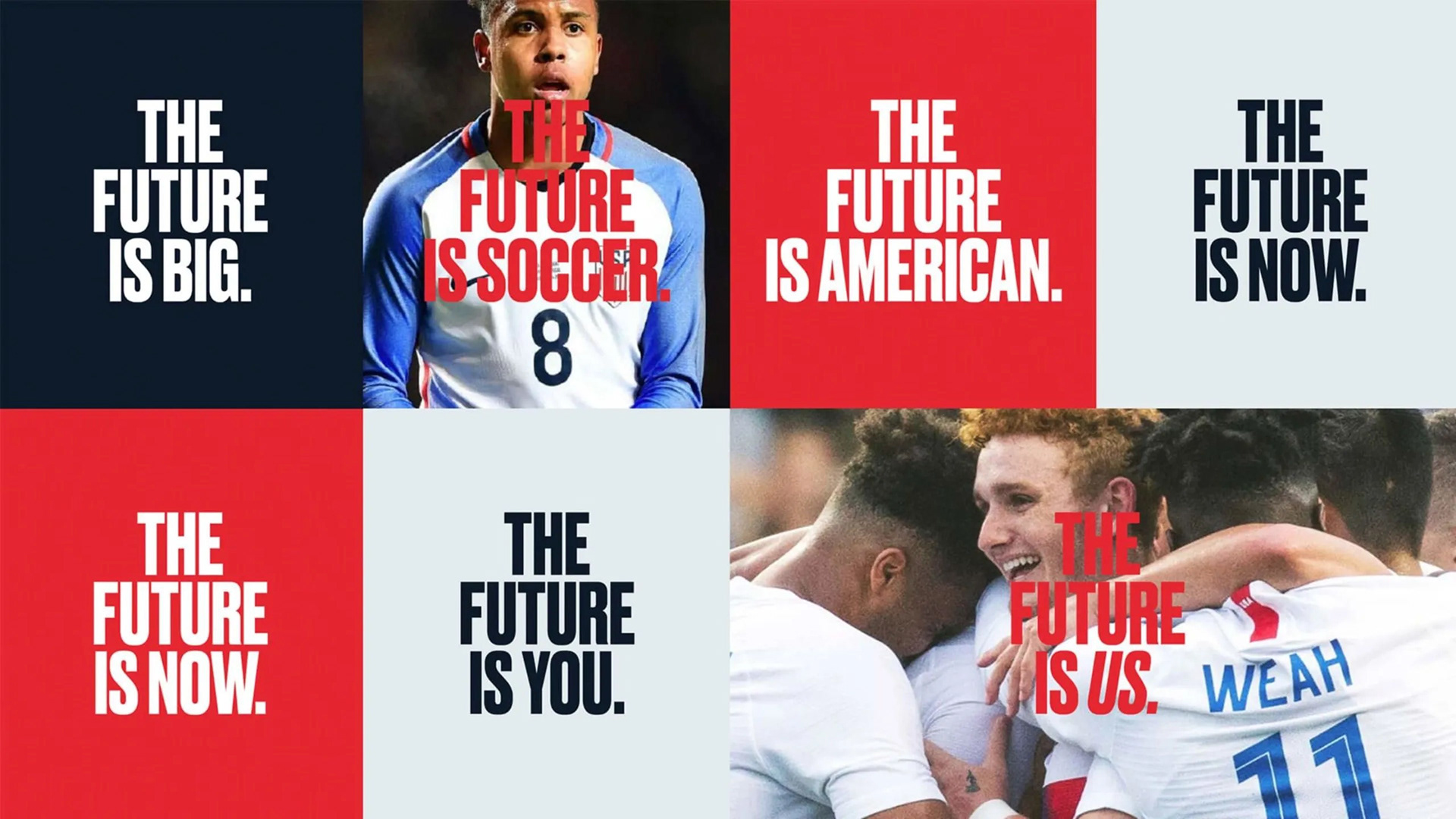
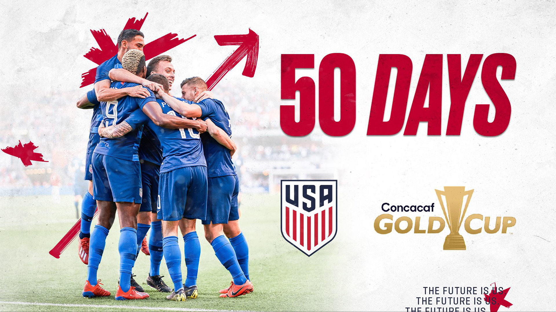

Targeting Young Talent – The campaign highlighted the rising stars of American soccer, featuring young players such as Zack Steffen, Weston McKennie, Matt Miazga, and Tyler Adams. These players were seen as the future of U.S. Men's Soccer, and the campaign aimed to inspire both them and the next generation of soccer players across the country.
Cultural Shift—The campaign focused on the team’s performance on the field and creating a cultural shift within American soccer. It aimed to engage a new generation of fans and players who were growing up in a more soccer-conscious culture, with increased exposure to top European leagues and international competitions. By entering the narrative on youth and development, the campaign aligned with U.S. Soccer’s broader goals of growing the sport at all levels in the country.
Visual and Messaging Elements – The campaign was visually striking, combining bold typography, vibrant imagery, and a cinematic tone. The visuals often focused on young players in action, alongside messages that underscored the country's soccer evolution. The branding included elements of brush strokes, as if to signify sketches of an early blueprint. "The Future Is Us" sought to define a new era for U.S. Soccer. It was a way of resetting expectations after the disappointing World Cup qualification miss and positioning the national team as a work in progress—one that would eventually reach greater heights as its young stars matured and gained experience.
Legacy and Influence – In a broader sense, the campaign reinforced the idea that U.S. soccer was looking ahead to a future where the country would regularly compete at the highest levels of international competition. The emphasis on youth and their potential had an aspirational quality, encouraging fans to be patient and supportive as the team rebuilt.
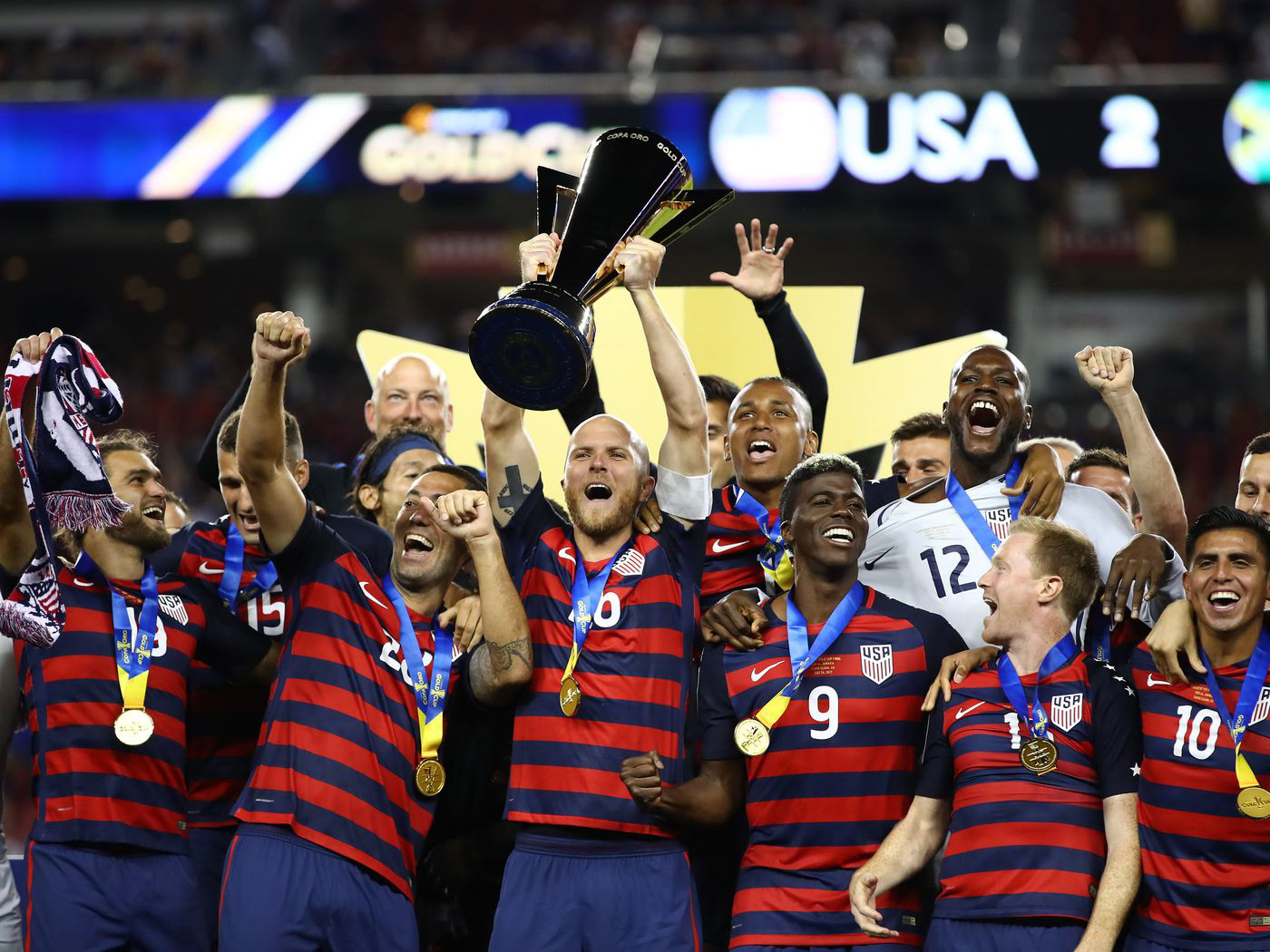
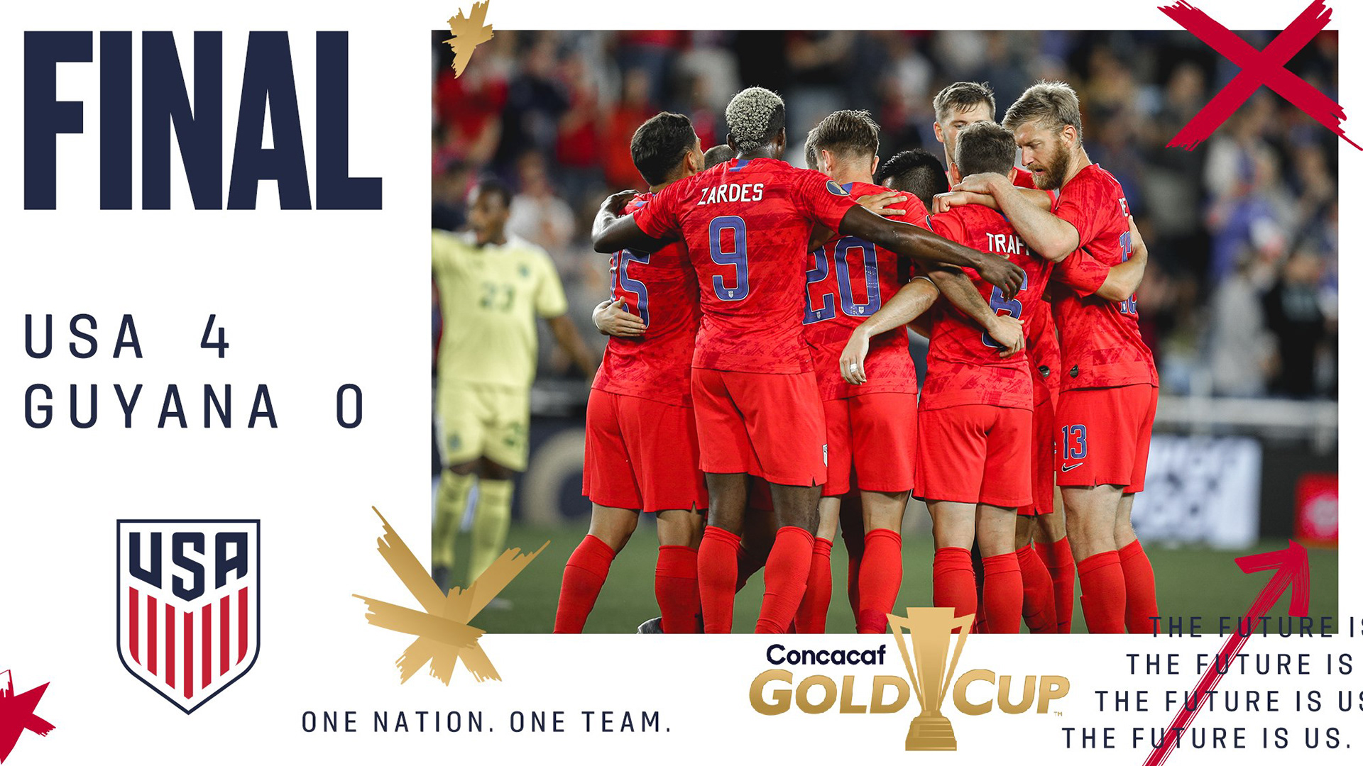
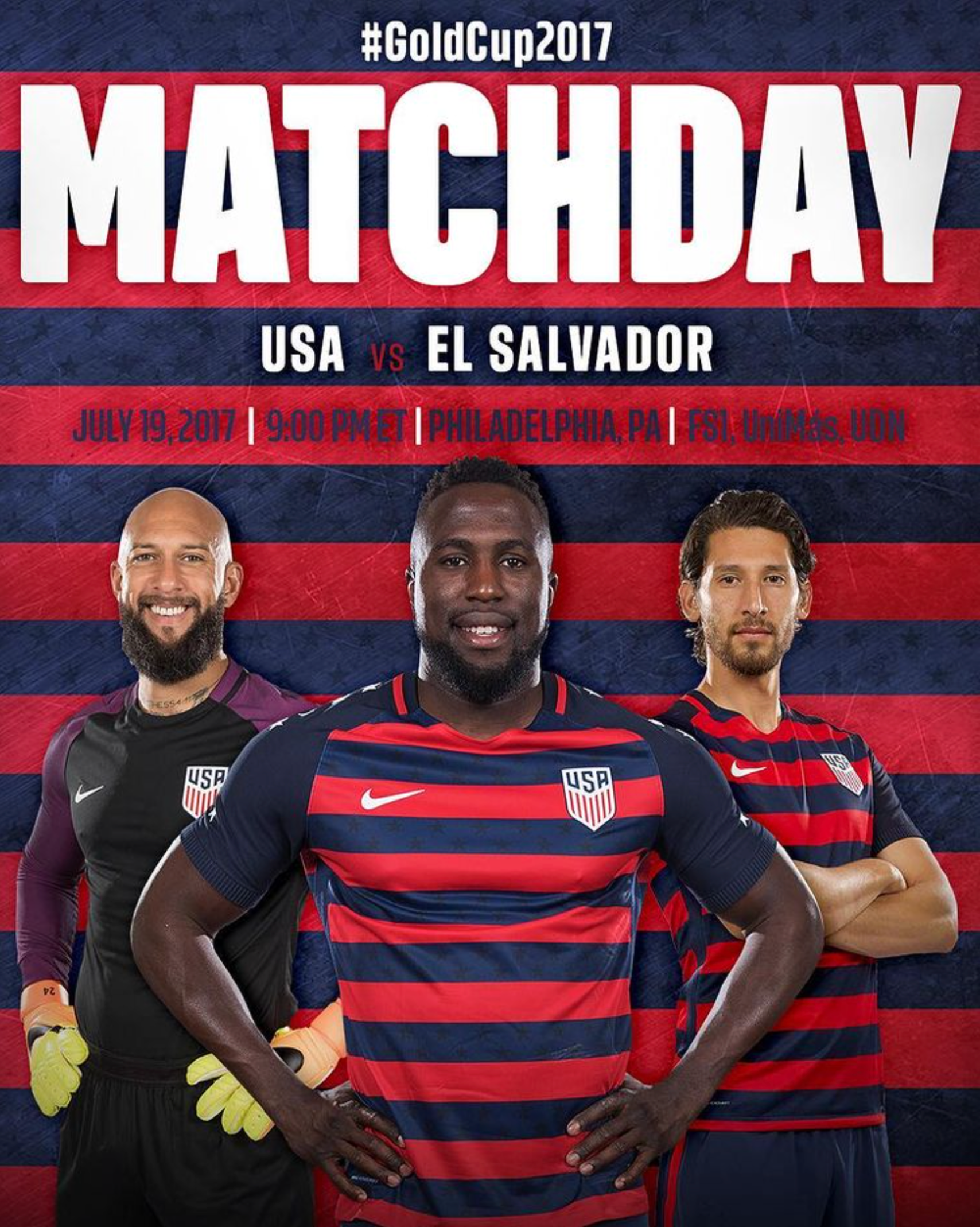
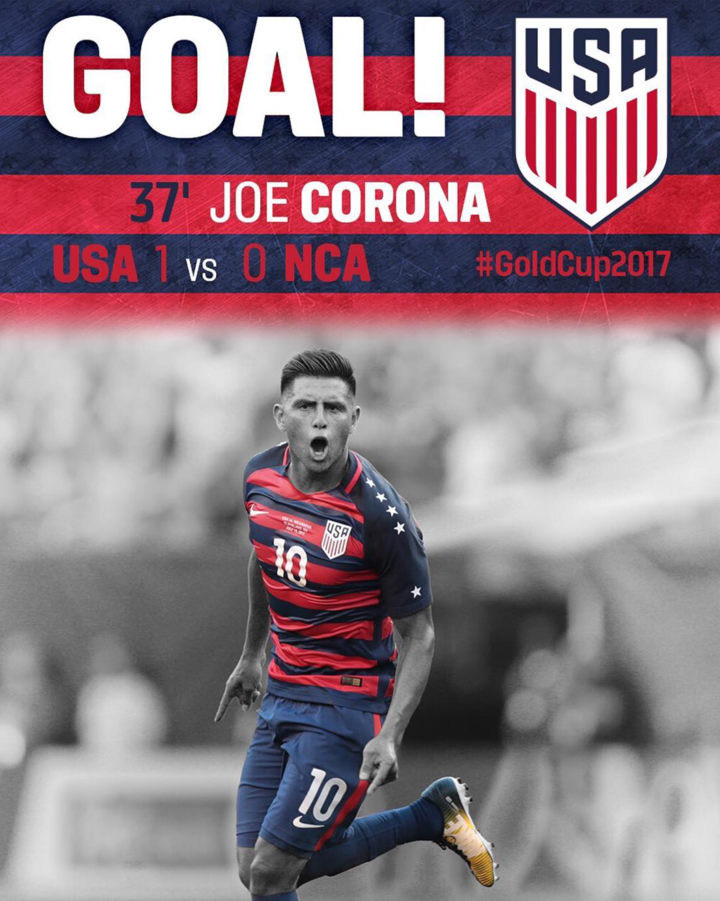
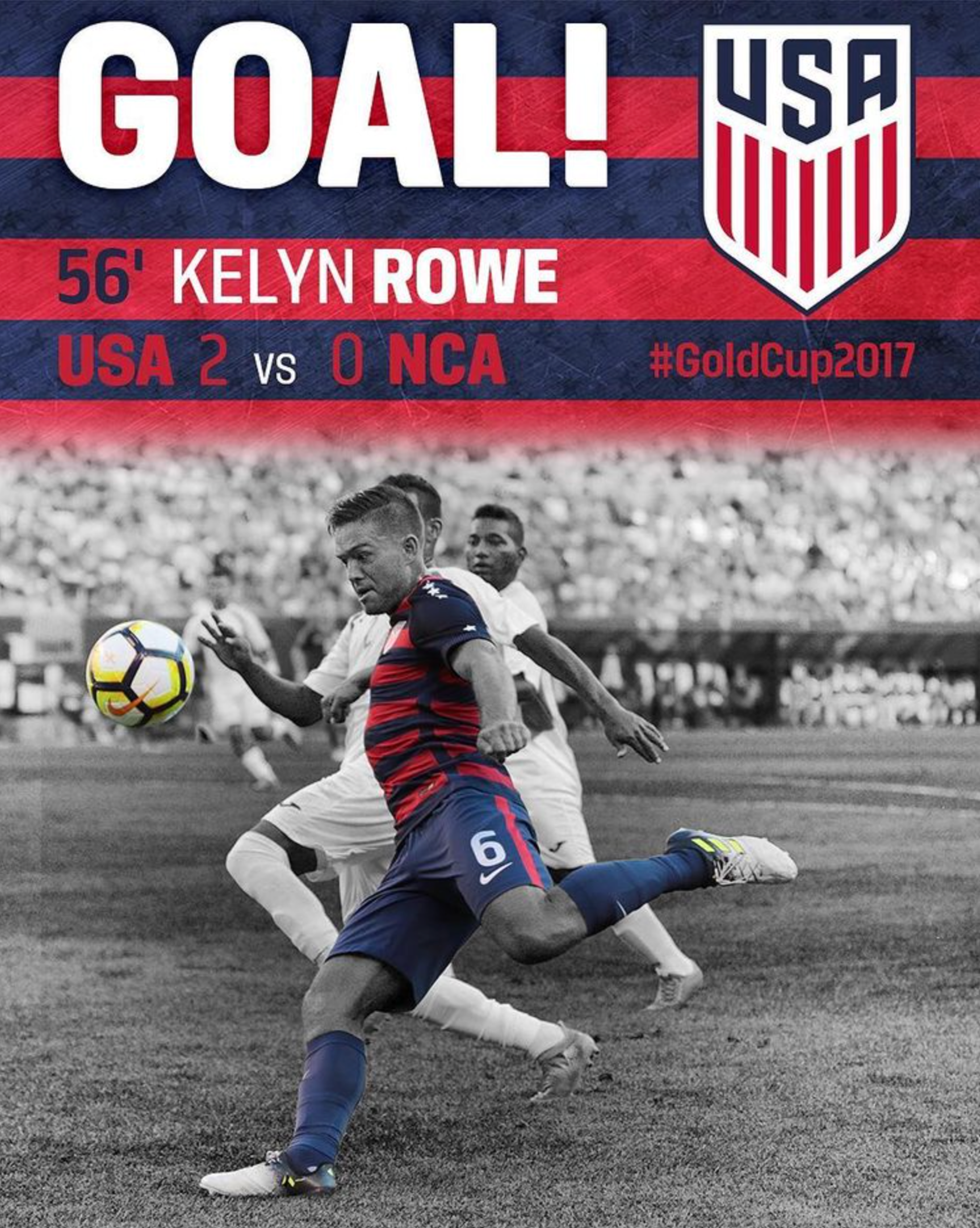
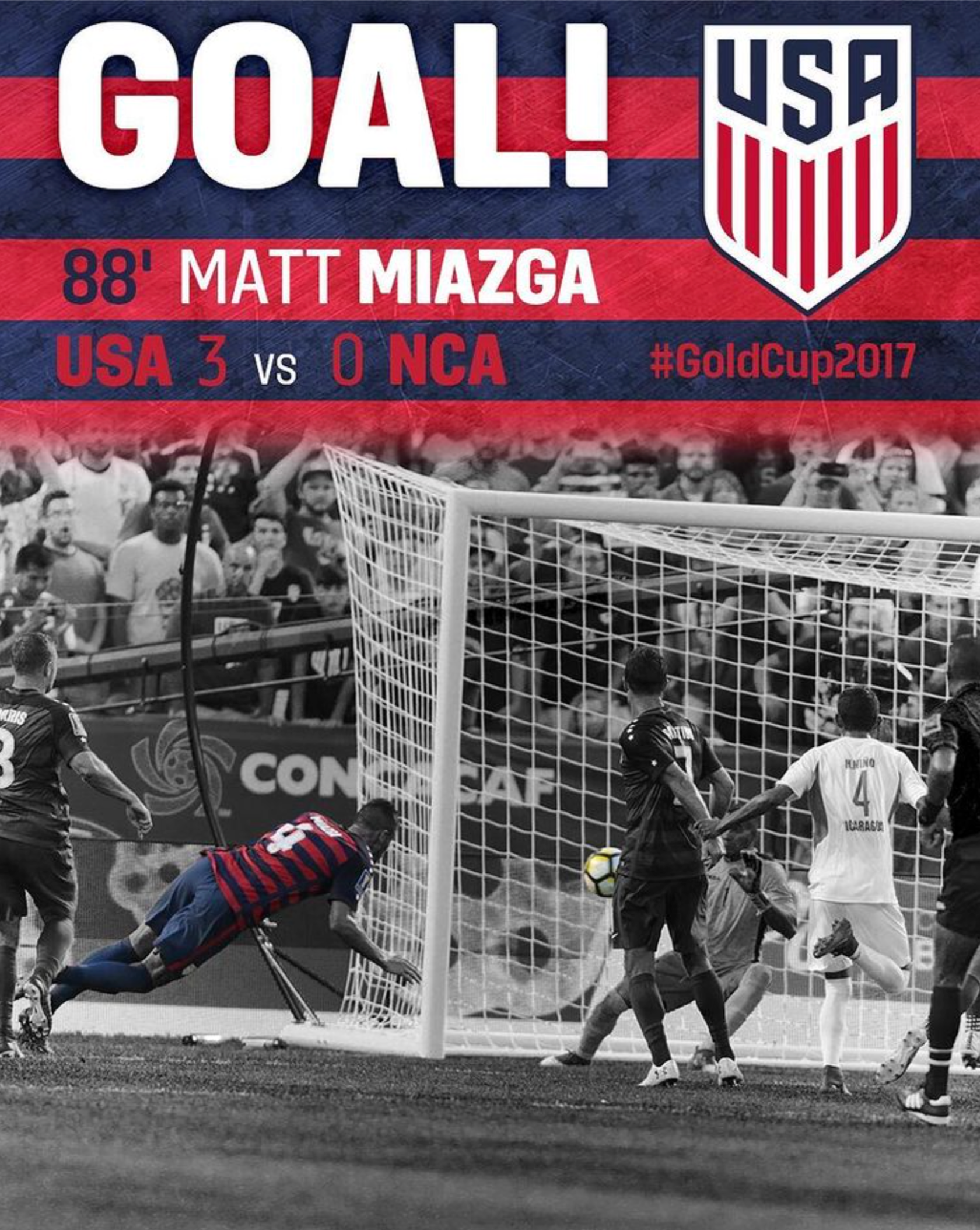
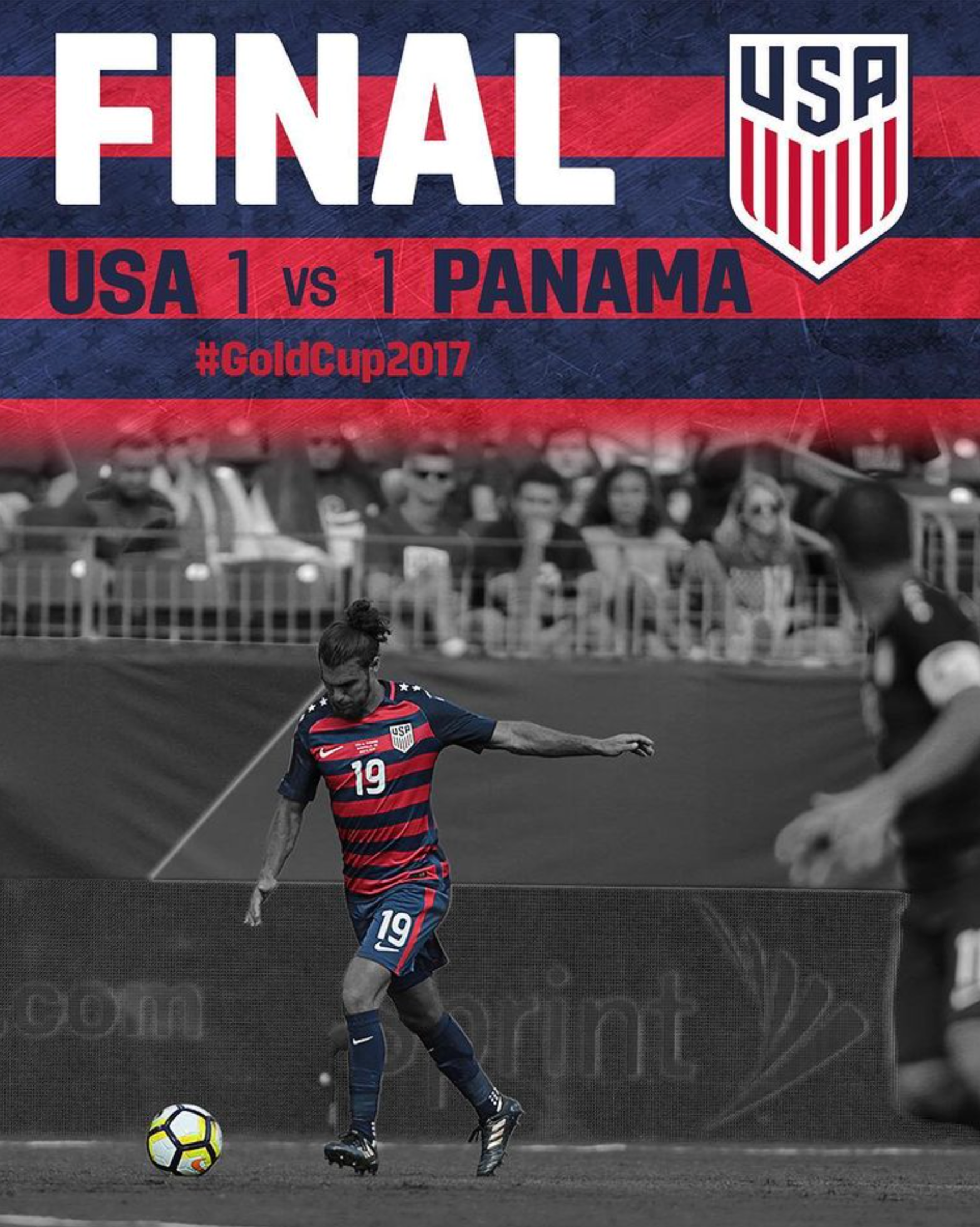
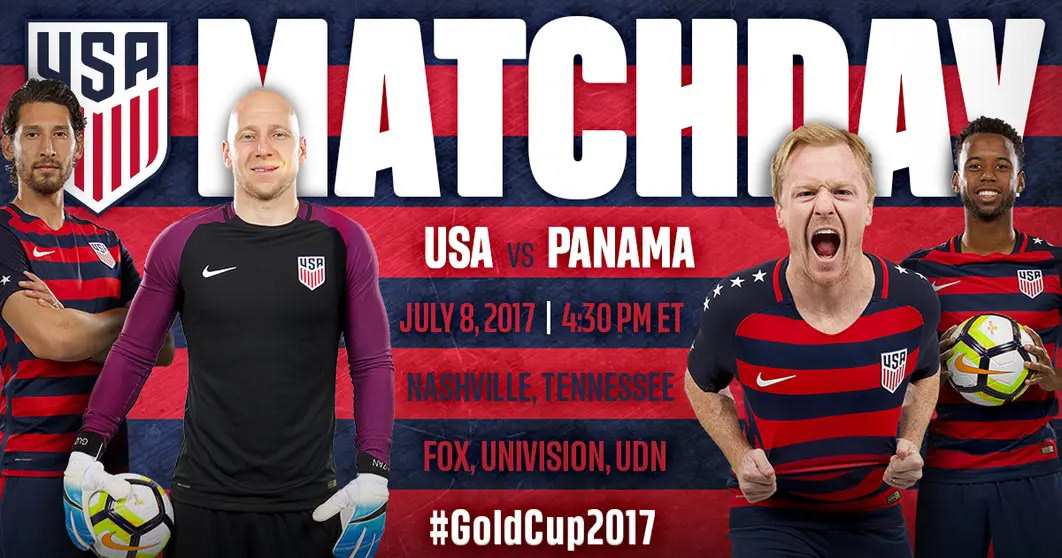
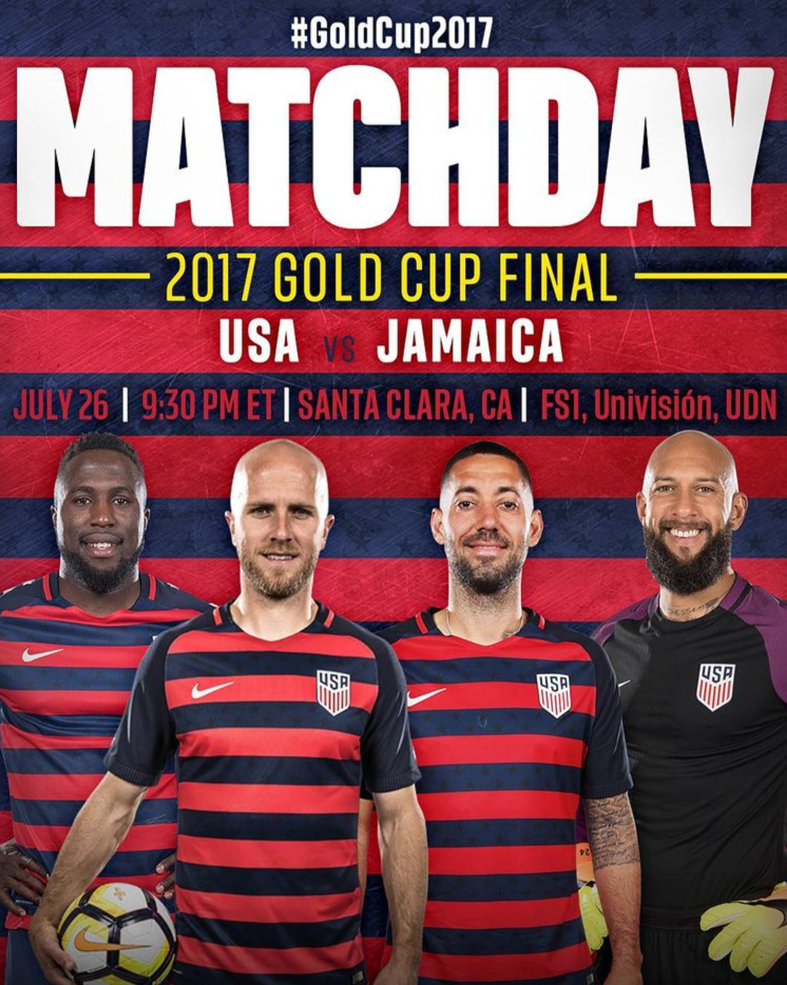
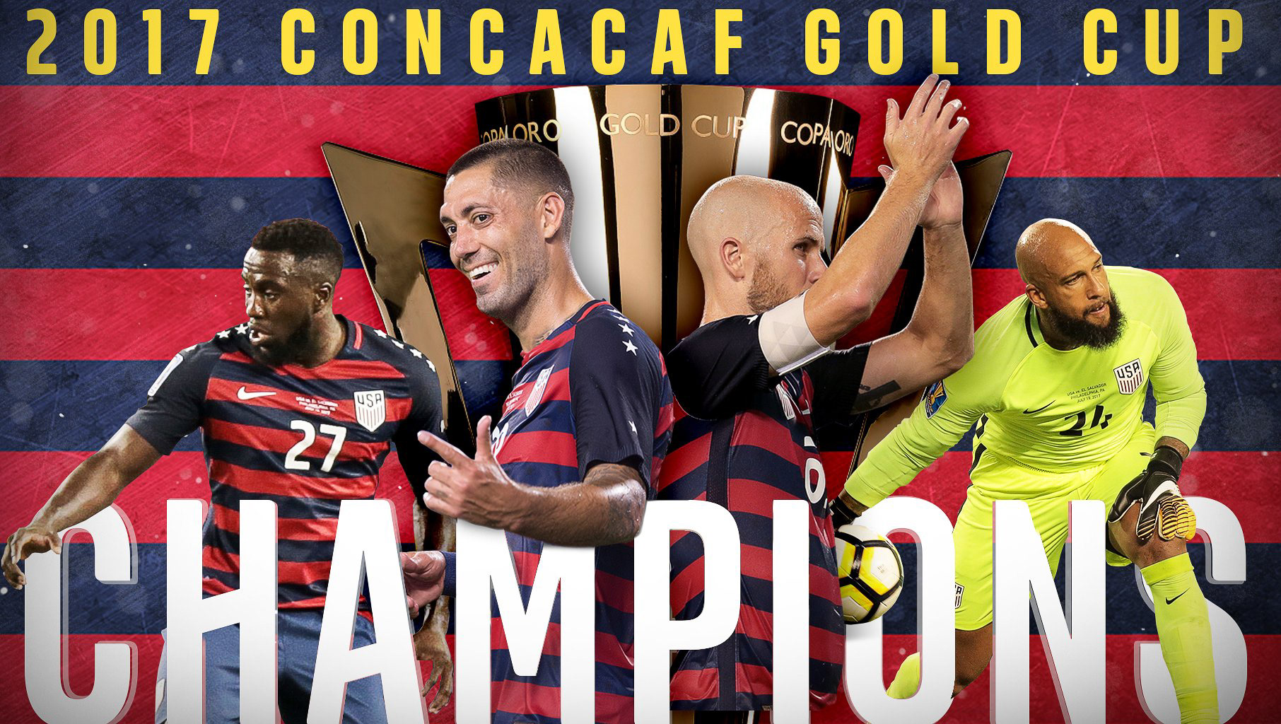
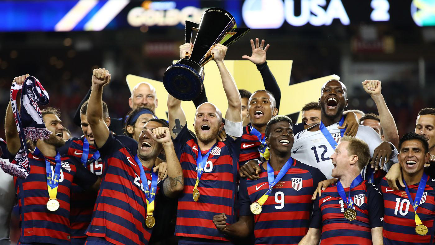
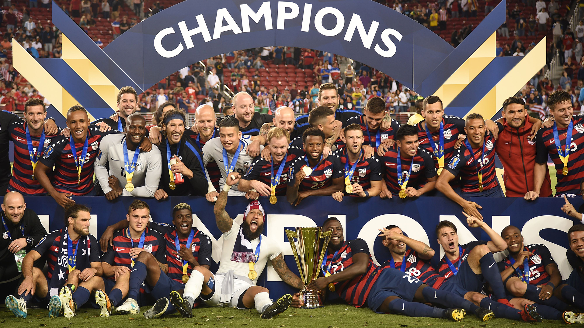
2017 USMNT Gold Cup Campaign (Champions)
In the summer of 2017, the U.S. Men's National Team competed against other teams in the Americas for the Gold Cup. Ahead of their first game, we launched unprecedented jerseys featuring navy blue and bold red striping with white stars patterned within—a unique take on the classic 'stars and stripes' theme of the American flag. In acknowledgment of the unique jersey design, we decided to model our entire Gold Cup branding cohesively, ranging from in-stadium prints to digital promotions, billboards, social media, local advertisements, and beyond.
After beating Jamaica 2-1 in a tense final in Santa Clara, Calif., the champagne corks soon popped as the men danced the night away to celebrate the U.S.M.N.T.’s first trophy since their Gold Cup success in 2013.
Roles: Creative Direction, Brand Strategist, Photographer/Editor, Graphic Designer

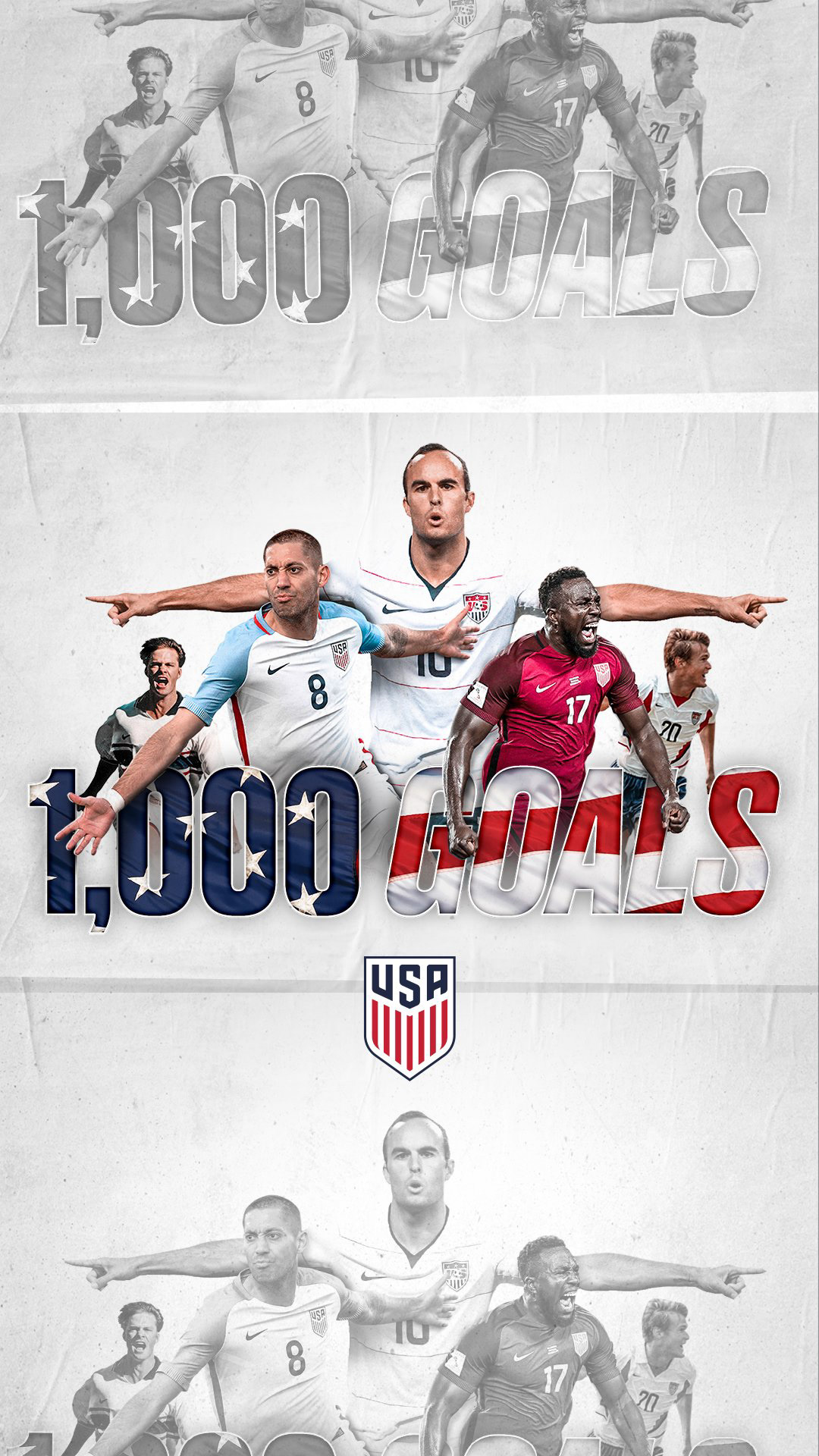

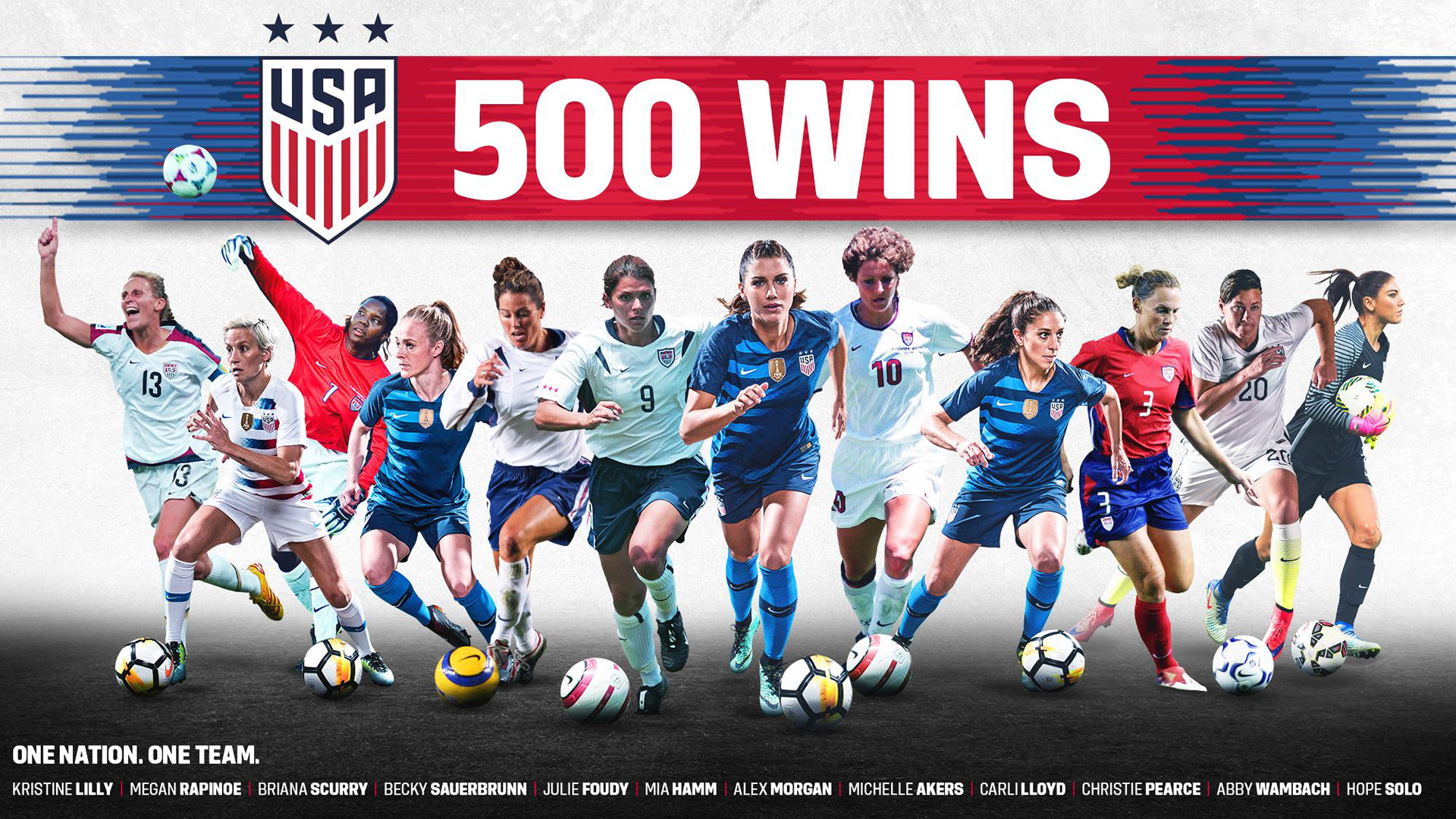
Various Milestones
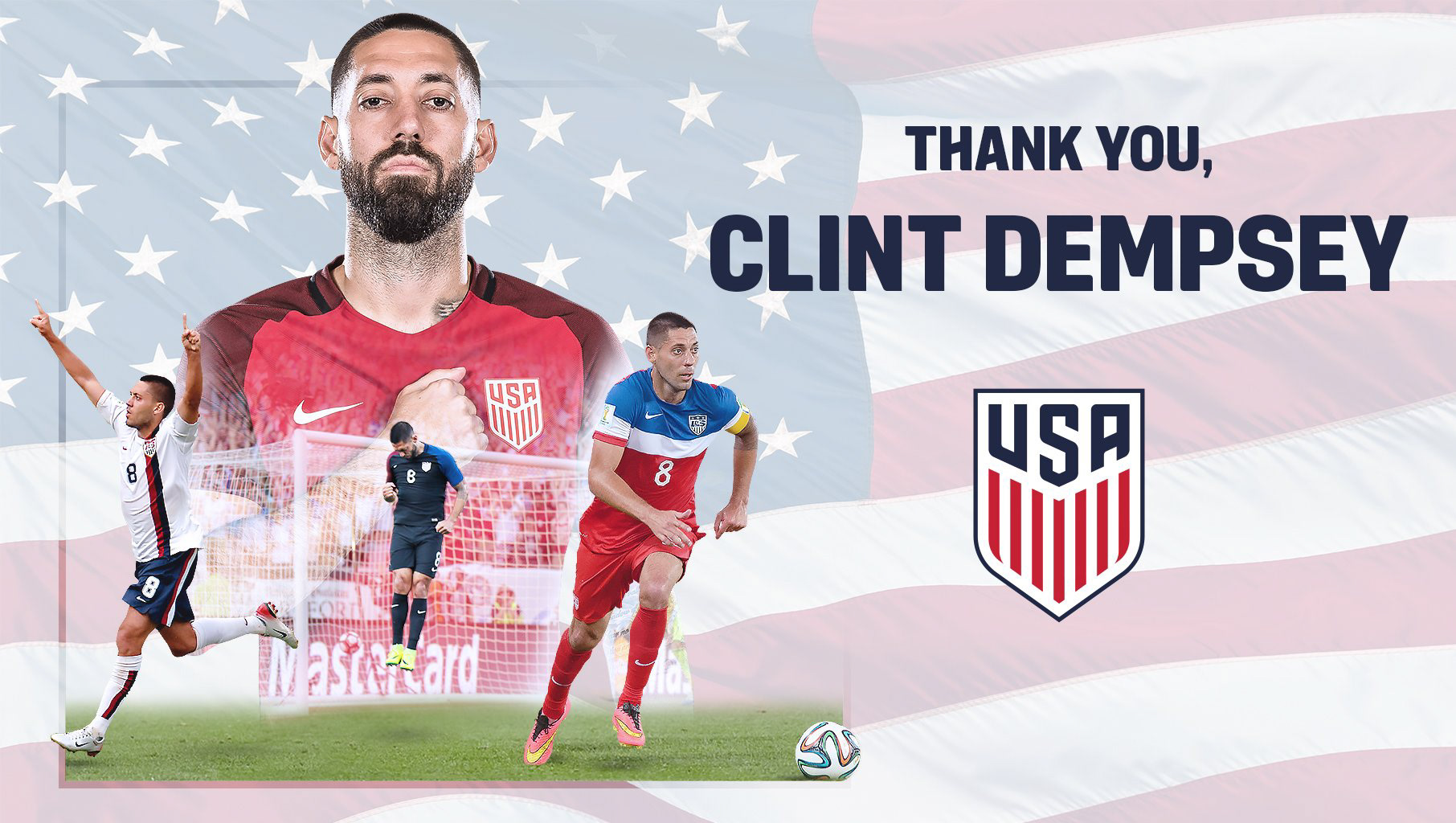
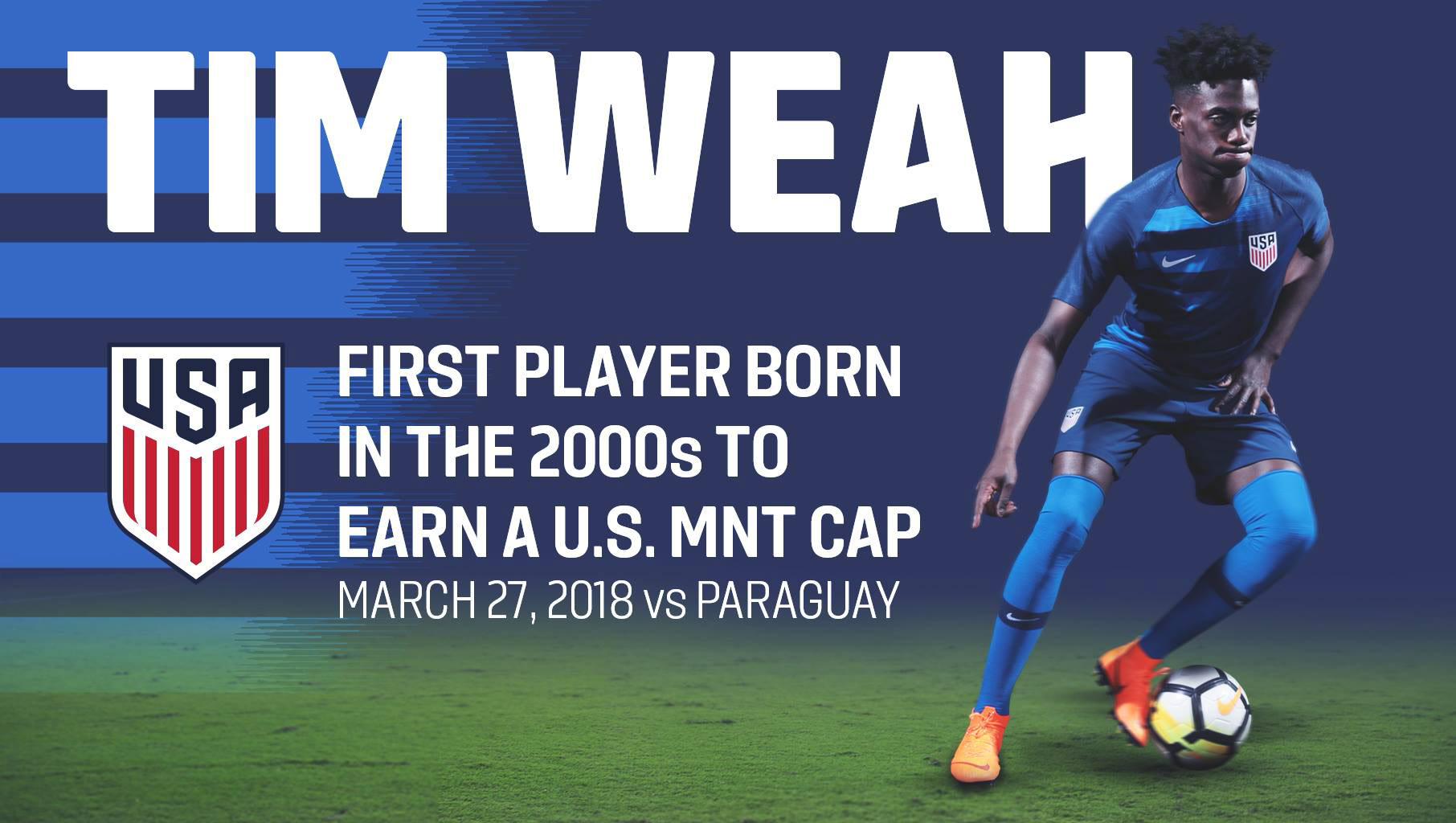
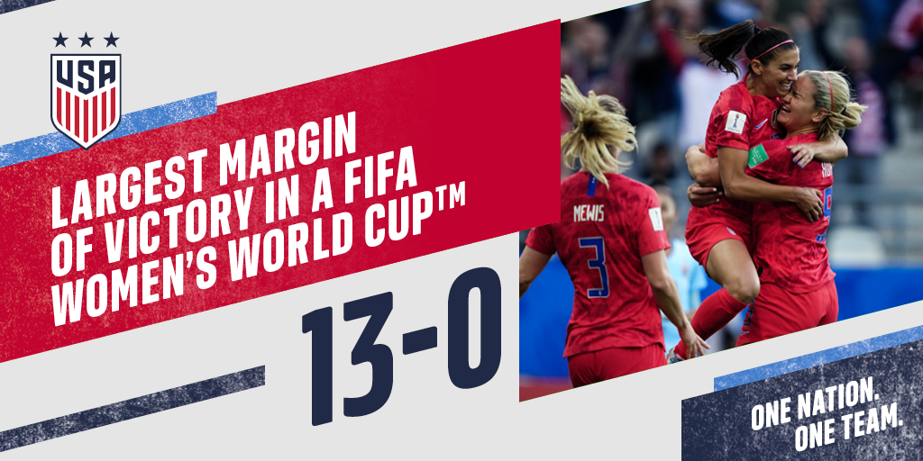
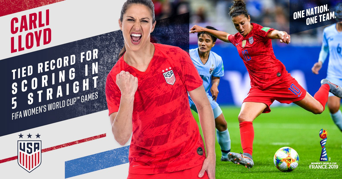
Throughout my three years with U.S. Soccer, players and coaches from the USWNT and USMNT have reached several milestones. These milestones include goals, appearances, wins, saves, clean sheets, hat tricks, and streaks.


For all social media graphics, please refer to my profile on Gondola
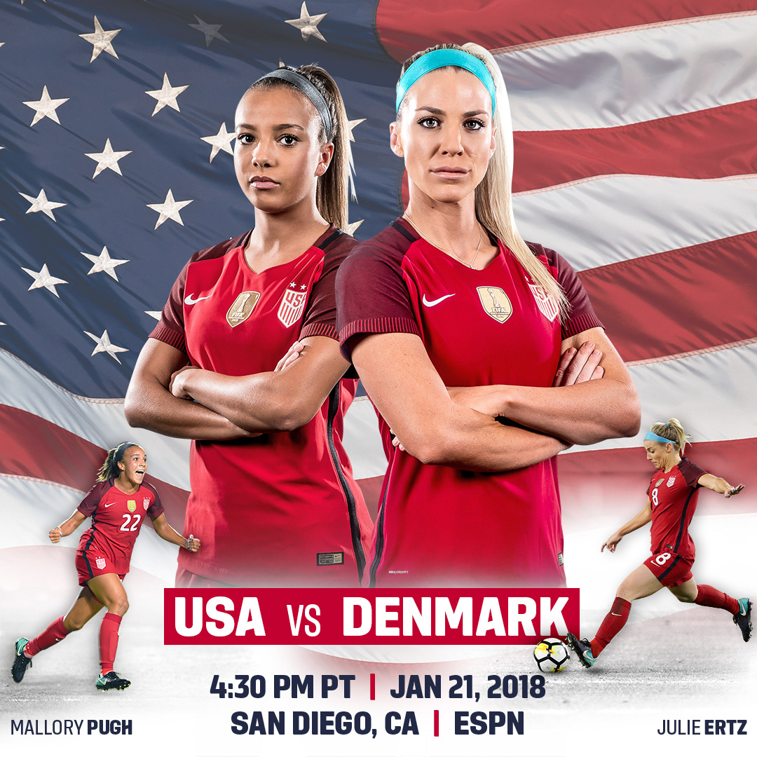
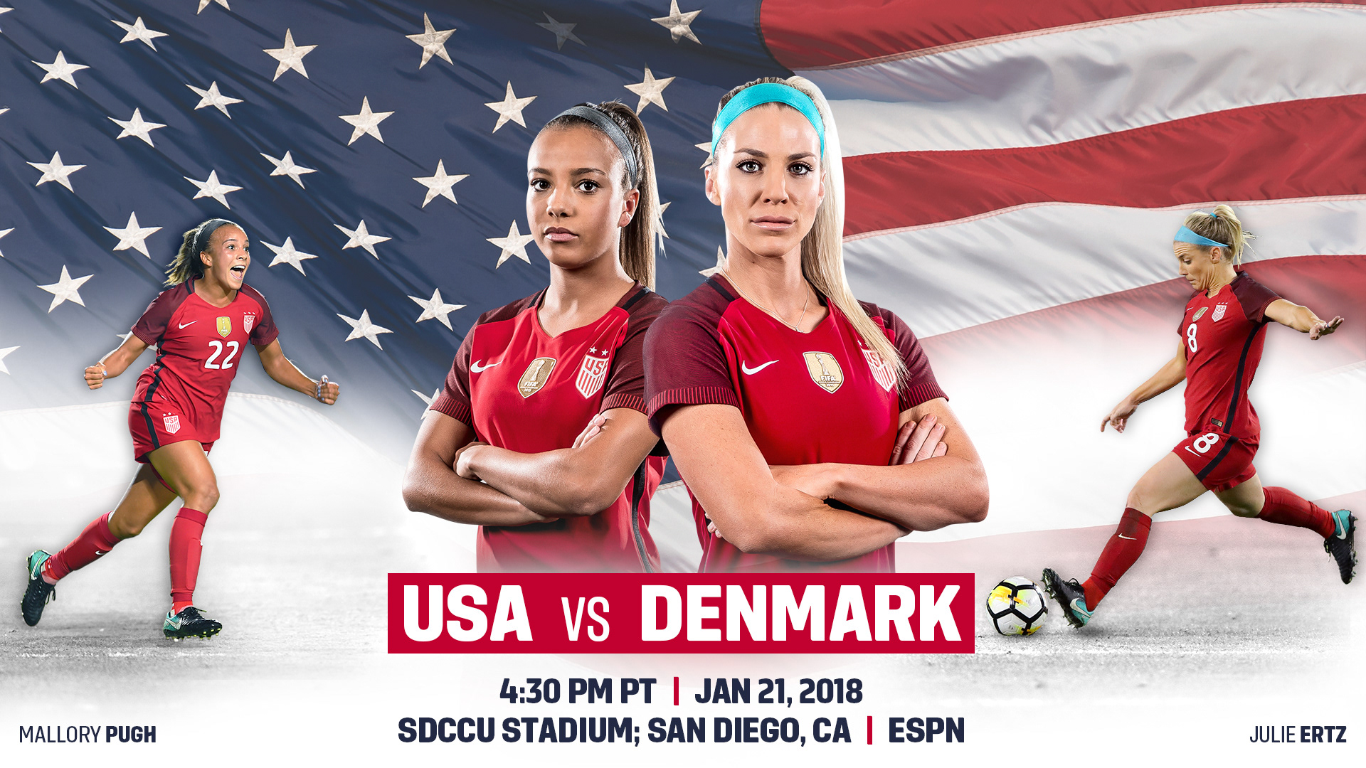
December, 2017
Objective: Announce the upcoming game against Denmark to the Public.
Provided: Photos from games/photoshoots.
Outcome: Created a short campaign of consistent graphics featuring two players advertised on multiple platforms for web advertisements, social media advertisements, as well as various other promos.
Tools used: Adobe Photoshop
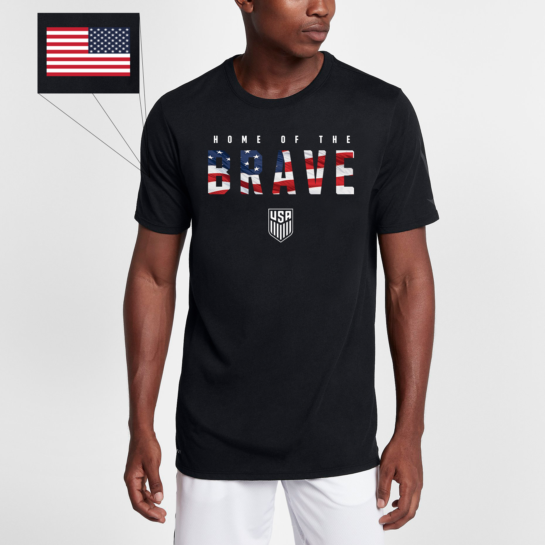
October, 2017
Objective: Develop a Veteran's Day T-Shirt.
Outcome: Conceptualized a T-Shirt that didn't follow the typical Army camo pattern that majority of other sports teams so often do. My team and I saw the opportunity to do something different that is inclusive to all five U.S. Military branches, as well as standing out from other sports teams. So often other sports teams use the Army camo pattern and the design gets too busy. We wanted something simple, bold, and impactful. Which is why we came up with two different versions - one with simple Military green, and the other using our American flag.
Tools used: Adobe Photoshop, Adobe Illustrator

July, 2017
Objective: Develop a creative, engaging, and under-budget way to respond to fan mail sent to our HQ.
Provided: Images of players
Outcome: Created a large poster featuring U.S. Soccer's most recognizable, current players to send back to all the fan mail we receive. We receive fan mail to both the Men's and Women's teams and it made the most sense to create a poster featuring the Men's players on one side, and the Women's players on the reverse side.
Tools used: Adobe Photoshop


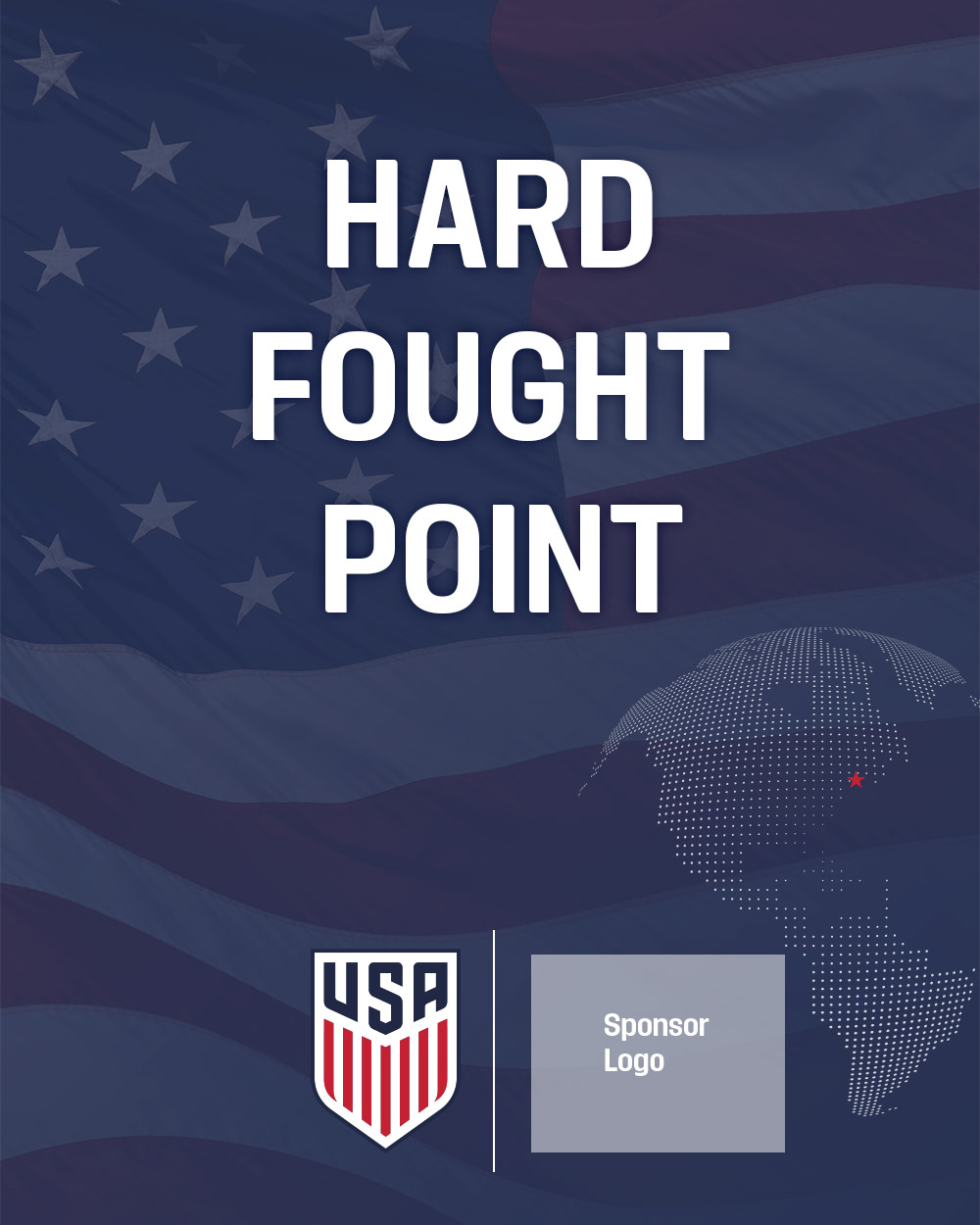
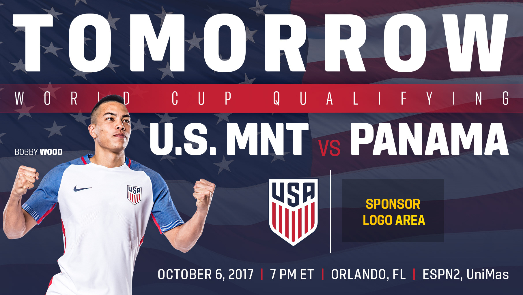
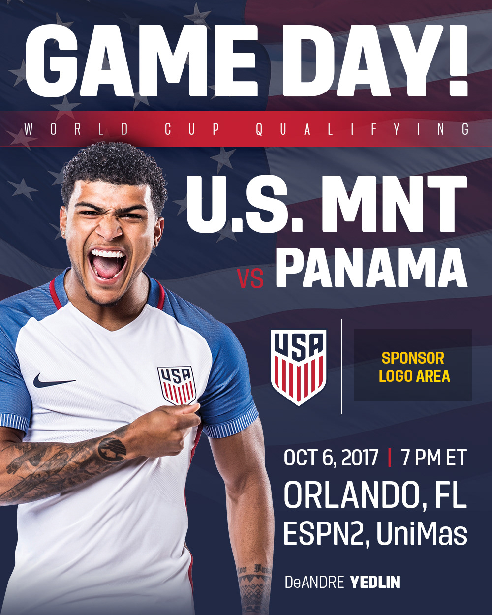
Corporate Sponsorship Graphics
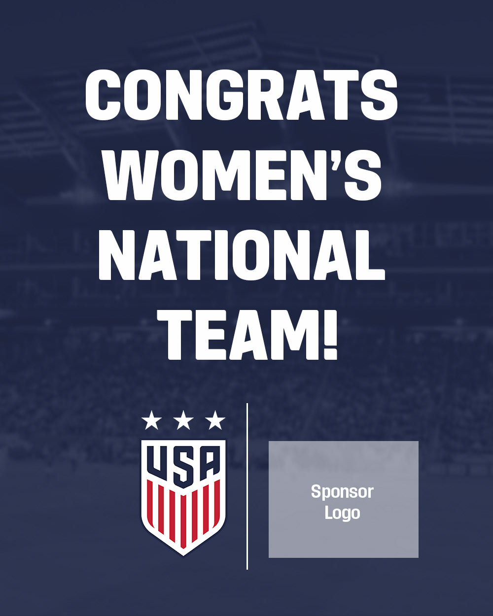
Objective: Re-create social media graphics promoting the upcoming U.S. Soccer game to give to our corporate sponsors to repost. Previously what was given to all of our corporate sponsors was simply a short image of supporting text followed by our crest and their logo (example below).
Provided: Photos of players
Tools used: Adobe Photoshop
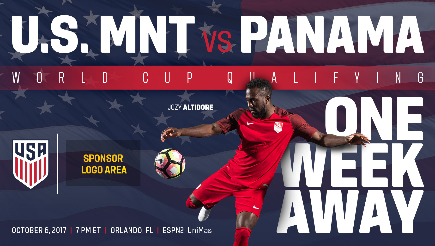
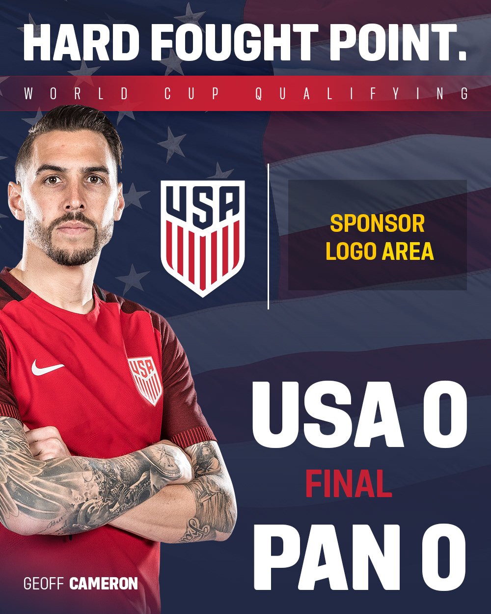
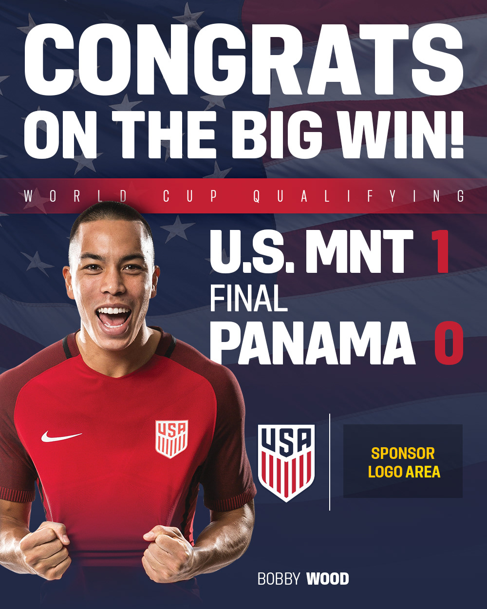
Outcome: To lift U.S. Soccer's branding to the next level while staying within graphics standards and quality graphics, we created templates to send to corporate sponsors so they could drop their logos into the specified area on each graphic. Sponsors will use the templates to post on social media platforms, ensuring consistent visual quality messaging.
The examples below are templates we send to our corporate sponsors so they can drop their logos into the specified area on each graphic.
Corporate Sponsor Graphics Previously:

Corporate Sponsor Graphics Revamped:
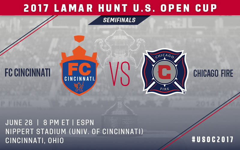
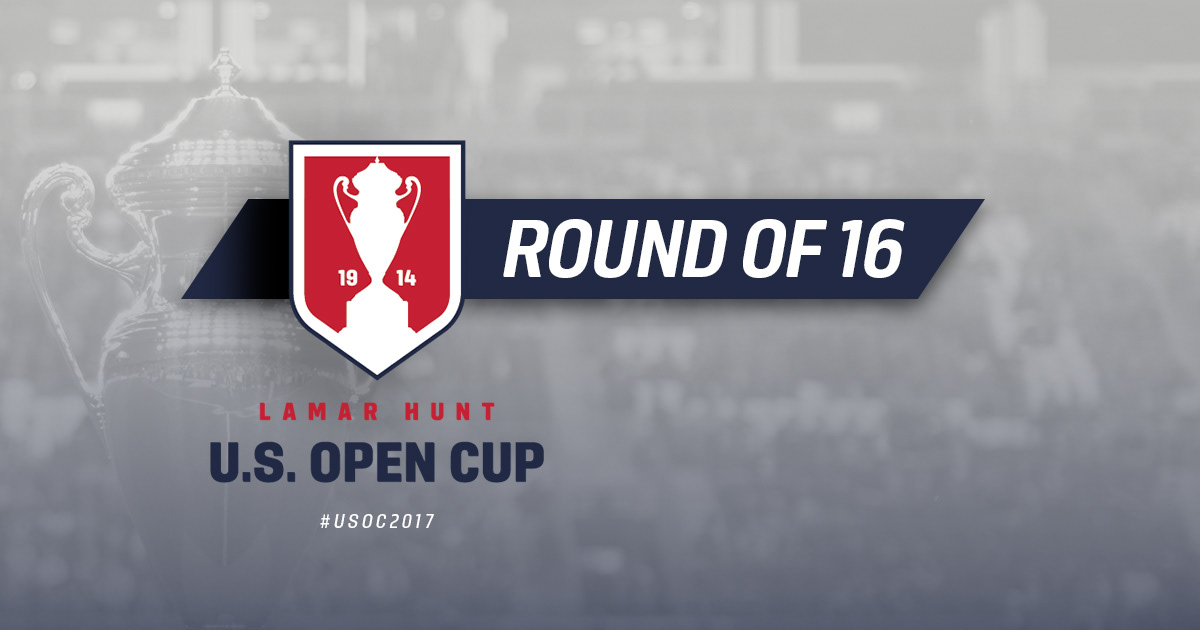
August, 2017
Objective: Create awareness and buzz around the final 16 teams in the U.S. Lamar Hunt Open Cup tournament - the largest tournament in the U.S. that any team can enter (professional, semi-pro, recreational)
Provided: Background image
Outcome: Created graphically appealing match-up templates and a bracket for the remaining 16 teams to compete for the Lamar Hunt trophy to be published on Social Media and later posterized for clubs who wanted to display it in their stadiums
Tools used: Adobe Photoshop, Adobe Illustrator