Quick Overview
Problem: Standard Brewing has seen a steady decline in its unique service of selling beer by the keg.
Hypothesis: By integrating all Standard Brewing's points of sale into its e-commerce platform and enhancing the shopping experience across these channels, customers will enjoy a more positive experience, ultimately driving increased keg sales.
Solution: First, Users Will test Standard Brewing's current website, identify pain points, and create a persona to communicate the user journey better. Then, a competitive analysis of other breweries of the same size offering the same services will be run. Lastly, Standard Brewing's website will be redesigned to focus on its keg ordering service.
Outcome: Six months later, Standard Brewing reported a 45% increase in keg sales and added new revenue streams from selling merchandise online and hosting/ promoting special events at its venue.
Website Redesign
Focusing on eCommerce
Duration
2.5 Weeks
My Roles
Researcher, UX/UI Designer, Project Manager
Tools
Sketch, InVision, Adobe Xd, Adobe Photoshop, Keynote
Existing site breakdown/ summary
Standard Brewing's website was not very user-friendly, especially in terms of its information architecture.
Meanwhile, their e-commerce efforts were nonexistent, and customers could not purchase through the website. The only item their customers can inquire about is ordering kegs to go.
However, purchasing a keg to go requires their customers to call in and inquire.
Competitive Analysis
After thorough research to compile a competitive analysis, I found that Stand Brewing's website lacked some foundational and functional elements. Most other local breweries of similar size had a Global Navigation, Home/ Landing Page, Footer, Events page, Blog, and Merchandise for online purchase. My eyes widened at the opportunity to make improvements!
Persona development
Lauren, who has a high level of tech empathy, needs fast shipping and overall authority on products she purchases; it was clear she would not be a customer of Standard Brewing, given their current site design.
Lauren cannot make a quick purchase on Standard Brewing’s website because it is disorganized and has outdated information. This is causing Lauren frustration and Standard Brewery a loss in sales.
For research, I visited Standard Brewing to experience and observe the brewery firsthand. During my time there, I spent about an hour at the bar, exploring the cozy space, sampling a few beers (naturally), and chatting with the friendly bartenders and owner. It became clear that Standard Brewing had significant growth opportunities, particularly in areas like renting out their event space, offering food, selling merchandise, and providing kegs to go.
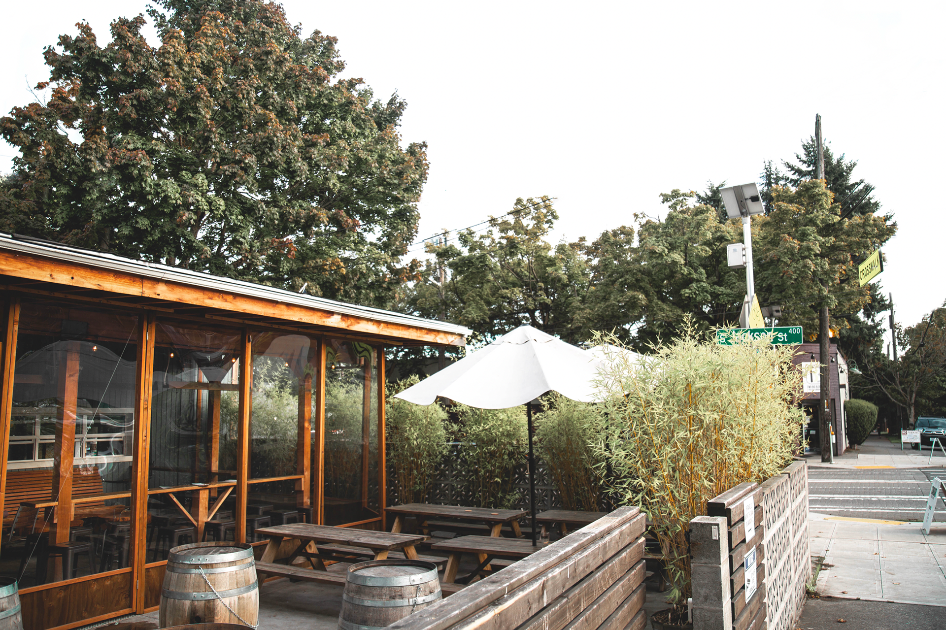
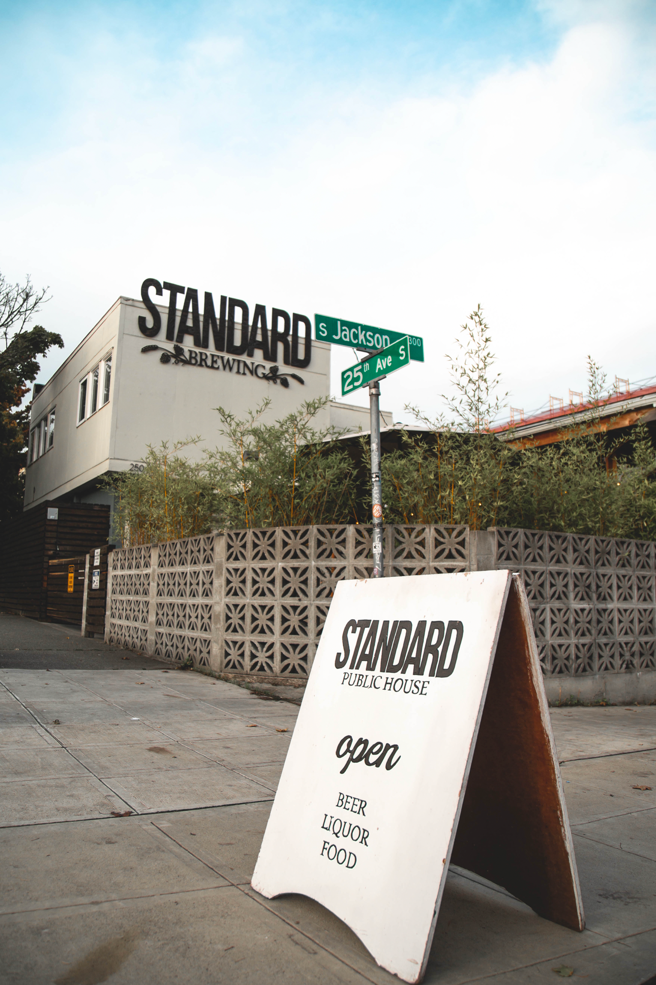
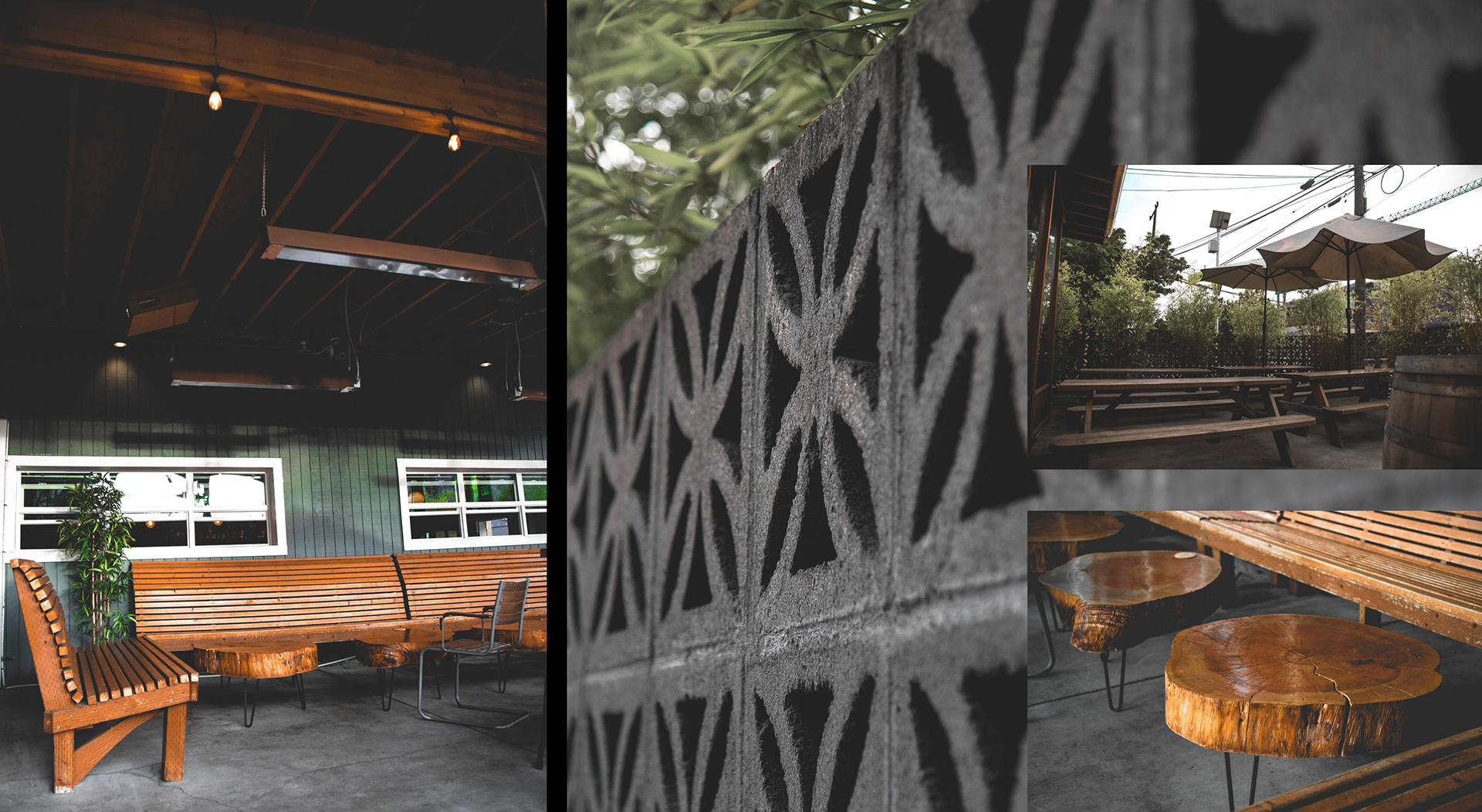
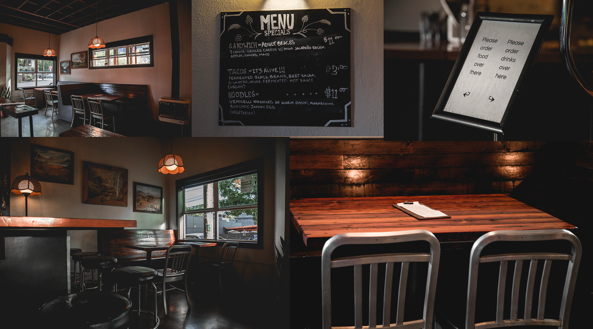
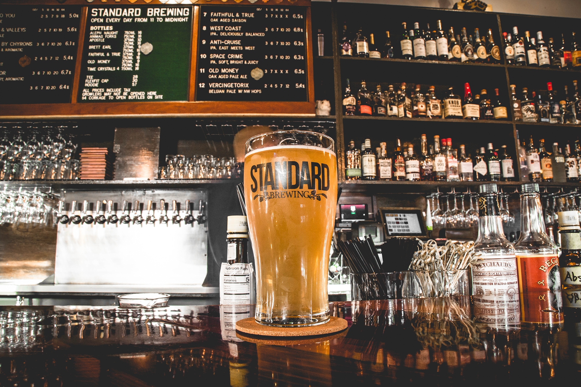
These elements became the core focus of my website redesign, aiming to create a seamless and intuitive experience for visitors. I wanted to make it easier for them to purchase kegs, explore the brewery’s offerings, and learn more about what makes Standard Brewing unique.
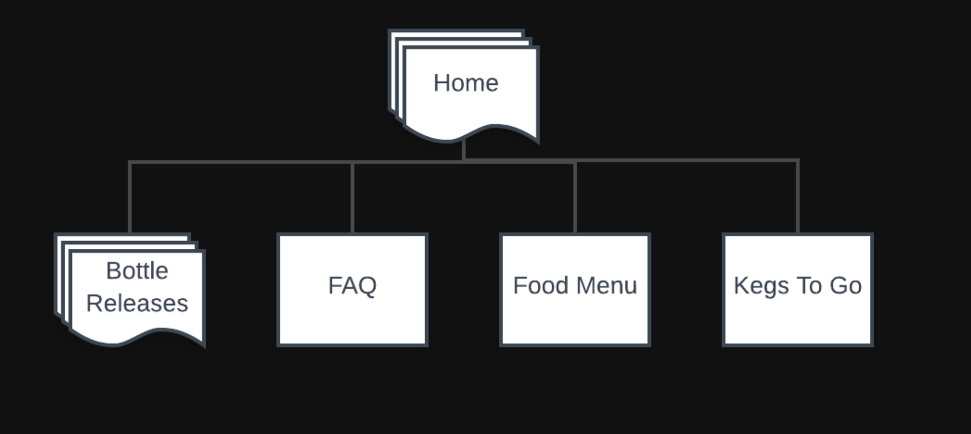
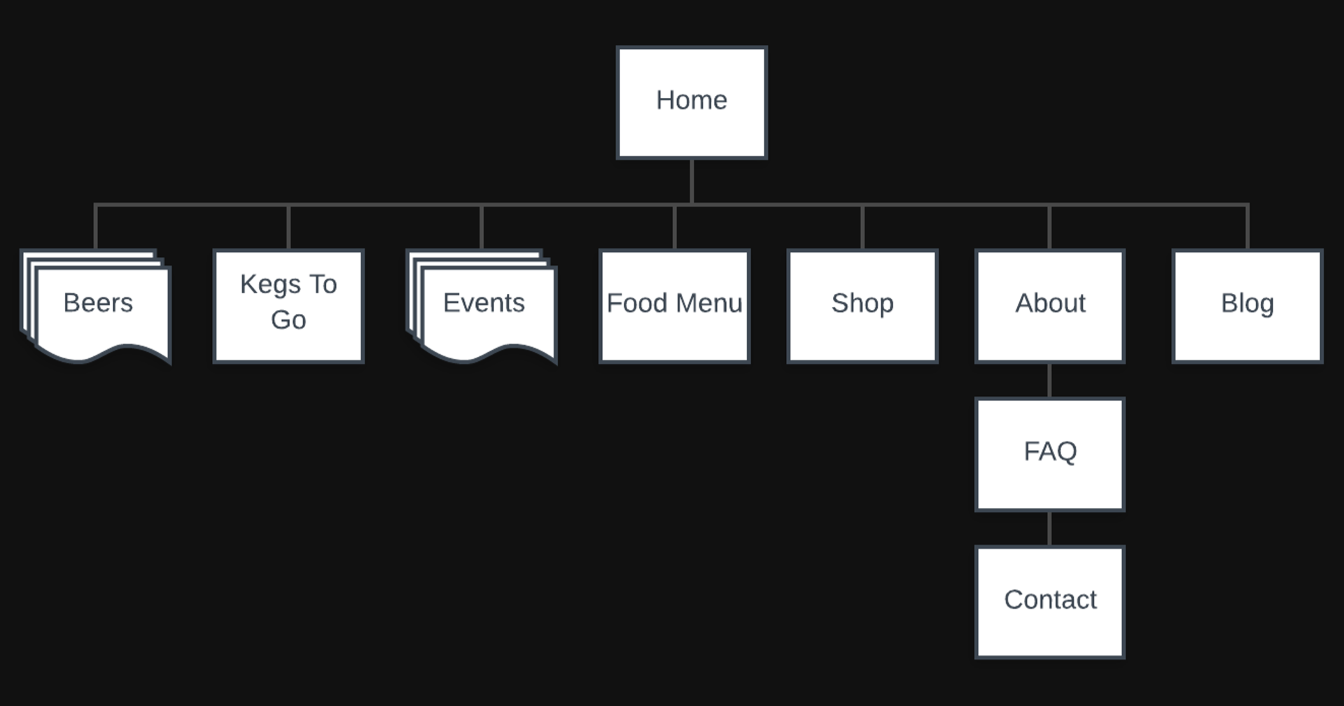
To understand how these newly added sale points would be integrated into Standard Brewing's website, I created an existing sitemap of their current website and then a version that would include the new sale points. This allowed me to see exactly how the website would be enhanced from an information architecture and visual perspective.
Existing Site Map
Revamped Site Map
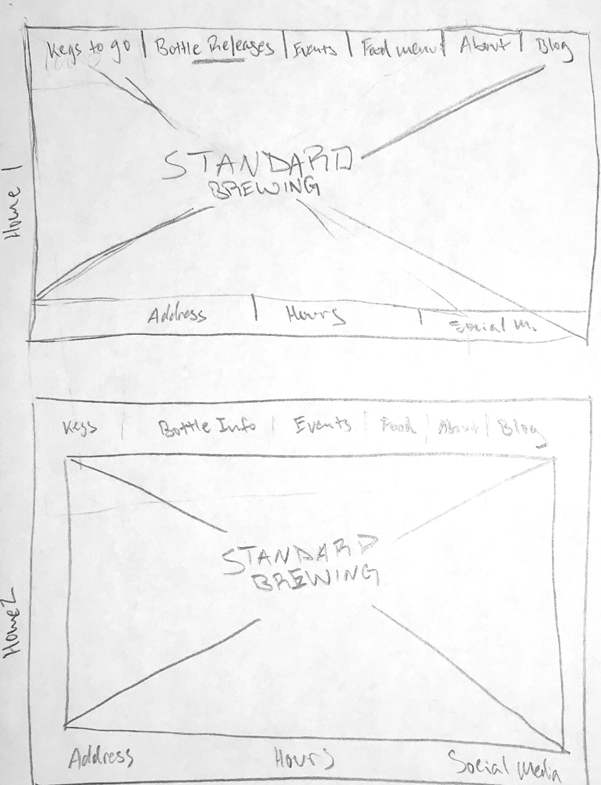
Next, I sketched out some low-fidelity visuals that would help inform and give shape to the home screen.
From here, I started to sketch out other screens and show how they would link and flow from one to another.
From here, I started to sketch out other screens and show how they would link and flow from one to another.
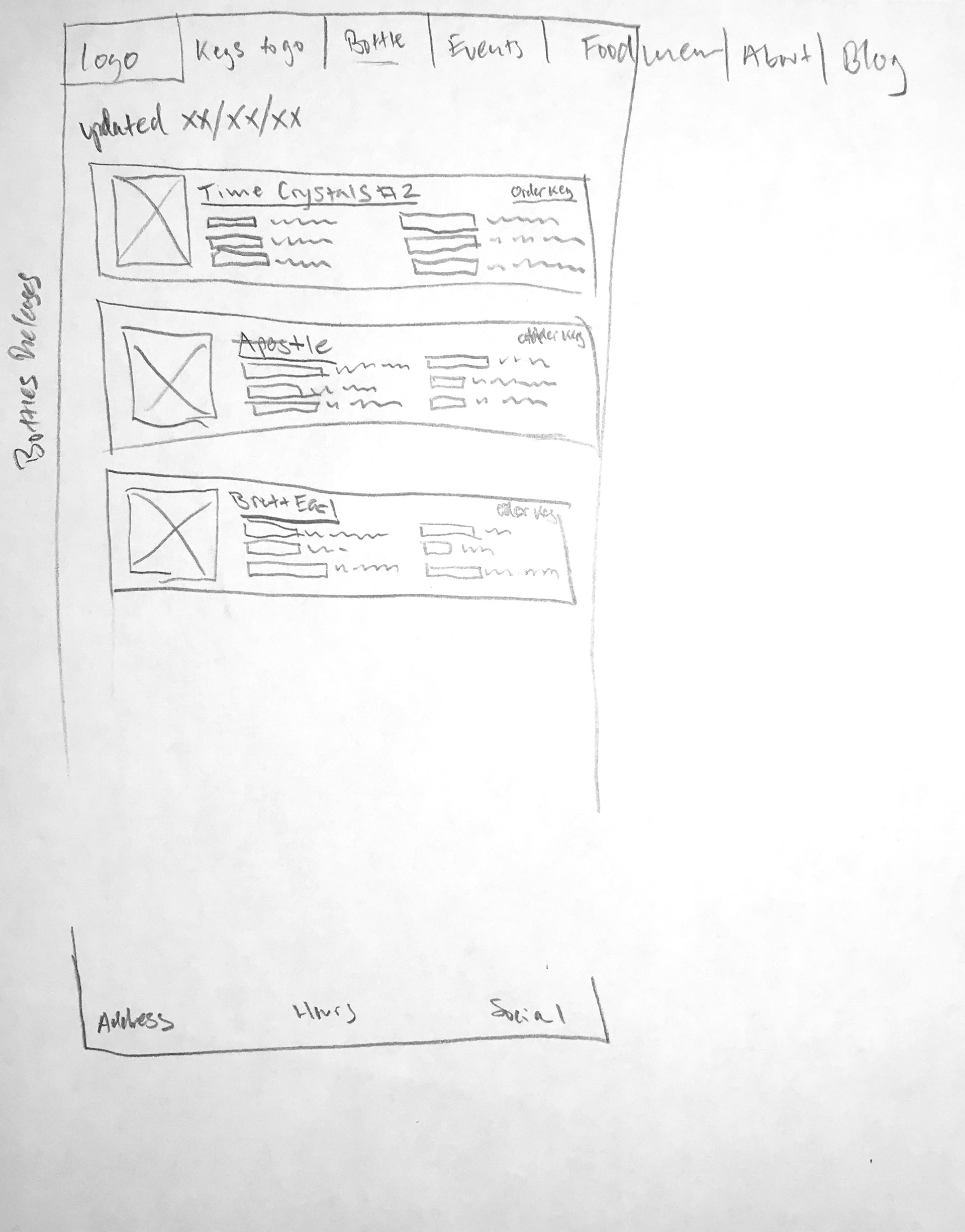
Next, I needed to validate the revamped sitemap by user-testing it to ensure the navigation and flow between each page were intuitive and easy to accomplish. Creating a low-fidelity prototype and explicitly testing the user's ability to navigate from each page across the site revealed specific adjustments needed.
Sketches -> Low-Fidelity Designs -> MVP Prototype
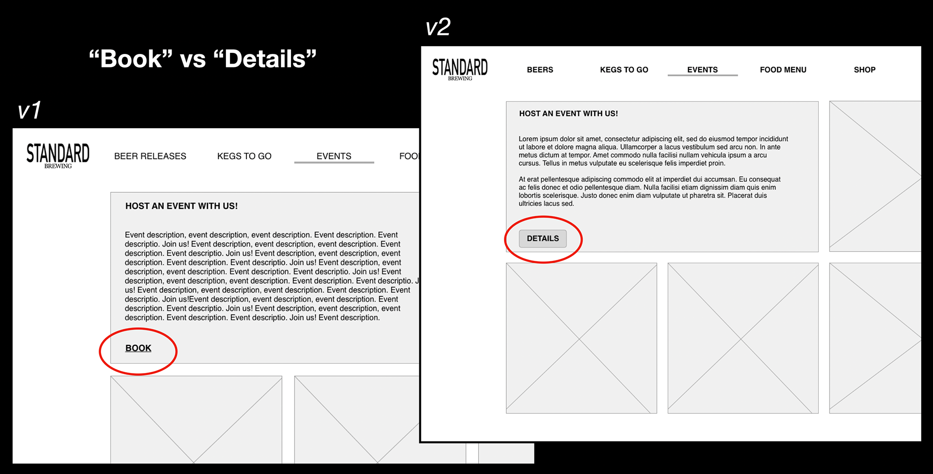
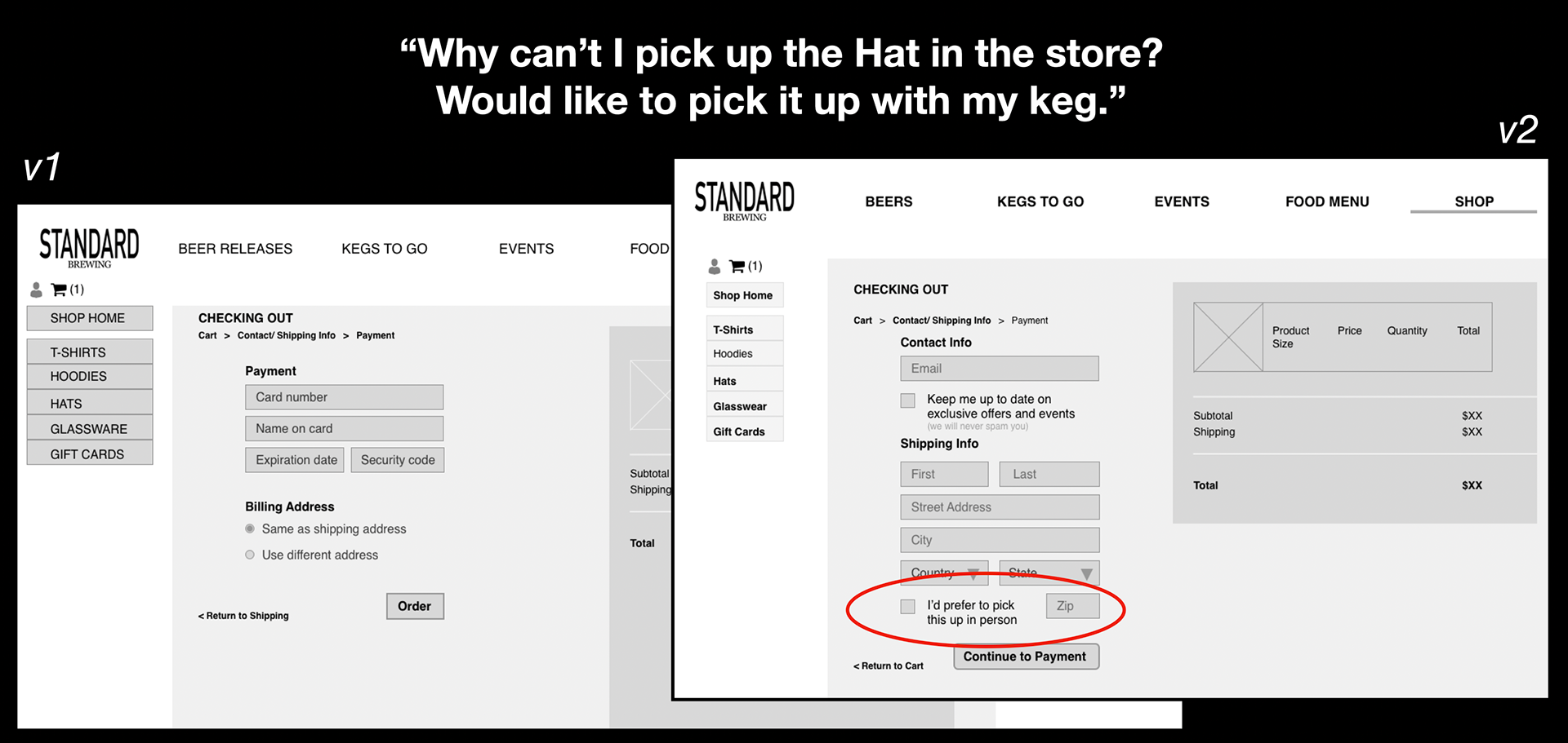
User testing of this new design was ultimately successful. However, they uncovered some other areas of improvement that needed to be addressed.
One user reported that the word "Book" felt like too big of a commitment and ultimately halted them from continuing their checkout process. To address this, I replaced the work with "Details" to give the customer less of a barrier to information entry and ultimately to make a purchase.
In another instance, one user reported frustration that they didn't have the option to buy merchandise and pick it up in the store with their pre-purchased keg. To address this, I added an option for the user to select "I'd prefer to pick this up in person."
After making these changes and testing with the same users and new ones, this new flow and navigation proved to be much more seamless.
With the 2.5-week sprint coming to a close, I had achieved the following:
- Evaluated the current website to identify specific pitfalls
- Researched similar breweries in Standard Brewing's market to gain insight into what points of sale they offer, specifically through their website
- Created a persona to gauge better the customer and what frustrations and pain points they have
- Visited Standard Brewing in person to better understand the business, physical environment, character, and potential opportunities to expand their business offerings online
- Iteratively designed and tested a new site map of Standard Brewing's website, with special emphasis on navigation and funnel of customers making a purchase
