
Quick Overview
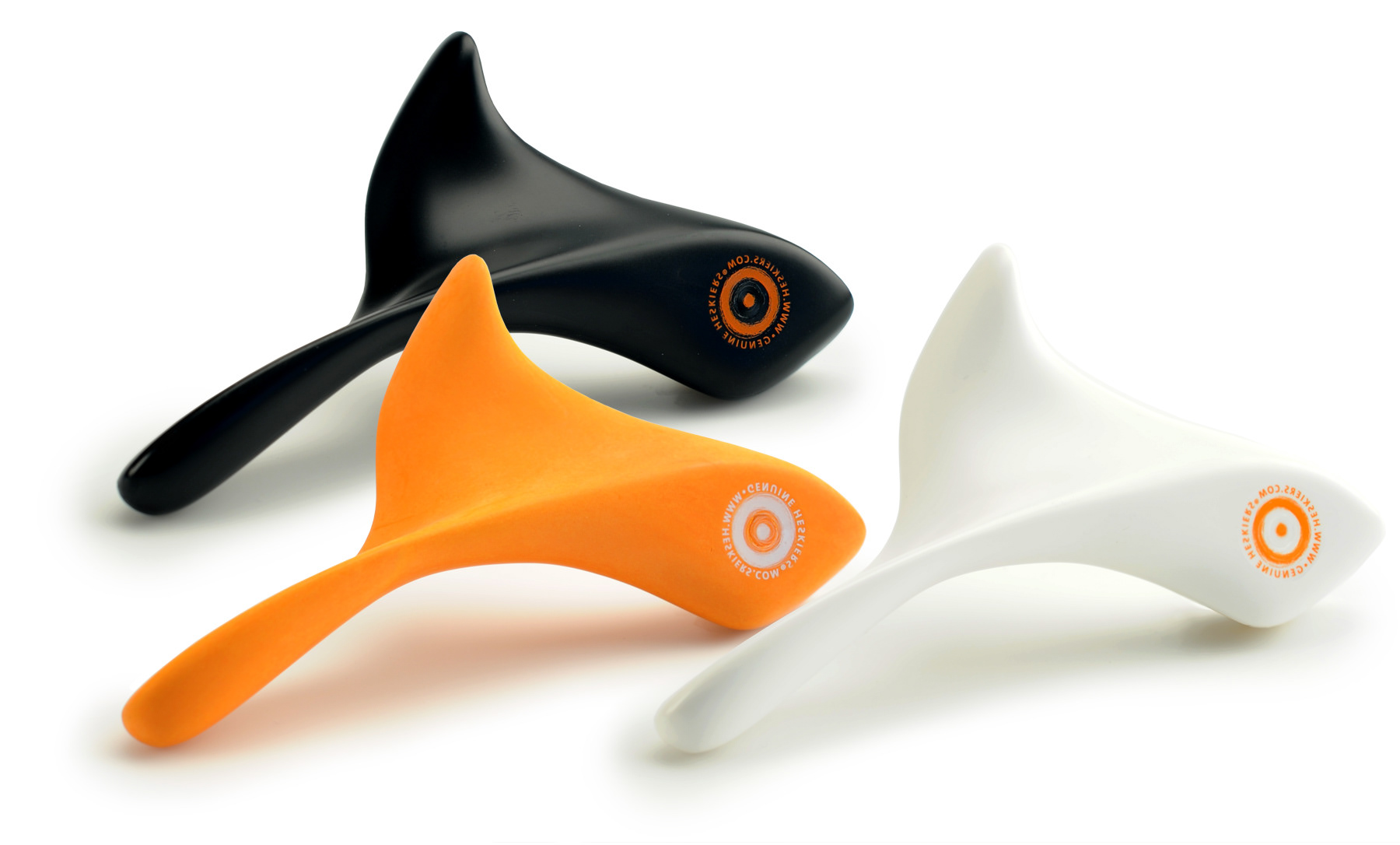
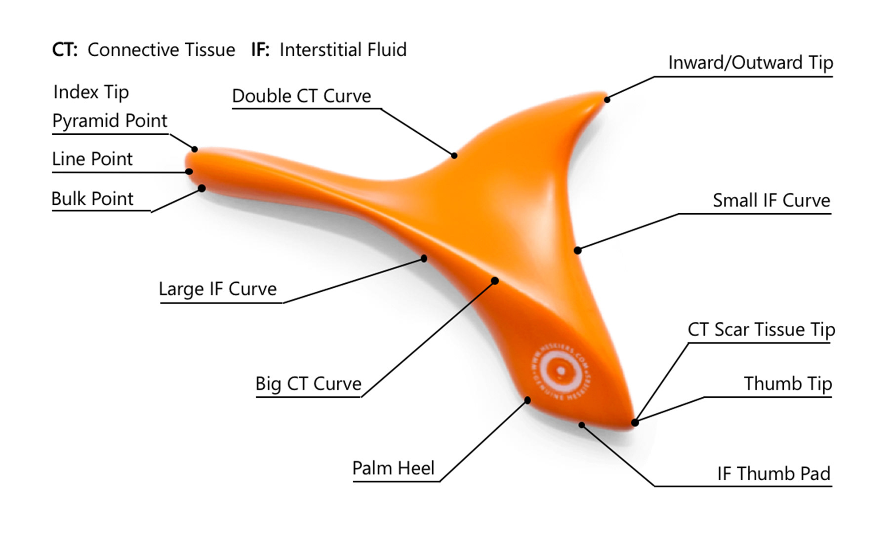
Problem: Heskiers was seeing minimal sales on their product, The OneTool: a self-applicate massage tool to relieve muscle soreness, only sold online.
Solution: Our team researched and performed usability tests to understand where the breakdown was for online customers, studied other competitors in the market, and through an iterative design process, redesigned Heskiers' entire site with a focus on the customer's ability to navigate and purchase The OneTool.
Outcome: After testing the latest high-fidelity interactive prototype of the website, it scored 28 points higher than the existing site per a System Usability Scoring metric.
Website Redesign
Focusing on eCommerce
Duration
2.5 Weeks
My Roles
Interaction Designer, Project Manager
Tools
Sketch, InVision, Adobe Xd, Adobe Photoshop, Keynote

Initial Research
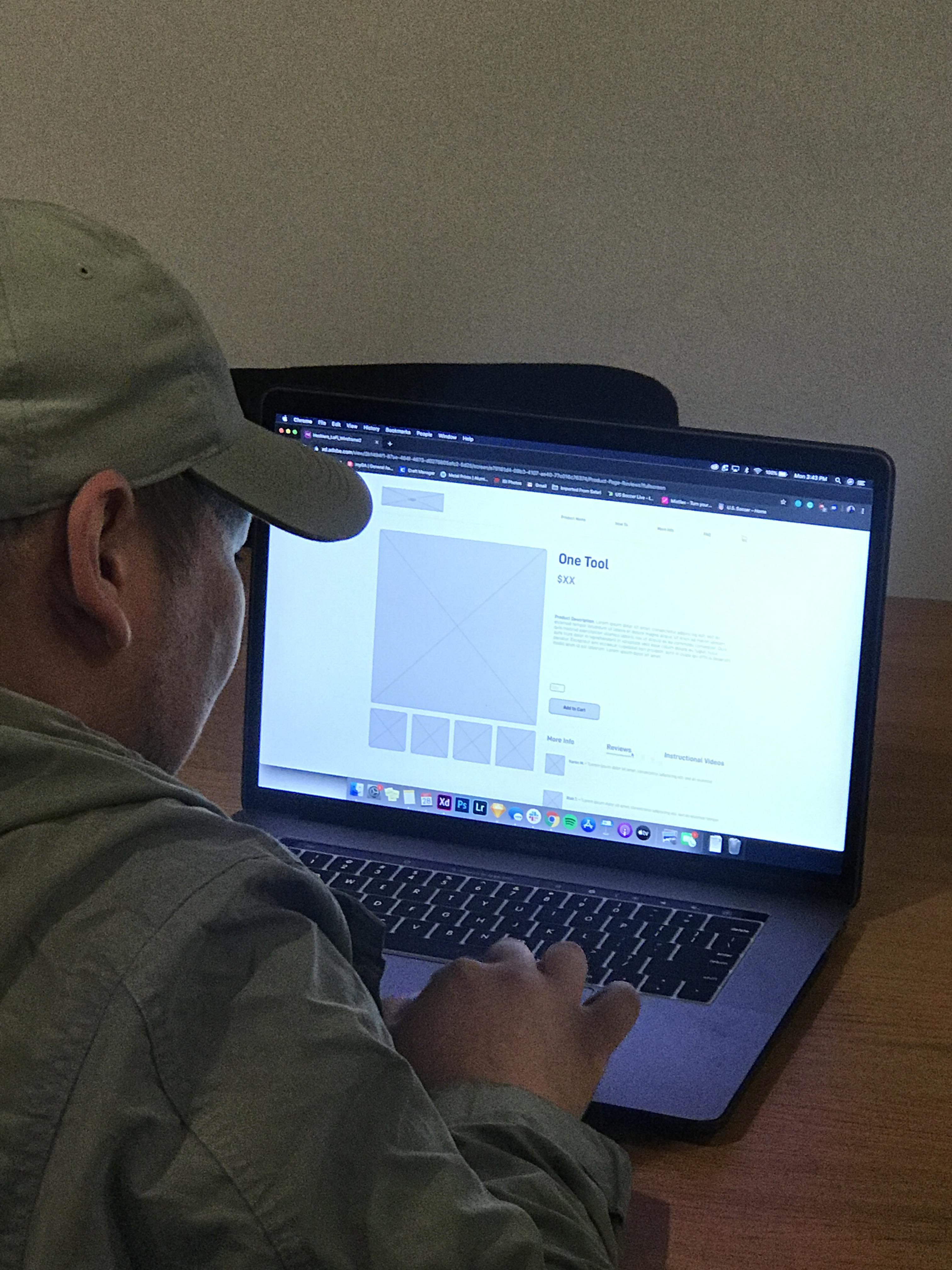
Before jumping in and designing anything based purely on assumptions surrounding the changes needed to the Heskiers website, we decided to do an existing site task analysis user testing to see if the site could achieve its priority purpose: produce a sale. Specifically, focusing on the checkout process: arriving at the Home page, navigating to the product page, adding the product to the cart, reviewing the order, and completing the checkout process.
From the task analysis user testing, we gained crucial pieces of information that would dictate how to improve sales for Heskiers:
- Insight to users' general pain points, red flags of elements we need to change
- In contrast to the previous, areas of the experience that were pain-free and we should maintain
- We established a SUS score rating of the existing site (70) which enables us to evaluate and measure our success at the conclusion of this project

Identifying Common Pain-points
1. Adding the OneTool to the Cart
2. Finalizing and completing the order
As the interaction designer, this provided a clear roadmap on how to prioritize needed changes:
1. Adding the OneTool to the Cart
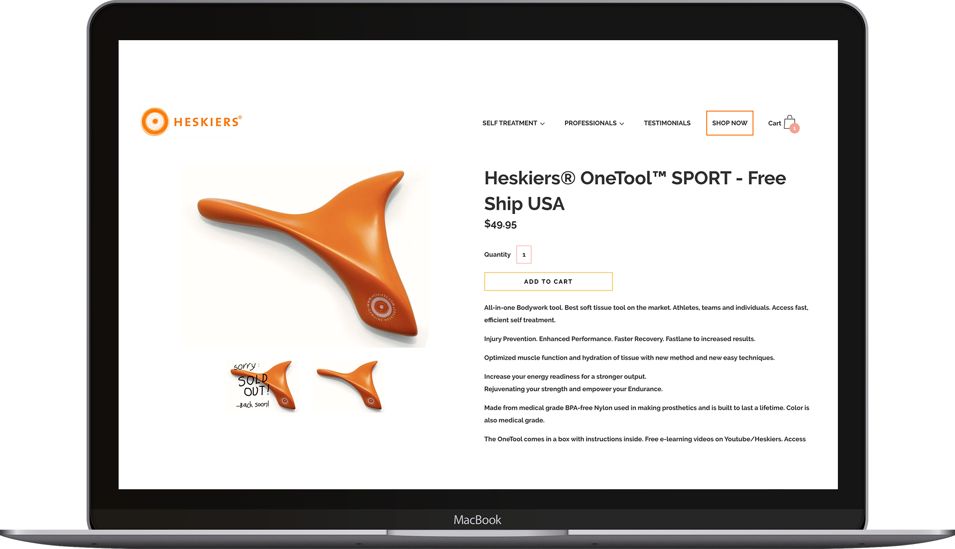
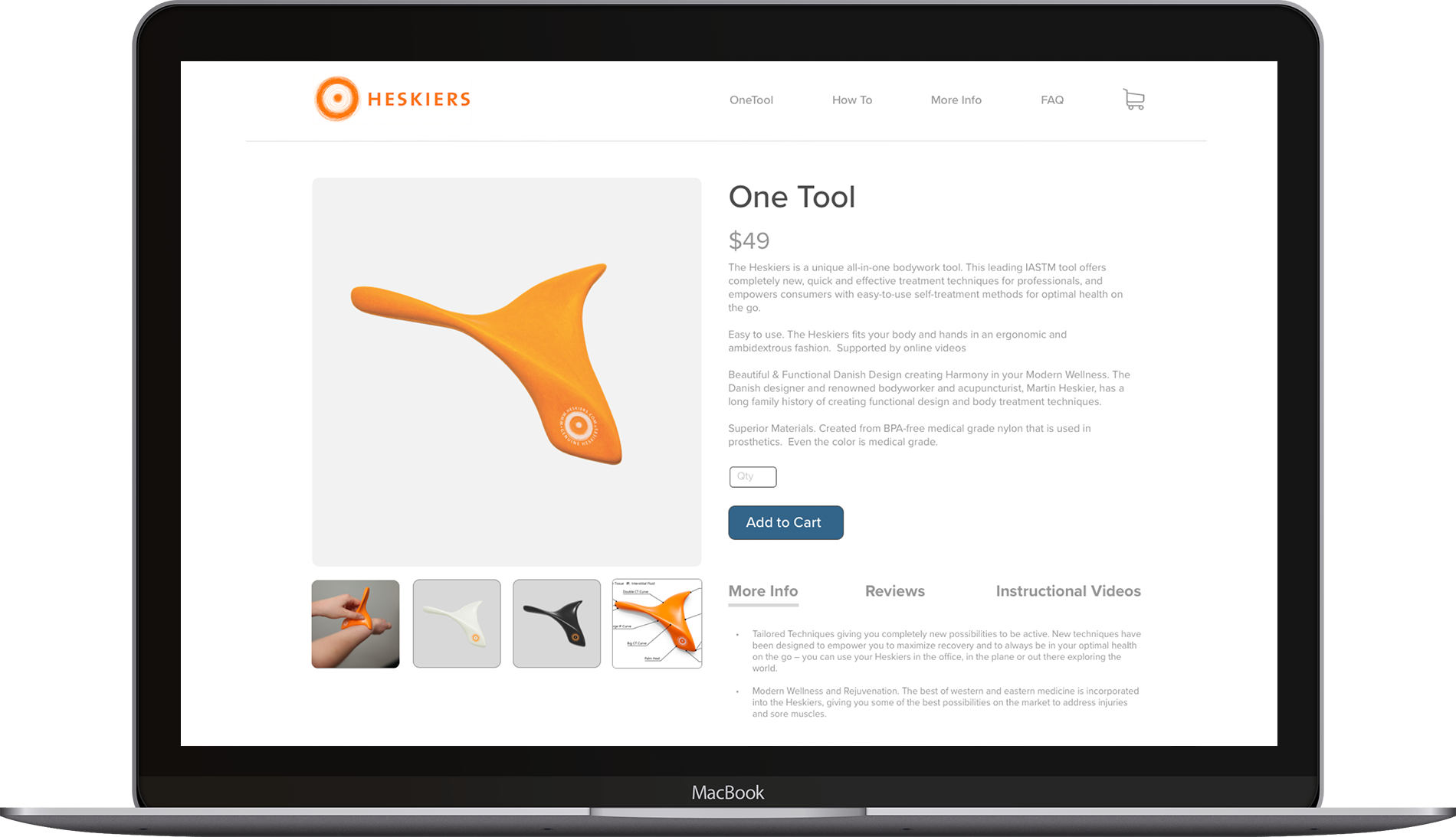
1.A – Existing site: Adding the OneTool to the customer's Cart

Before Clicking 'Add To Cart'
After Clicking 'Add To Cart'
Above are two screen shots of the existing product page for the OneTool. The first image shows before, while the second image shows the screen change after a customer has added the product to their cart. Notice any difference? Probably not. Don't worry, you're in good company with all of the 13 participants we asked to add the product to their cart and complete their purchase. Only until they had clicked the 'Add to Cart' button 7 times, did they realize they had then added 7 products to their cart. This was the most common pain point, as customers then had to try and navigate how to remove products from their cart, ultimately adding an extra step or barrier towards them making a purchase.
1.B – Designing mid-fidelity wireframes: addressing the 'Add to Cart' pain point
Below, is a mid-fidelity representation of how the screen would change to indicate that a product has been added to the customer's cart. Reflected similarly to above, the image on the left shows before, while the image on the right shows after a customer has added the product to their cart.
Before Clicking 'Add To Cart'

After Clicking 'Add To Cart'
Notice any difference? There are a few key indicators to show the customer that the product (and only one) has been added to their cart:
1. The shopping cart icon in the global navigation bar gains a badge indicating the total number of products it contains (in this case, just one).
2. The horizontal thin dividing line between the global navigation bar and the local page kinks to include the shopping cart, indicating that the current page the user is viewing is now under the shopping cart section. A second thin dividing line appears, differentiating the "Product" and "Cart" sections.
3. The "Add to Cart" button lost a significant amount of opacity, and the text within changed to "Added to Cart" - these changes indicate the user has clicked the button, and it is now past-tense, no longer an active button to press again (and accidentally add another product to the cart).
4. Taking up the most screen real-estate in regards to this change is the "Cart" section itself showing the products currently in the cart, the price, quantity, total price, and a button at the bottom if the customer is ready to checkout and pay. Ideally, this screen change would be a slight animation, rather than a quick change to not confuse the customer into thinking they had navigated to a completely different page.
5. Lastly, the different tabs at the bottom give more information about the product under the product description slide over to the left, underneath the supplemental images of the product.
1.C – Test mid-fidelity design: make changes as needed, repeat

In testing this screen change to indicate something was added to the shopping cart, there was not a single participant who indicated they were lost or confused. However, a couple inquired about adding an option to 'continue shopping.' Instead of this feedback, a 'continue shopping' button was added adjacent to the checkout button at the bottom of the cart slider.
1.D – Redesign: Adding the OneTool to the customer's cart - High Fidelity
Moving into a high-fidelity stage for the working prototype, below is a representation of how the screen would change to indicate that a product has been added to the customer's cart. We tested this high-fidelity prototype as a part of a more macro test, focusing on the entire checkout process.
Before Clicking 'Add To Cart'

After Clicking 'Add To Cart'
2. Finalizing and Completing the Order
2.A – Testing the existing checkout process, incorporating results from comparative analysis into new checkout process
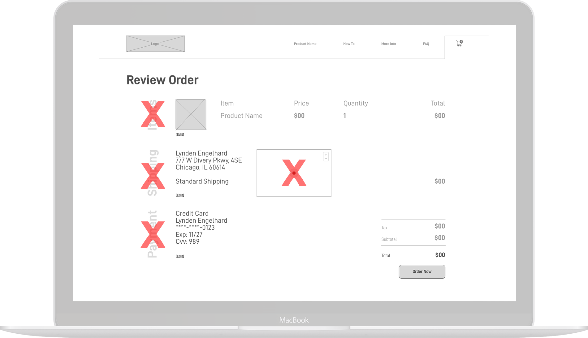
Through testing the existing Heskiers OneTool site, in addition to running a comparative analysis with how other eCommerce single-product websites structured their checkout process, we designed and then tested the following mid-fidelity checkout pages. The screen on the left was the first iteration as a result of our initial research. After a round of participant testing, we discovered a few major pain points or areas of confusion:
"Why is the text on the left sideways?"
"Why is there a map?"
"How do I go back to modify my order?"

First Iteration based on research and existing site
Elements omitted from first iteration, following participant testing and feedback
2.B – Redesign the checkout page based on feedback, test again
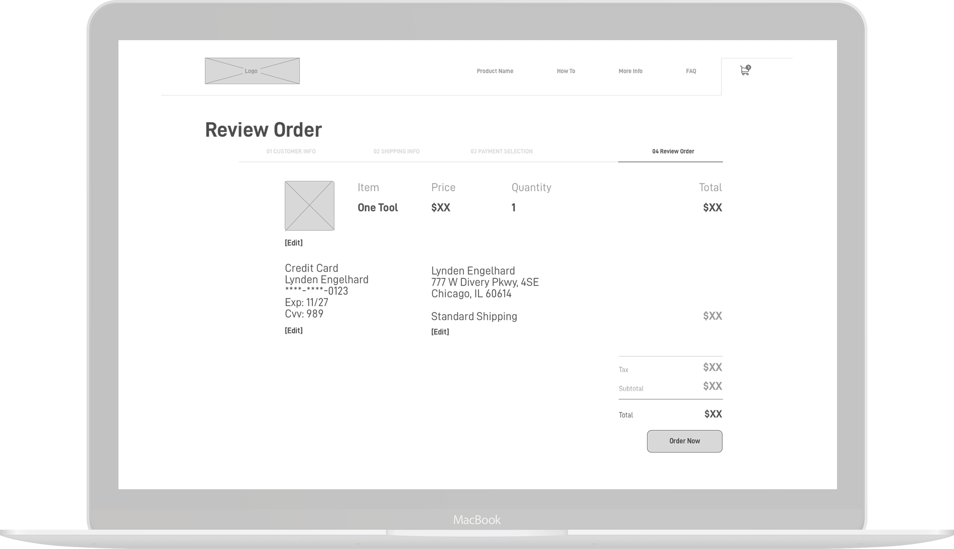
The most significant changes made from the previous iteration derive directly from the participant's feedback quoted above. Therefore, the vertical text and map were removed, and we built in a way for the customer to orient themselves in the checkout process, similar to a conventional breadcrumb. Additionally, the customer can use this breadcrumb bar to go back and make changes to their order without changing pages and becoming disoriented. Thus, making it easier for them to get to the final checkout page and complete their order. Lastly, we made the "Edit" text larger as majority of our participants did not notice the text altogether.
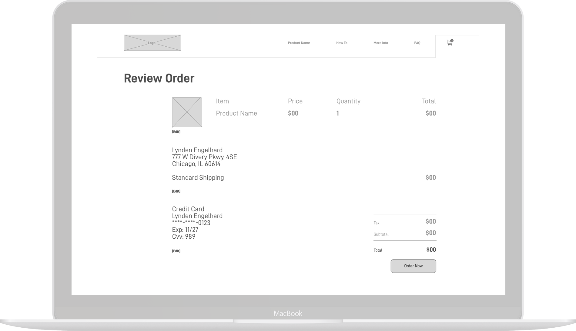
First Iteration, without the vertical text and map

Second iteration, implementing the breadcrumb bar and increasing the "Edit" text size
2.C – Redesign the checkout page - High Fidelity
Finally, after enough testing to ensure our current design we ready to move forwards, we created a high-fidelity version of the Checkout page, seen below.
Second iteration
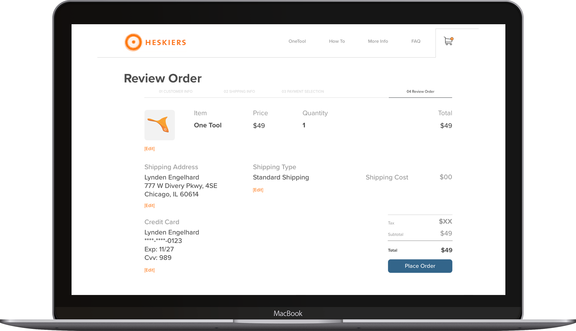
High Fidelity of the Checkout Page
3. Combing the Product Page and Checkout Page into a High Fidelity Prototype
Below is our High Fidelity, interactive prototype. I encourage you to click through and see how easy it is to purchase a product!


Team members/ Roles:
Alyssa Evans/ Researcher
Brett Cherry/ Visual Designer